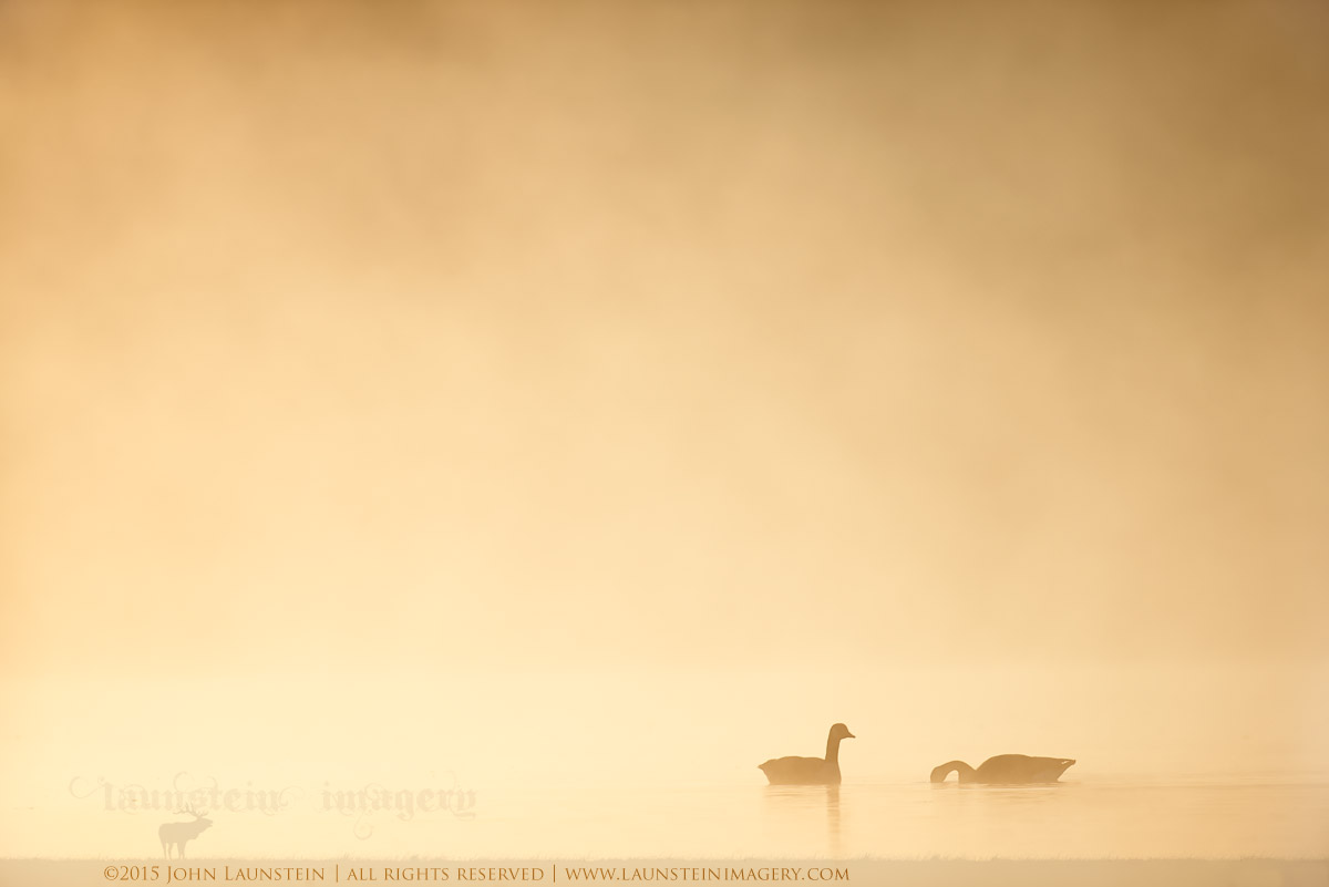
On Golden Water
by John Launstein
Hi All! Jenaya, Josiah, Marlise and I have just returned from 10 days on the west coast of Canada photographing owls and waterfowl. While we had hoped to go a bit earlier in the month, we are very excited to have snuck this trip in and have returned with a few thousand images to sort through and edit, including our best pygmy owl images to date.
It will take me a bit to get at this year's haul, so here's a favourite from last year from the same stillwater we spent a few days at again this year.
Please note that I had to clone a milk crate(!) from the LRC and removed a few other pieces of foreign debris from the water to the left of the geese.
I chose to NOT increase the levels or contrast here to retain the original bright-yet-soft tones.
Looking forward to your comments, critiques and suggestions on this one! Please view the larger version for best quality.
---------------------
Nikon D600
Nikkor AF-S 500mm f/4D IF-ED
ISO 400
1/4000sec @ f/5
+0.33 stop overexposed from meter
Mounted on FEISOL CT-3372 Elite tripod with Acratech GV2 ballhead and Wimberley Sidekick
Full frame

Comments
12 commentsI do find the elk in your signature interfering with subject, being of similar tones. Not sure if you felt the same way.
Ditto. I understand the desire to watermark, but it isn't going to protect image theft so why distract the viewer.
Keith, in response to your question about our watermark, there's quite a lot of background but I'll try and summarize it simply:
- As you know, while watermarks are usually pretty easy to remove, courts have demonstrated a tendency to see such action as clear intent re copyright infringement and come down more strongly in terms of consequence. That doesn't speak to our watermark design directly, but it is related, as ours is obvious.
- I was frustrated with various text-only watermarks being difficult to read against busy backgrounds so gravitated toward a solid background element behind the copy as part of the watermark.
- As you also know, our photography business isn't just the work of one photographer, but is more of a cooperative of nature photographers who happen to all share the last name (i.e. we are a family of photographers), so a simple signature did not promote that larger aspect of our business and branding.
- Speaking of branding, we decided we wanted our logo on all our online files to accompany them wherever they might migrate. While we are first and foremost nature fanatics and wildlife lovers and artists, we are, in the end, also in the business of providing compelling wildlife imagery to various markets.
- Finally, as a family of photographers, I wanted my kids to have ownership of this part of the business as well, so our logo, and the way we watermark, was a bit if a democratic decision and reflects some of my kids ideas as well as my sense of execution. It's not perfect, and isn't what I would have gone with if I were a solo photographer, but it's ours and I'm proud to share it with my young photographers who helped design it.
Finally, I do adjust the opacity on virtually every image we prepare for the web, and when I can reduce it significantly and still retain the branding and clear copyright notice and web information, I do--like I did here. I'm disappointed the result seems to be an issue on some images for some of our fellow NPN members on the critique forums, but because we/NPN has no way of absolutely making that the final/only place posted images appear, we decided to keep the watermark consistent on ALL online uses, including NPN. We have seen some of our images that had only been posted on NPN appear elsewhere on the world wide web and social media venues, so that influenced our decision to just prepare all our web files this way.