Nature Photographers Network
This is the preserved archive of the original Nature Photographers Network. The community continues at naturephotographers.network.
+RP 100 Sq. Yards #2
‹ PreviousLandscape GalleryNext ›

+RP 100 Sq. Yards #2

by Lon Overacker

Gallery: LandscapePosted February 23, 2016232 views15 comments
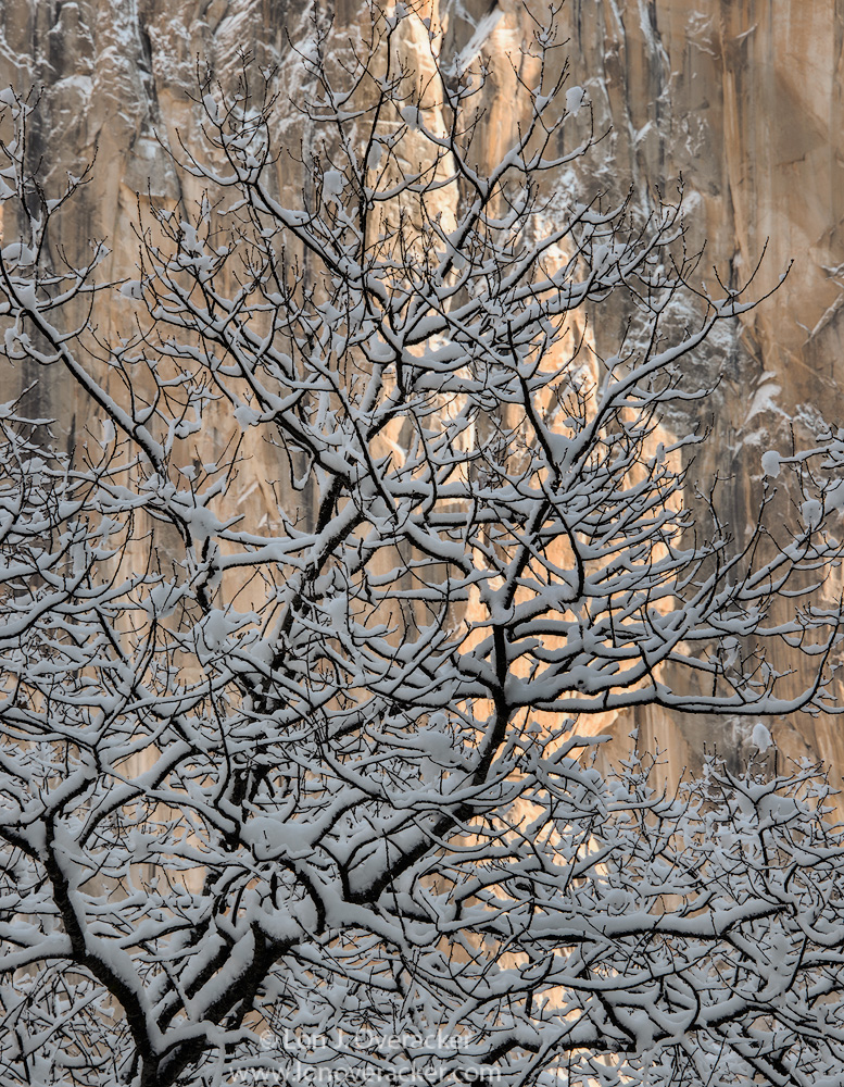
Same concept, different tree, different part of El Cap, 18min later.

This one a little warmer and brighter than the previous post.

Your comments, critiques and suggestions most welcome on this attempt.

Nikon D800E
Nikon 28-300mm @150mm
f/20 1/20th
Tony Kuyper's masks and actions.

Thanks for looking!

Lon

Comments

15 comments
Comment posted by Harley Goldman on February 23, 2016 at 8:45 PM
Real nice, Lon! The processing works for me. I like the neutral snow in this one compared to the blues in the prior image. I like it brighter, too. Very well done. Master of the Trees!!!!
Registered on November 19, 2003, 586 Posts, 11271 Comments
Comment posted by David Schoen on February 23, 2016 at 11:01 PM
I actually prefer the original posting because I believe the shape of the tree and the tree itself really pops in the first image and is less apparent in the second image. The blue tones in the first image are just part of the coolness of the composition. Yes, this one is a little warmer.  The tree here is less symmetrical than the original image. I'm not saying that's a bad thing. It is different. The lighting here creates a slightly different mood because warm than in the first comp.
Registered on November 6, 2006, 1213 Posts, 4587 Comments
Comment posted by Roel Wijtmans on February 24, 2016 at 3:18 AM
I prefer the processing you did on this one, it has more clarity and feeling like this. Compwise I prefer your previous version by a small margin though.
Registered on September 30, 2012, 116 Posts, 2257 Comments
Comment posted by Pete Bengeyfield on February 24, 2016 at 10:51 AM
I think I prefer the first one because of the greater contrast between the tree and El Cap.
Registered on December 2, 2003, 1247 Posts, 3439 Comments
Comment posted by Tom Falley on February 24, 2016 at 1:01 PM
Lon

very nice image, but I also prefer the prior image due to being able to see the wall behind, which with the sun on its features makes the image have power.

cheers.  Tom
Registered on November 21, 2014, 189 Posts, 454 Comments
Comment posted by Igor Doncov on February 24, 2016 at 1:14 PM
I think the first image was better that this because:

1. The overall layout of the tree. The 1st image has the bg evenly popping out through the branches throughout the image. In this one it goes from no bg to no fg. I just like the other approach. 

2. I like that the snow is bluer and flatter in the 1st image. It plays off better against the warm wall. In addition shadows look naturally flat so it also looks more realistic to me. 

Although if if there was nothing to compare this image to its a 'home run'. 
Registered on November 22, 2014, 189 Posts, 2733 Comments
Comment posted by Mark Metternich on February 24, 2016 at 2:43 PM
Nice job here Lon. 
Registered on June 19, 2009, 276 Posts, 6240 Comments
Comment posted by Mark Seaver on February 24, 2016 at 4:08 PM
Lon, these two views of trees against El Cap. make for quite a comparison.  The "back lighting" works great in both cases.  The extra brightness looks good in this one, but I find the tiny branches up top fading into the textures of El Cap a subtle distraction.  Maybe a modest crop off the top...  I think the bigger branches in the previous post make for a stronger subject.  Overall, I have a slight preference for the first view.
Registered on January 23, 2011, 1103 Posts, 17270 Comments
Comment posted by Albert Darmo on February 24, 2016 at 4:51 PM
Hi  Loncrying     Agreecool   ,  warmer &  brighter,  and  again with  exceptionally  fine   detail, light and  colorlaugh.  i  love all  trees!  but  this one does not have the  beautiful form  of the first post.  and  the colder  tones  of  the first post  turn  me on  more  for  a winter scene

Albert Darmo
Canada
Registered on November 25, 2008, 1386 Posts, 11978 Comments
Comment posted by Lon Overacker on February 24, 2016 at 5:02 PM
Thank you all for your comments so far, with excellent observations.  I too prefer the first posts for most of the reasons given already.

Then Igor writes:

Although if if there was nothing to compare this image to its a 'home run'. 


Lesson learned?  All images should stand on their own right?  If I (or anyone) posts similar images back to back, there will naturally be a comparison.  I knew that too, but had this been shown independantly without knowledge of the first, would there be different feedback?  hmmmmm  

@Mark - thanks for the comment and observation about the tiny branches up top.  I actually cloned some small ones on the right edge.  I was wondering if anyone was going to suggest a crop.  I actually played with a significant crop because I was also unsure about the large branch in the LLC.  Always options and alternatives.

Thanks again.  I guess I'll post the 3rd one in a day or so.  
Registered on November 24, 2006, 521 Posts, 19147 Comments
Comment posted by Nick Bristol on February 24, 2016 at 5:41 PM
Lon, Both of these are really nice, but I do prefer the first one overall. I like the shape of the tree better in that one and also prefer the cooler tone of the snow. Two different moods and both are excellent.

Nick Bristol
Lone Rock, WI
Registered on February 1, 2004, 752 Posts, 14140 Comments
Comment posted by Richard Wong on February 25, 2016 at 12:09 AM
Love the fresh snow Lon. My personal preference would be to lighten the snow a bit but it's a matter of taste.
Registered on February 2, 2006, 79 Posts, 2629 Comments
Comment posted by Tom Falley on February 25, 2016 at 2:45 AM
Lon

very nice image, but I also prefer the prior image due to being able to see the wall behind, which with the sun on its features makes the image have power.

cheers.  Tom
Registered on November 21, 2014, 189 Posts, 454 Comments
Comment posted by Lon Overacker on February 25, 2016 at 12:37 PM
I've reworked this some to incorporate some of the suggestions and observations.  I used the color picker, Color selection and a Levels layer just to adjust the snow on the tree.  Then I did the same with the wall.  The snow a little cooler, the wall slightly warmer and I think a better separation between the two.  I also cropped slightly from top and right.  also, not sure if I've mentioned, but am getting in to the habit of adding a 10-20% opacity Orton at the end for a slight boost in contrast.

Thanks for the feedback everyone!

edit: changes are pretty subtle now that it's posted...
Registered on November 24, 2006, 521 Posts, 19147 Comments
Comment posted by S Govindarajan on February 25, 2016 at 5:53 PM
I am a sucker for tree abstracts and this works beautifully, Lon. Dig the color tones and contrast between snow and the dark tree limbs. Very well composed too.
Registered on April 19, 2008, 115 Posts, 1921 Comments