
Nature Photographers Network
This is the preserved archive of the original Nature Photographers Network. The community continues at naturephotographers.network.
Bleak Midwinter [+edit]
‹ PreviousLandscape GalleryNext ›

Bleak Midwinter [+edit]

by John Williams

Gallery: LandscapePosted February 20, 20163,477 views17 comments

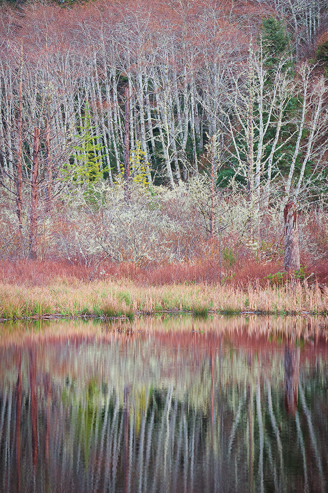
With dreams of capturing a fiery sunset, I spent a couple of nights at the coast last weekend. The weatherman was wrong, and I spent the entire time in gray and drizzly weather. Instead, I ended up chasing some of the more abstract patterns formed by the bare winter vegetation.

Nikon D7100
Nikon 55.0-200.0 mm f/4.0-5.6 at 105mm (157mm equiv.)
1/125 sec at f/5.6 and ISO 800

Comments

17 comments
Comment posted by John Williams on February 20, 2016 at 12:49 PM
I wrestled with whether to include the upper corners or not; here's a cropped version to compare.
Registered on September 6, 2007, 221 Posts, 5985 Comments
Comment posted by Preston Birdwell on February 20, 2016 at 2:16 PM
John, I prefer the cropped version. I think it zeroes in on the important elements. I think the reds are little too saturated, especially in the trees on the left. Also, I think the darks could be a little deeper, especially in the reflection. I like the various textures and the quiet mood.

--P
Registered on November 1, 2003, 471 Posts, 5188 Comments
Comment posted by Mark Metternich on February 20, 2016 at 4:45 PM
Lovely image John!  Love the comp and the color. Wonderful.  I like both versions. 

My only nitpick is it seems a tad over sharp on my Mac 27 Thunderbolt. 
Registered on June 19, 2009, 276 Posts, 6240 Comments
Comment posted by Ed Lowe on February 20, 2016 at 5:51 PM
Even though you did not get that fiery sunset, you came away with a winner, John. I too prefer the cropped version because it has a better flow without those corners. I love all the layers along with those colors.

Ed
Registered on February 7, 2004, 414 Posts, 7115 Comments
Comment posted by Ken Smith on February 20, 2016 at 11:46 PM
The lichen creates a strong contrast ...almost sparkles.  As Mark M said, it could be oversharpened esp near the top of frame on the cropped version.  The colors are strong and vivid.  Nicely seen and shot.
Registered on September 5, 2008, 449 Posts, 2444 Comments
Comment posted by Lon Overacker on February 21, 2016 at 2:42 AM
John,

I've always enjoyed your work and I'm so glad to see you post this image.

I love both versions and think they stand up on their own for different reasons.  I really enjoy the first because it has a radiating look to it I think most because of the reflection and the ripples and abstractness.  the bright values also give this almost a color version of a high-key image, yet the colors are displayed beautifully here.

The cropped version doesn't have that same dynamic feel, but I do like that the top corners have been removed.  It really boils this scene down to it's core elements, and so I think the cropped version works beautifully too.

This is also pretty unique; beautifully seen and captured.

Lon
Registered on November 24, 2006, 521 Posts, 19147 Comments
Comment posted by Harley Goldman on February 21, 2016 at 8:51 AM
Both are real nice, but I prefer the cropped version. I would agree with Preston on the colors, a little strong for my tastes. 
Registered on November 19, 2003, 586 Posts, 11271 Comments
Comment posted by scott lanz on February 21, 2016 at 10:05 AM
I prefer the cropped version, John. I like the enite image, but the foreground abstract reflection is truly amazing. 
Registered on November 14, 2003, 840 Posts, 12902 Comments
Comment posted by Roel Wijtmans on February 21, 2016 at 10:52 AM
I honestly have a hard time choosing between the two versions. I love the reflection in the original, but I do like the look of the trees in the cropped version without that corner. In the end, I do think both are great anyway, it's a small nit to pick! The reds look a tad too strong compared to the rest, but that is also a small nit.
Registered on September 30, 2012, 116 Posts, 2257 Comments
Comment posted by John Williams on February 21, 2016 at 11:56 AM
Thanks all! I'm working on a newer monitor, so the saturation/sharpening feedback is really helpful to dial it in.

Here's a final crop try, also trying to adjust the sat/sharp, abandoning the 2x3 ration to trim the upper corners yet keep the reflection.
Registered on September 6, 2007, 221 Posts, 5985 Comments
Comment posted by Lon Overacker on February 21, 2016 at 12:43 PM
John,

This repost nails it for me!  You've addressed all the feedback.  And hopefully it's the version you're most happy with too!
Registered on November 24, 2006, 521 Posts, 19147 Comments
Comment posted by Nick Bristol on February 21, 2016 at 3:48 PM
John, The final version looks fantastic! It is such a beautiful scene and really has a wonderful look and feel. I love the colors and the reflections look awesome. I think you came up with a real winner!! 

Nick Bristol
Lone Rock, WI
Registered on February 1, 2004, 752 Posts, 14140 Comments
Comment posted by Albert Darmo on February 21, 2016 at 4:19 PM
Hi  John   crying Magical  color and  light ,  the reflections add  to the beauty of the scene...     I  too  prefer the repost.   i like the softer detail.


Albert Darmo
Canada
Registered on November 25, 2008, 1386 Posts, 11978 Comments
Comment posted by Stuart Williams on February 22, 2016 at 7:58 AM
having remembered one of your previous images, john: http://www.naturephotographers.net/imagecritique/ic.cgi?a=vp&pr=217721&CGISESSID=fc0e10a2745cf66425112bdfaebd0ab0&u=5789&title_action= I can only imagine the starting point for this. we'll all have an opinion on your processing but the final image looks grand - i wouldn't mind it being slightly less contrasty but then if you offered that up, i'd bet that people would be demanding it to be more contrasty. can never win with these folks, me included. nicely pulled out of a grey drizzly day!
Registered on December 7, 2007, 247 Posts, 4792 Comments
Comment posted by Mark Seaver on February 23, 2016 at 1:11 PM
This looks warm and dreamy, John, in spite of the title.  One of the treats of overcast, is how saturated colors become.  I'm really enjoying all of the colors and textures.  I especially like the longer reflections in the final repost.
Registered on January 23, 2011, 1103 Posts, 17270 Comments
Comment posted by Ryan Shain on February 23, 2016 at 10:46 PM
Hi John,

The last repost works out great for my liking. With the combo of wonderful comp, and killer colors, there is so much to enjoy in this capture. For me, the layers in this image really make it work, and beautifully seen and presented.
Registered on February 20, 2007, 226 Posts, 4571 Comments
Comment posted by Dave Dillemuth on February 26, 2016 at 12:31 PM
John,
Beautiful image. Well seen and composed. Prefer the final repost rendering. Nice work!
Registered on December 10, 2015, 104 Posts, 1112 Comments