Untitled (with repost)
by Carey Closs
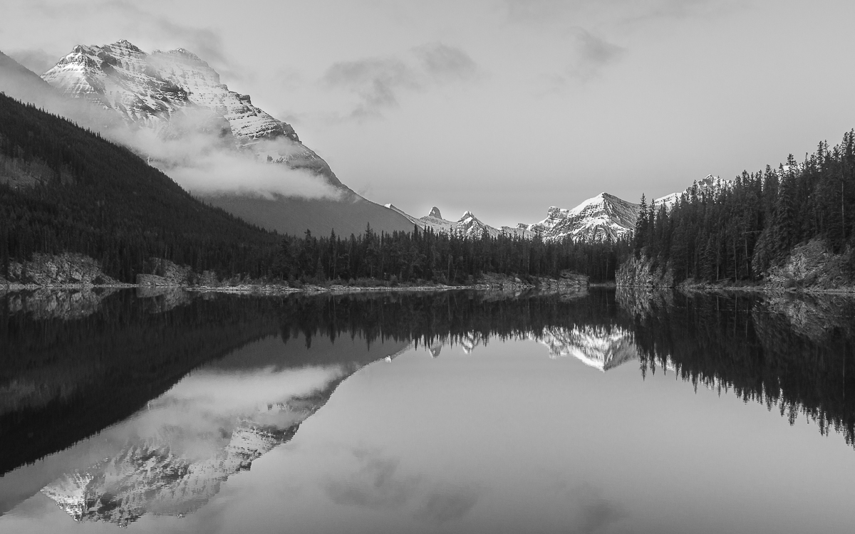
It's been a while since I posted here, mainly because I have made some changes in my life which involved moving from Alberta back to my native Ontario a few months ago. Although I will miss the mountains and the closer proximity to the American west it is still good to be home and I am looking forward to exploring this region and the eastern part of Canada and the U.S, in the near future This an image I took early one morning back in 2012 of Horseshoe lake in Jasper NP. I was never satisfied with the processing but I took another stab at it recently and am more pleased with the results. Thanks for looking.
D7000
18-200
f/13
1/80
22mm
iso400

Comments
10 commentsThis is a nice, pleasing scene. I like the Kaleidoscope-like effects of the rock faces where they meet the water.
I think the color version works a bit better for this image since there is some color contrast in the pine trees. The B&W has little tonal contrast in the trees, so they are blocked up.
I think the B&W has the potential to be the stronger image, but it needs stronger highlights and more clarity. If I were editing in Lightroom, I'd adjust the greens, yellows, and oranges to get better tonal contrast in the trees and then add a pretty good dose of clarity to make it pop. I like to add clarity and often decrease contrast in B&W pictures to get the look I like.
Nick Bristol
Lone Rock, WI
I'm torn between the two versions, but ultimately I prefer the color. B&W is great for showing form, shape, graphics and of course light and contrasts, which this image has plenty of. But some about the color version, including the almost pale colors, which for me work beautifully with this image. Of course the symmetry and mirrored reflection aren't hurting either. Just a terrific image any way I look at it.
Just one small wish - and that's for a tiny bit more breathing room at the bottom, but not a big deal.
Thanks for posting,
Lon
Lon, there was a little more "breathing room" available as you put it, so I included it in the repost.
Brad thanks for the suggestions. My normal approach would be to bump up the clarity as you suggested but in this instance it just wasn't working. For starters, the trees around the pond were very scraggly looking and increasing the clarity emphasized that even more which created a lot of dissonance with the rest of the scene. This was counter to my objective which was to create a feeling of serenity so I lowered the contrast in that area to try to get a softer look.
The last repost looks great, and I appreciate the quite nature of this scene. It is a great image to sit back at and enjoy after a busy day to calm the soul. The color version wins me over as the subtle tones really bring out the best in this image for myself.
ML