Nature Photographers Network
This is the preserved archive of the original Nature Photographers Network. The community continues at naturephotographers.network.
Zabriske Dawn + Repost
‹ PreviousLandscape GalleryNext ›

Zabriske Dawn + Repost

by Bill Fach

Gallery: LandscapePosted February 15, 2016261 views17 comments
Sony A77
Sony 70-400G @ 210mm, CPL
ISO 50, 1/6 @ f11
Death Valley NP

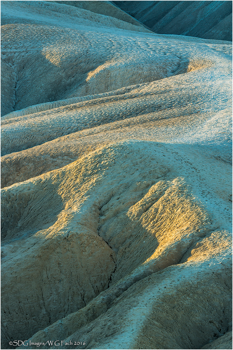
One of my favorite photography techniques is using my long zoom to extract comps from dunes, rock faces and in this case badlands at Zabriske Point. I was fascinated by the colors of the land forms as the just risen sun struck some facets and left others in shadow under a bright blue sky. While I did punch up the blue a tiny bit this is pretty much the way things looked in fast changing conditions. All comments welcome. >=))>

Comments

17 comments
Comment posted by Mark Seaver on February 16, 2016 at 9:35 AM
Bill, the lighting, subject, and colors here had me thinking "Tony Kuyper".  The mix of warm yellows and blue shadows is quite eye catching and I like how you've transitioned from a well lit fore/middle ground to scattered touches of light in the "distance".  That creates a fine sense of depth and pattern in this view.
Registered on January 23, 2011, 1103 Posts, 17270 Comments
Comment posted by Dave Dillemuth on February 16, 2016 at 10:47 AM
Bill,
Engaging landscape isolation. Nice textures combined with a pleasing mix of cool and warm tones. Just fine as rendered but I think I'd be tempted to try bumping up the contrast a bit.
Registered on December 10, 2015, 104 Posts, 1112 Comments
Comment posted by Roel Wijtmans on February 16, 2016 at 11:36 AM
Wow, that looks really cyan! I do like the cyan tint though, gives some nice extra atmosphere. Comp and processing looks spot on to me. Nice!
Registered on September 30, 2012, 116 Posts, 2257 Comments
Comment posted by Mark Metternich on February 16, 2016 at 12:13 PM
Nice job Bill.  I like these types of shots too. I think the saturation is fine but the color balance toward Cyan is a bit strong. I might play with the color balance a bit more.  
Registered on June 19, 2009, 276 Posts, 6240 Comments
Comment posted by Nick Bristol on February 16, 2016 at 1:12 PM
Bill, This looks really cool and I love the composition you came up with. The light and shadows look great and really add interest to the shapes. It does look like the cyan is a little strong but I do enjoy the look. Nice capture!

Nick Bristol
Lone Rock, WI
Registered on February 1, 2004, 752 Posts, 14140 Comments
Comment posted by Brad Strong on February 16, 2016 at 1:41 PM
This is pretty interesting as is. I like the shapes and lines. Since there's not a lot of color anyway, I'd suggest black and white and darken in the shadows some. 
Registered on October 1, 2012, 43 Posts, 302 Comments
Comment posted by Bill Fach on February 16, 2016 at 3:33 PM
Toned down the cyan. Better?
Registered on November 1, 2003, 1805 Posts, 26981 Comments
Comment posted by Ed Lowe on February 16, 2016 at 3:37 PM
I think you nailed it with the cyan reduction in the repost, Bill. The side lighting is fantastic; perfect for bringing out all those wonderful textures and details. Nicely done.

Ed
Registered on February 7, 2004, 414 Posts, 7115 Comments
Comment posted by Harley Goldman on February 16, 2016 at 5:43 PM
The repost is working for me. Nice capture of the lines and shadows of the iconic spot.
Registered on November 19, 2003, 586 Posts, 11271 Comments
Comment posted by David Schoen on February 16, 2016 at 7:22 PM
I think you're still able to capture some cool tones in the image by reducing the cyan as much as you have. The repost works for me a lot better. No harm in trying something as you did with the cyan.
Registered on November 6, 2006, 1213 Posts, 4587 Comments
Comment posted by Igor Doncov on February 16, 2016 at 10:19 PM
Glad you included the dark upper right corner. I think it improves the composition.  
Registered on November 22, 2014, 189 Posts, 2733 Comments
Comment posted by Roel Wijtmans on February 17, 2016 at 11:05 AM
Yes, repo looks better!
Registered on September 30, 2012, 116 Posts, 2257 Comments
Comment posted by Lon Overacker on February 17, 2016 at 4:34 PM
Bill,

Great job isolating the features and form with your long lens - a great and fun technique.  That first light gracing the scene adds so much to this.  Excellent!

Regarding the cyan, yeah, I was going to comment on the original.  The repost looks great and actually I think as a result you have brought out some subtle pastels, no longer dominated by the cyan.  It made me think though, that perhaps through some masking and painting you could actually bring back some cyan in a few areas - not as much as before as it was too much and too global in the image, but I think you could bring a little back in - say along the top portion pathway and maybe selective throughout.  Just enough to add to the soft pastels of the pinks and warm tones of the repost.  Just a thought.

Well seen!

Lon
Registered on November 24, 2006, 521 Posts, 19147 Comments
Comment posted by Mark Seaver on February 17, 2016 at 4:41 PM
Bill, for me, the two versions tell very different stories.  The extra warmth in the repost make it more openly inviting and conveys a pleasant mood.  All the blue/cyan in the original make for a very mysterious feeling that I find inviting in a different way.
Registered on January 23, 2011, 1103 Posts, 17270 Comments
Comment posted by Basil Greber on February 18, 2016 at 3:49 AM
Very nice! I agree about Death Valley being a fantastic place for this kind of composition! Well done!
 
Registered on November 8, 2005, 219 Posts, 1340 Comments
Comment posted by Bill Chambers on February 18, 2016 at 1:14 PM
The larger hi-res version is sweet.  I agree it's a bit heavy on the cyan but I like it better than the repost.  On my work monitor (uncalibrated) the repost takes out too much cyan, but I love the composition and overall look.. 
Registered on April 10, 2005, 753 Posts, 21216 Comments
Comment posted by John Williams on February 24, 2016 at 6:38 PM
Wonderful shot Bill. I agree with Bill C.; something between the two should be just right.
Registered on September 6, 2007, 221 Posts, 5985 Comments