Gallery: LandscapePosted February 10, 2016280 views17 comments
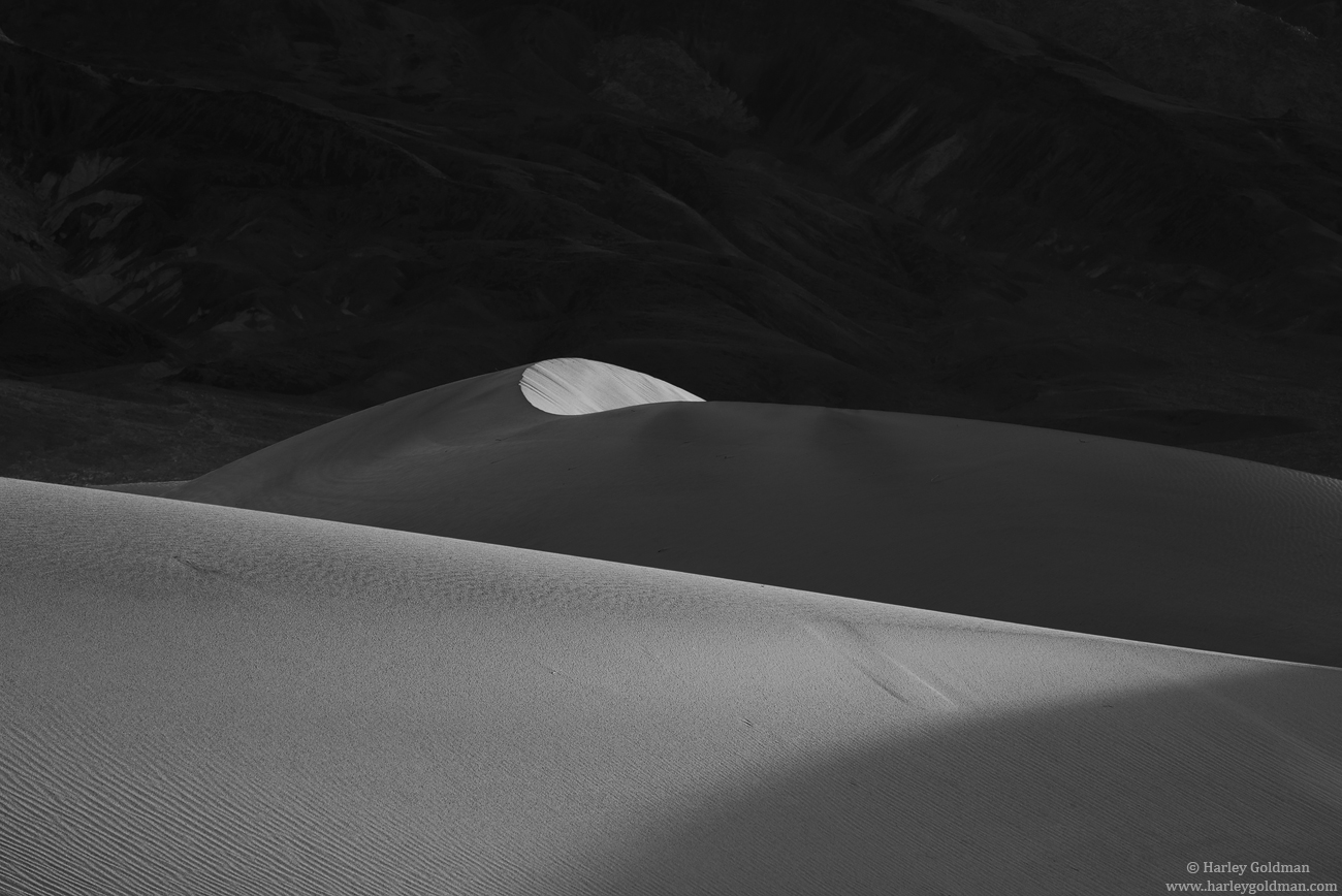
Another one from Death Valley a couple of weeks ago.
D810, 70-200mm
Comments, critiques and suggestions are always welcome.
Comments
17 comments
Comment posted by Pete Bengeyfield on February 10, 2016 at 5:59 PM
I like the FG shadow being part of the light/dark theme.
Did you try it as ap pano cropped from the top? It's a different picture, but might be as good.
Registered on December 2, 2003, 1247 Posts, 3439 Comments
Comment posted by Vance Gese on February 10, 2016 at 6:43 PM
Love the bold forms and lines of your image, Harley, as well as the textures, especially the foreground textures. The hint of detail in the background mountains in shadow is just right. Elegant art in my opinion.
Registered on November 13, 2008, 298 Posts, 6629 Comments
Comment posted by Lon Overacker on February 10, 2016 at 7:03 PM
This is fabulous Harley! I too thought about a pano crop, but I like the bg too much to get rid of any of it. Plus, I like how the curved face that is lit up is spaced in the frame - if that makes sense.
The only suggestion I have would be to boost the light values to create a little more contrast in the dunes - both the lower dune, partially shaded, as well as the primary "curvy" part. But I wouldn't change anything with the bg mountain!
Love this one!
Registered on November 24, 2006, 521 Posts, 19147 Comments
Comment posted by Dave Dillemuth on February 10, 2016 at 10:06 PM
Harley,
Visually a very strong image. This is a great choice for B&W rendering. I too really like that hint of detail in the background mountain. No nits.
Registered on December 10, 2015, 104 Posts, 1112 Comments
Comment posted by Tom Falley on February 10, 2016 at 10:36 PM
Simple is good!
Registered on November 21, 2014, 189 Posts, 454 Comments
Comment posted by Eva McDermott on February 10, 2016 at 11:42 PM
Simple but full of visual impact Harley. I like this a lot.
Registered on January 4, 2009, 1015 Posts, 13229 Comments
Comment posted by Sairam Sundaresan on February 11, 2016 at 11:16 AM
Love B&W dune shots, and this one is really beautiful, Harley. I would try to crop in from the top, or warp the Dune bit so that it occupies greater height in the frame.
Registered on March 14, 2013, 100 Posts, 643 Comments
Comment posted by Roel Wijtmans on February 11, 2016 at 12:51 PM
This definitely needs to be seen large to appreciate all the details! Excellent job, the simplicity is great, and the contrast is spot on. I like the dark part with the right amount of details.
Registered on September 30, 2012, 116 Posts, 2257 Comments
Comment posted by Ed Lowe on February 11, 2016 at 1:51 PM
Sweet B&W, Harley. Great lines and textures in the dunes and you have just the right amount of detail in that BG mountain.
Ed
Registered on February 7, 2004, 414 Posts, 7115 Comments
Comment posted by Alberto Patiño on February 11, 2016 at 2:18 PM
Lovely light and composition, Harley. I would not touch a thing!
Registered on December 2, 2014, 278 Posts, 1736 Comments
Comment posted by Preston Birdwell on February 11, 2016 at 6:00 PM
I love this composition. The large version really shows off the details. I do agree with Lon's suggestion: "...to boost the light values to create a little more contrast in the dunes - both the lower dune, partially shaded, as well as the primary "curvy" part."
Well seen, and nicely done, sir!
--P
Registered on November 1, 2003, 471 Posts, 5188 Comments
Comment posted by Michael Lowe on February 11, 2016 at 8:56 PM
I really like this. The hint of shapes in the Bg adds to an excellent image
Registered on February 11, 2004, 777 Posts, 5252 Comments
Comment posted by Paul Breitkreuz on February 11, 2016 at 9:27 PM
Harley.....IMVHO......your best dune shot ever.....period.....
Registered on February 25, 2006, 525 Posts, 8448 Comments
Comment posted by Igor Doncov on February 11, 2016 at 11:15 PM
I too like all that dark at the top. The first commenter used the right word for this image - elegant. It has a classy, distinguished look to it.
Registered on November 22, 2014, 189 Posts, 2733 Comments
Comment posted by Brad Strong on February 12, 2016 at 7:26 AM
Absolutely love it! Don't change anything. When I grow up, I want to take and make pictures like you. You obviously have the skill of seeing figured out and have the technical skills to execute your vision.
Registered on October 1, 2012, 43 Posts, 302 Comments
Comment posted by Bill Fach on February 15, 2016 at 10:56 PM
Harley: I must tell you I was OK with the gallery shot but not overly impressed. However, the larger view is just superb and brings out the details the BG needs to be compelling. Beautiful scene superbly capture. >=))>
Registered on November 1, 2003, 1805 Posts, 26981 Comments
Comment posted by Mark Metternich on February 16, 2016 at 11:50 AM
Even though B+W's never seem to get the same views as color, this is one of my favorites on this page right now. I'm wondering how a 16:9 crop off the top might look as another alternative. Nice image.
Registered on June 19, 2009, 276 Posts, 6240 Comments

Comments
17 commentsDid you try it as ap pano cropped from the top? It's a different picture, but might be as good.
The only suggestion I have would be to boost the light values to create a little more contrast in the dunes - both the lower dune, partially shaded, as well as the primary "curvy" part. But I wouldn't change anything with the bg mountain!
Love this one!
Visually a very strong image. This is a great choice for B&W rendering. I too really like that hint of detail in the background mountain. No nits.
Ed
Well seen, and nicely done, sir!
--P