Gallery: LandscapePosted January 31, 2016344 views12 comments
Click on the image above for a larger view, or the expansion symbol for an even larger detail view. PLEASE SEE THE REPOST IN A COMMENT BELOW.
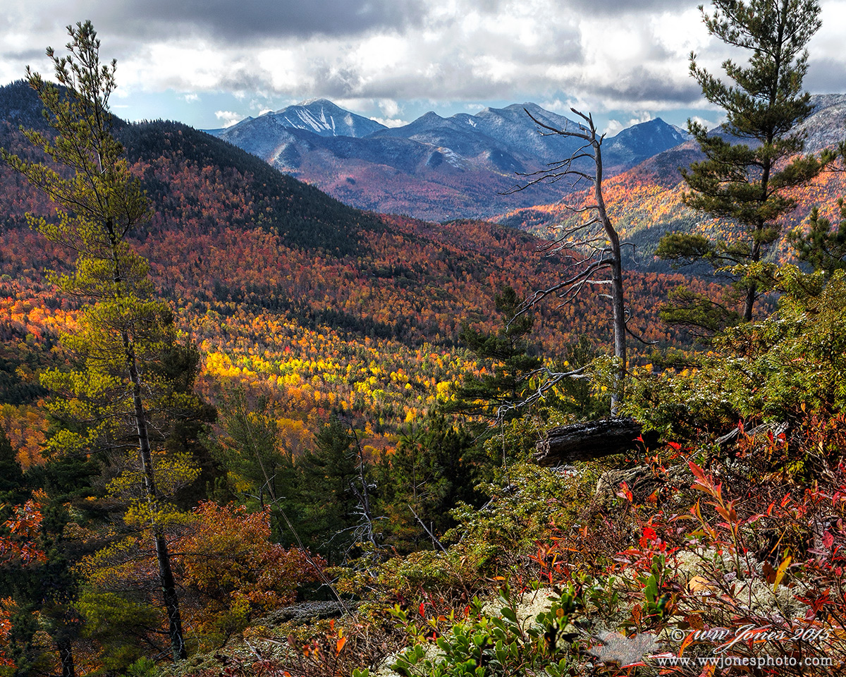
TITLE: Sunshine in Keene Valley Sunrise view from Baxter Mt. in the Adirondack Forest Preserve. I Posted a vertical version of this view last month that filled the bottom half of the frame with the intricate foreground. In that version, I was concentrating on the close view of the dusting of snow because I climbed the mountain looking for snow on the autumn leaves. In retrospect, I think the pre-visualized idea of catching foreground snow distracted me from the longer view. (The snow on the foreground leaves is barely visible. The more conspicuous white stuff in the extreme foreground in reindeer lichen.) This view concentrates on the distant view and the streaks of warm morning light breaking through holes in the snow clouds.
Comparing this simpler composition with the vertical version, which do you think captures a more pleasing view from this mountain?
THANKS
Canon 24-105 mm.
1/30 sec. @ f/11; ISO 320; Circ. Pol.
Three exposures blended for depth of field.
Comments
12 comments
Comment posted by Harley Goldman on January 31, 2016 at 10:09 PM
Beautiful array of color in a beautiful scene. It looks a little over-sharp on my monitor, but minor stuff.
Registered on November 19, 2003, 586 Posts, 11271 Comments
Comment posted by Richard Teller on January 31, 2016 at 10:42 PM
Another beautiful presentation of the mountains of the northeast. I really like the color and composition.
Registered on August 23, 2010, 1162 Posts, 6692 Comments
Comment posted by D.A. Edwards on February 1, 2016 at 2:58 PM
While they are both outstanding images, I think I prefer the vertical comp, Wayne. On both versions I would try to address some of the blown-out looking parts of the clouds if you've got some data in the raw version.
Registered on October 8, 2014, 226 Posts, 1187 Comments
Comment posted by Wayne Jones on February 1, 2016 at 10:42 PM
Thanks guys! Even though we no longer get 20+ comments, there is still so much to be gained by posting and commenting on NPN!
Here's a REPOST to address the points Harley and Dave made: SORRY I can't upload the larger version. Still getting that annoying error message for files over 500KB.
OVERSHARP? Is this repost any better? I am afraid I just don't get the concept of "oversharp" unless there are halos or some other artifacts. Maybe it's my old eyes and trifocals, but when I put my face close to the monitor, I want so clearly see individual snowflakes instead of little fuzzy spots. Not sure if this one is any better because I don't know what to look for.
BLOWN OUT CLOUDS: I am trying to get over a recent habit of trying to pull too much detail out of shadows and highlights, which seems to result in some dull-looking landscapes. In my attempts to get back to more lively contrast, I see that I am overdoing the the highlights in post. That's odd, because I am kind of paranoid about bracketing when making exposures. Thanks to Dave for catching that.
Registered on April 18, 2007, 953 Posts, 6435 Comments
Comment posted by Ed Lowe on February 2, 2016 at 1:59 PM
I think I prefer this version better, Wayne. I am not sure as to an explanation why other than I seem to be gravitating to the landscape instead of verticals lately. This still has all the drama with the clouds and the sweet light in all the right places along with those wonderful details in the FG.
Ed.
Registered on February 7, 2004, 414 Posts, 7115 Comments
Comment posted by D.A. Edwards on February 2, 2016 at 2:20 PM
Huge improvement, Wayne, on those clouds, made much more dramatic. I'm not getting the crunchy look typical of over-sharpening so I'd say that the sharpening is pretty optimal. My personal preference is for ever so slightly less sharpened images for the web but I do think that your level of sharpening is probably appropriate for large prints. Everyone's taste will vary on this I imagine.
Registered on October 8, 2014, 226 Posts, 1187 Comments
Comment posted by Dave Dillemuth on February 2, 2016 at 3:56 PM
Wayne,
Repost looks great. A fine, very pretty, well-composed image. I think I still slightly prefer your vertical comp.
Registered on December 10, 2015, 104 Posts, 1112 Comments
Comment posted by gary phillips on February 3, 2016 at 1:52 AM
I envy the fall colors available to you, Wayne, and love seeing every one of them. I like the detail I'm seeing and have been experimenting with more stacks in landscapes. I think I like this version better than the vertical. I can't really say for sure why, perhaps the foreground becomes the story in state of the long view . Nice work.
Registered on October 24, 2013, 185 Posts, 4136 Comments
Comment posted by Igor Doncov on February 3, 2016 at 3:21 AM
I think the vertical may be a stronger composition. The snag improves the vertical como but seems obtrusive in the horizontal. It seems to be in the way more. In the vertical it's more of a point of focus.
Registered on November 22, 2014, 189 Posts, 2733 Comments
Comment posted by Lon Overacker on February 6, 2016 at 11:29 AM
A little late to the part Wayne, but still wanted to chime in. I remember the vertical version now. Tough choice, they are both beautiful landscapes. One ever so small nit for me is the saturation level in the mid-range slope with the yellow trees - but also, there is one red tree that is pretty loud. Yeah, it's tiny in the frame, but once my eye found it, I keep looking back at it. Very nitpicky. ;-)
As far as the H vs. V, they of course are both beautiful, but your question is which one is "a more pleasing view." This reminded me when I used to teach composition in some beginning photography classes, oh, about 25 years ago. Clearly, you're not a beginner, but your question really relates to what I wrote back then:
Try shooting both horizontal and vertical. Many subjects may be more appropriately shown in a vertical format such as tall trees, buildings, sailboats with tall masts in a marina, or even people. Conversely, rolling green hills, pastoral, peaceful scenes or grand scenic's might suggest a horizontal format. In general, the vertical format emphasizes strength, power and is a good choice for near/far compositions. The horizontal format is generally safe for broad views and sweeping landscapes.
So, for me, the more pleasing view is the horizontal version because the format fits so very well with a grand and broad scenic landscape and view. The vertical is the perfect example of the near/far composition, great depth, and a very strong and dynamic landscape. So, one is more gentle, peaceful and pleasing, the other strong, dynamic and with great depth.
Glad you asked now?
Registered on November 24, 2006, 521 Posts, 19147 Comments
Comment posted by Roel Wijtmans on February 6, 2016 at 11:55 AM
This would be my comp of choice, works better for me than the vertical. My only nit were the highlights in the clouds (which I think is the biggest curse of digital photography), and I like the way you treated them in you repo. Nice autumn colors!
Registered on September 30, 2012, 116 Posts, 2257 Comments
Comment posted by Mark Seaver on February 7, 2016 at 2:18 PM
Wayne, haven't you heard that it's winter?.... This is a lovely scene with the outstanding fall colors that make "New England" such a fall destination. In comparing this view with the vertical, I can't make a choice. Both have lots to offer, with this version feeling more peaceful while the vertical has such a great near-far comp. If you twist my arm, I think I'll choose the vertical as ever so slightly better than the horizontal, but both are truly fine views.
Registered on January 23, 2011, 1103 Posts, 17270 Comments

Comments
12 commentsHere's a REPOST to address the points Harley and Dave made: SORRY I can't upload the larger version. Still getting that annoying error message for files over 500KB.
OVERSHARP? Is this repost any better? I am afraid I just don't get the concept of "oversharp" unless there are halos or some other artifacts. Maybe it's my old eyes and trifocals, but when I put my face close to the monitor, I want so clearly see individual snowflakes instead of little fuzzy spots. Not sure if this one is any better because I don't know what to look for.
BLOWN OUT CLOUDS: I am trying to get over a recent habit of trying to pull too much detail out of shadows and highlights, which seems to result in some dull-looking landscapes. In my attempts to get back to more lively contrast, I see that I am overdoing the the highlights in post. That's odd, because I am kind of paranoid about bracketing when making exposures. Thanks to Dave for catching that.
Ed.
Repost looks great. A fine, very pretty, well-composed image. I think I still slightly prefer your vertical comp.
As far as the H vs. V, they of course are both beautiful, but your question is which one is "a more pleasing view." This reminded me when I used to teach composition in some beginning photography classes, oh, about 25 years ago. Clearly, you're not a beginner, but your question really relates to what I wrote back then: So, for me, the more pleasing view is the horizontal version because the format fits so very well with a grand and broad scenic landscape and view. The vertical is the perfect example of the near/far composition, great depth, and a very strong and dynamic landscape. So, one is more gentle, peaceful and pleasing, the other strong, dynamic and with great depth.
Glad you asked now?