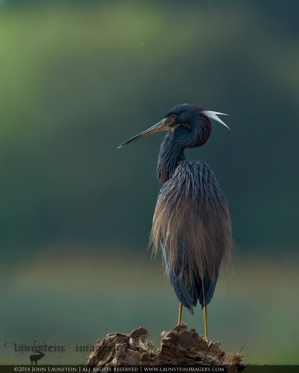
Hi again, everyone! Back with a more...acceptable(?) comp on my Tricolored Heron portrait. Many thanks for the consistent feedback on my outside-of-the-rules composition I posted earlier this week
here.
I still left more negative space on top than perhaps some might advise, but I personally really prefer the feel of the image with the darker band of tones at the top...it just adds a bit of intangible mood for me. I welcome your suggestions in this regard, though!
As per my notes on the original post, the only way this scene differs from the RAW file is the top of an intruding branch has been removed from the bottom left. I used the history brush very carefully around the cloned branch to bring the actual tones of the scene in that area back in and then cloned those pixels back overtop of the branch area, so this is virtually identical to the actual scene less that pesky (but natural and beautiful) ;) branch. Because I did end up retouching the file, I also removed three brighter OOF bugs/fluffs from the background, but left the other very OOF items because it enhanced the natural feel for me, and as you know, wetlands are full of floating bugs and bio bits.
As per my earlier comments, I intentionally went a bit darker than might be considered optimal or "normal" here as the heron was backlit and the scene was dark to my eye through the viewfinder. I think this retains the mood and feel of the moment.
Once again, many, many thanks for your time and feedback on this one! Please do look at the detailed version for best quality.
---------------------
Nikon D7100
Nikkor AF-S 500mm f/4D IF-ED
ISO 400
1/2000sec @ f/5
-1 stop underexposed from meter
Mounted on FEISOL CT-3372 Elite tripod with Acratech GV2 ballhead and Wimberley Sidekick
Full-frame width, cropped from bottom to 4:5 ratio
Tree branch cloned from bottom left, three OOF bugs/fluffs cloned from background

Comments
6 commentsThe head and neck of the bird almost matches the BG in tone so I would carefully work on those regions of the heron to make it show up a little better. The larger version shows better than the smaller view. Other than that, I like the comp and rich colors. Well done