Nature Photographers Network
This is the preserved archive of the original Nature Photographers Network. The community continues at naturephotographers.network.
Not Manly
‹ PreviousLandscape GalleryNext ›

Not Manly

by D.A. Edwards

Gallery: LandscapePosted January 25, 2016180 views10 comments
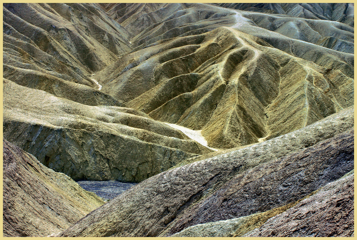
Usually when I go by Zabriskie Point in DV, it's the wrong time of day and crowded especially up at the vista point. However I find the gullies to the south of the parking area more fertile compositionally than the standard image looking west past Manly Beacon towards the Panamints. Earlier I posted an image of those hills/gullies and here is another. I liked how 3D this appears, the spots of whites at the bottom of one of the gullies and the triangular blue spot of wash bottom. I took a bit of liberty with the color and also cloned away some of the more obvious trails on some of the ridges which were a bit distracting.

f/10, 1/200 sec, 36mm, handheld, mid-day.

Comments

10 comments
Comment posted by Dave Dillemuth on January 25, 2016 at 9:00 PM
Dave,
Interesting study of eroded hills. ​You managed the light very well considering it was mid-day. I might suggest burning down the bright wash in the center which looks a little hot, at least on my monitor.
Registered on December 10, 2015, 104 Posts, 1112 Comments
Comment posted by Lon Overacker on January 25, 2016 at 10:25 PM
Dave,

Great job extracting a comp from this area.  Yeah, Zabrisky and Manly have been DTD (done to death,) but one of the great things about DV, is that there is plenty of room for different looks and perspectives.

You may have taken some "liberty" with the colors, but you certainly didn't take it beyond believable.  And I think you did well to not go over, and the colors are also reflective of the light and time of day, so good job with that.

I agree with Dave D. about the bright spot in the wash.  It's central to the image and my eye just can't ignore it.  No problem with the bottom triangle area.

It sure is a fascinating and desolate place, and I think you've captured that very well here.

Lon
Registered on November 24, 2006, 521 Posts, 19147 Comments
Comment posted by Harley Goldman on January 25, 2016 at 10:35 PM
Real nice take on the landscape. I would agree about the gully and the colors are a bit enthusiastic for my tastes, but real nice image. You did not want to mingle with 75 of your best photo friends at Z-Point??? 
Registered on November 19, 2003, 586 Posts, 11271 Comments
Comment posted by Alberto Patiño on January 26, 2016 at 12:24 AM
Tough light conditions, no doubt. I do find the color somewhat harsh, too green, and at the same time with some magenta tints in the foreground. I think I would have preferred something closer to the original, but that is just a preference and it is all in the artistic latitude !!
Registered on December 2, 2014, 278 Posts, 1736 Comments
Comment posted by Aaron Feinberg on January 26, 2016 at 6:48 AM
Always so many textures and lines to play with in that area.  Nicely seen.
aF
Registered on October 26, 2009, 399 Posts, 2789 Comments
Comment posted by scott lanz on January 26, 2016 at 9:59 AM
It's a dynamic landscape, which is why it's DTD (Thanks, Lon; I like that abbreviation!). First I noticed about your version, Dave, is the green tint. Good or bad, intended or unintended, it certainly makes this image different from the many others images of this area, which is good. 
Registered on November 14, 2003, 840 Posts, 12902 Comments
Comment posted by Roel Wijtmans on January 26, 2016 at 11:53 AM
I agree that this has a wonderful 3D feeling, very much aided by the compressed comp. The bright white spot is a tad too bright for me, I think I would burn that one down a bit.
Registered on September 30, 2012, 116 Posts, 2257 Comments
Comment posted by Igor Doncov on January 26, 2016 at 5:23 PM
This really needs to be seen LARGE to fully appreciate it. It's a great composition and this can be easily seen but the detail in the foreground slope(s) is what really makes it for me. That texture is amazing and provides a richness that dominates the landscape.
Regarding the coloring, my initial thought was that Zabriskie Point is flamboyant enough as it is without any further enhancement. The far slopes as I remember are a rich yellow (in the morning) and I'm not sure I would have changed that. Having said that the color composition overall is very pleasing and not over the top. Wonderful image. Thanks for sharing.
Registered on November 22, 2014, 189 Posts, 2733 Comments
Comment posted by Mark Seaver on January 27, 2016 at 10:02 AM
Dave, this is a landscape to get lost in.  Love the combination of real and abstract with all of the ridges piled on top of each other and fading into the distance.  Never having been here, the colors look fine to me.
Registered on January 23, 2011, 1103 Posts, 17270 Comments
Comment posted by Albert Darmo on January 27, 2016 at 6:33 PM
Hi  Davecrying  Agree with the others,  this is  over the top. frownblushfrown   the large  image must  be seenlaugh.   love the amazing  detail and beautiful color....

Albert Darmo
Canada
Registered on November 25, 2008, 1386 Posts, 11978 Comments