Nature Photographers Network
This is the preserved archive of the original Nature Photographers Network. The community continues at naturephotographers.network.
TechniColor Sandstone
‹ PreviousLandscape GalleryNext ›

TechniColor Sandstone

by Ryan Shain

Gallery: LandscapePosted January 19, 2016110 views9 comments
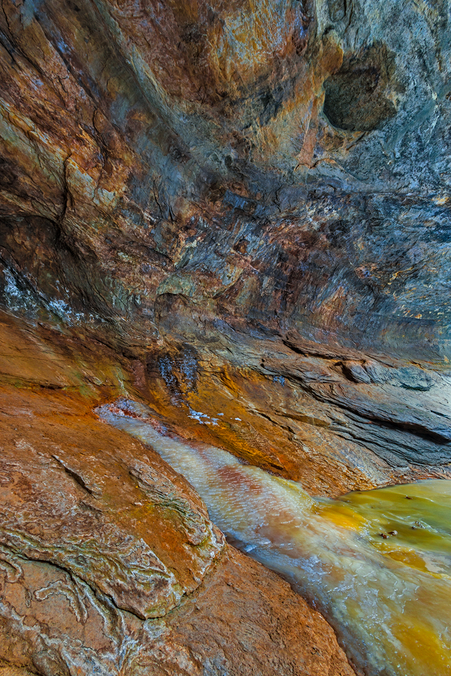
This image was captured last winter in Matthiessen State Park on a very cold February morning. I believe it was -6 degrees, and there was some moisture in the air that was turning instantly into some kind of snow crystals. Our eye lashes and my beard was frosted over, well while it was exposed. I have been to this park often, and I was shooting from the frozen over pond that usually makes this angle impossible to shoot. I have never seen the sandstone in this area look quite like it did on this morning, and I really enjoy how vibrant all the colors were in the sandstone. I know sandstone in quite porous compared to other rocks, and maybe this is why the colors were so vibrant along with the cold temps and moisture present in the air.

I really have no idea why, lol, but it sure did look awesome to be around. I am debating about bringing down the blue a bit more in the rocks up top on the far right.

Thank you in advance for any thoughts y'all may have, and all ideas are welcome and appreciated.

canon 70d, 10-22, f 16, 1/15th sec, ISO 100, tripod, and maybe a circ polarizer, hmm i forget

Comments

9 comments
Comment posted by Harry Lichtman on January 19, 2016 at 7:40 PM
Very cool abstract, colors are really beautiful.  The blues are a little strong, but considering the vibrance of the other colors they do not seem out of place.  Beautiful abstract.
Registered on September 17, 2010, 304 Posts, 3507 Comments
Comment posted by gary phillips on January 19, 2016 at 9:16 PM
What a cool spot, except of course, for the temperature. Brrrrrrrr.  Love the color and motion in this abstract, Ryan.  I could see taming the blue a little, but it is very, very nice.
Registered on October 24, 2013, 185 Posts, 4136 Comments
Comment posted by Alberto Patiño on January 19, 2016 at 10:46 PM
Great image, with several possible interpretations. I can see it as an abstract, or as a pond at the bottom of a shaft, or as a pond next to a wall (correct interpretation?). I would agree with desaturating the blues a bit - other than that I would not touch a thing.
Registered on December 2, 2014, 278 Posts, 1736 Comments
Comment posted by Lon Overacker on January 20, 2016 at 1:13 AM
Ryan,

This is fascinating - and the colors are varied and terrific. Of course I wasn't there so it's hard to say about the blue saturation, but given a few spots through the middle up in to the ULC, those blues do appear that they could be tamed a little.

I said fascinating because I'm a bit disorientated with this with no context or clues for orientation.  The curved, cave-like wall, the upward flow of the frozen "stream" and the colors of the frozen pond - which looks like it could be toxic waste all serve to add to the mystery of this  But I'm really enjoying the variety of color, the textures and details throughout.  What a wonderful and intriguing display of nature.

Beautifully captured!

Lon
Registered on November 24, 2006, 521 Posts, 19147 Comments
Comment posted by Roel Wijtmans on January 20, 2016 at 11:06 AM
The leading line in the rock works very well, but, as you mentioned, the colors are what make this photo. They are splendid! I agree with you on turning down the blue a bit though, they look a bit unnatural. The rest looks great though!
Registered on September 30, 2012, 116 Posts, 2257 Comments
Comment posted by Dave Dillemuth on January 20, 2016 at 11:46 AM
Ryan,
Very nice rock abstract. Really dig this color palate. As others mentioned you could experiment with dialing back the blues but in an image like this it really comes down to personal preference.
Registered on December 10, 2015, 104 Posts, 1112 Comments
Comment posted by Nick Bristol on January 21, 2016 at 7:43 PM
Ryan, What a cool shot! The colors and textures on my monitor are good and this comp is really interesting to look at. I like it as is and it makes me think about how wonderful nature is. Nick

 
Registered on February 1, 2004, 752 Posts, 14140 Comments
Comment posted by Chris Chamberlain on January 23, 2016 at 3:21 PM
A nice abstract with really amazing colors. I think with abstracts, there is more room for artistic expression. So if the color is a little intense, I think it works.
Registered on March 13, 2007, 500 Posts, 8365 Comments
Comment posted by Mark Seaver on January 27, 2016 at 10:13 AM
A finely seen abstract, Ryan.  Even though I "see" the shape of this side wall, it's the colors and textures that stand out.  Particularly considering the abstract nature of this view, I don't see the blue as excessive.
Registered on January 23, 2011, 1103 Posts, 17270 Comments