Gallery: LandscapePosted January 19, 2016234 views18 comments
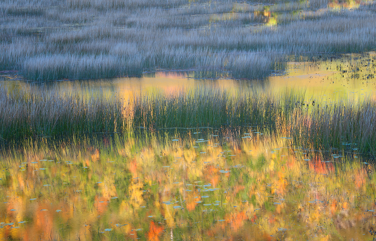
This glacial pond is in shade while the mountain to the west is illuminated by the rising sun.
Acadia National Park, ME
Comments
18 comments
Comment posted by Ryan Shain on January 19, 2016 at 7:22 PM
Hi Ed,
This image has some beautiful layers of color and texture. The image starts off with a smashingly good reflection, and moves into very nice green reeds, more reflections and some sweet brown reed with some wonderful texture. Oh Yeah, a hnit more reflection to finish off a wonderful work in photography.
Love it!!!
Registered on February 20, 2007, 226 Posts, 4571 Comments
Comment posted by Harry Lichtman on January 19, 2016 at 7:46 PM
Sweet! The cool and warm colors work so well here. Despite the nice colors, I think the grasses are so eye catching. I find the bright patches of color in the URC are a little distracting, so I might crop out. Otherwise near perfection.
Registered on September 17, 2010, 304 Posts, 3507 Comments
Comment posted by gary phillips on January 19, 2016 at 9:10 PM
I with Harry here, Michael, near perfection for sure. Love the blue grasses and the reflected color is to die for. The only small suggestion I have is to clone the one white spot in the bottom center in the reflection. Beautiful in every way.
Registered on October 24, 2013, 185 Posts, 4136 Comments
Comment posted by Chris Chamberlain on January 19, 2016 at 10:18 PM
Oh my, this is fantastic! The colors and the light vs shadow comp are amazing.
Registered on March 13, 2007, 500 Posts, 8365 Comments
Comment posted by Marylynne Diggs on January 19, 2016 at 11:48 PM
This is gorgeous. I love the impressionistic style. For some reason, despite its abstract expressionistic content, I feel like it needs a slight clockwise rotation. Maybe I'm just nuts? I hope someone else chimes in on this.
ML
Registered on December 14, 2010, 122 Posts, 1034 Comments
Comment posted by John Launstein on January 20, 2016 at 12:22 AM
Michael: Just discovered your work and am seriously impressed and inspired! This is simply wonderful...I hate taking the easy way out but I honestly like everything about this image as presented.
Registered on April 5, 2011, 223 Posts, 1193 Comments
Comment posted by Lon Overacker on January 20, 2016 at 1:00 AM
Michael,
This is striking and spectacular. The abstract nature of the bottom reflection is wonderful. Add the reeds and layers and this adds up to a gorgeous image. Subtle, but I really like how the middle layer of color and reflection and more muted and less defined than the foreground reflection.
Impressionistic is a good description and agree with Marylynne. But I myself don't see any rotation issues; there is no horizon reference and I think just the layout and presentation of groups of grasses show a diagonal, but I don't see a need to rotate this.
I do agree with the clone of the small white vertical at the bottom. Also, I'm wondering how a crop off the top to remove the bright reflections up there would look. The good news, you have a strikingly beautiful image. Wish it were mine.
Lon
Registered on November 24, 2006, 521 Posts, 19147 Comments
Comment posted by Roel Wijtmans on January 20, 2016 at 11:03 AM
This photo is playing tricks with my brain, and in a good way. I like the juxtaposition of the monotone grasses with the colorful, impressionistic reflection. Works for me as it is!
Registered on September 30, 2012, 116 Posts, 2257 Comments
Comment posted by Dave Dillemuth on January 20, 2016 at 11:41 AM
Michael,
Really beautiful image. Love the colors and textures. Agree with other comments that this has an impressionistic feel. Great work.
Registered on December 10, 2015, 104 Posts, 1112 Comments
Comment posted by Bill Chambers on January 20, 2016 at 12:25 PM
Really special Michael. The combination of warm and cool colors works so well.
Registered on April 10, 2005, 753 Posts, 21216 Comments
Comment posted by D.A. Edwards on January 20, 2016 at 12:55 PM
Just spectacular, Michael. I agree with Harry that the upper reflections are a tad distracting but cropping them would lose too much of that special blue grass real estate. My suggestion would be to de-sat those small reflection areas so that they look a little less saturated than the subdued colors in the middle ground and less like the more intense colors of the foreground. That one very yellow spot on the left is actually the main culprit for me in terms of distraction.
This is all very minor quibbling however on your outstanding image.
Registered on October 8, 2014, 226 Posts, 1187 Comments
Comment posted by Dietrich Gloger on January 20, 2016 at 2:55 PM
The "look" of this image is fascinating as it is muted and soft, although showing reflections which often have highlights and more clarity than this one. This is a good thing here making this photograph stand out.
I agree with Harry - the reflections top right are a bit distracting, but cropping removes just too much of the nice reeds. Dave's idea to desaturate them sounds good to me.
Registered on January 26, 2007, 360 Posts, 9876 Comments
Comment posted by Stephen Stanton on January 20, 2016 at 11:44 PM
Fantastic image, Michael. The marsh sedge provides a nice structure and balance for the reflection. The colors are off the chart special. The floating leafs (or are they lily pods?) in the foreground are an interesting focal point. I agree with others that the URC is a little distracting but a very minor point. Outstanding image.
Registered on March 1, 2015, 54 Posts, 453 Comments
Comment posted by Albert Darmo on January 21, 2016 at 12:21 PM
Hi Michael Wonderfully captured in every aspect.. but agree with Dave about the de-sat of the reflection on the URC. otherwise excellent photography
Albert Darmo
Canada
Registered on November 25, 2008, 1386 Posts, 11978 Comments
Comment posted by Michael Lowe on January 21, 2016 at 12:27 PM
Thanks to all for the nice comments and helpful suggestions.
Registered on February 11, 2004, 777 Posts, 5252 Comments
Comment posted by Nick Bristol on January 21, 2016 at 7:33 PM
Michael, This is one wonderful image! It does have that impressionistic look and feel and that works so well here. I could see toning down the brighter highlights in the upper r corner but that would be it. Really an excellent image and work on your part. I like this alot!
Nick Bristol
Lone Rock, WI
Registered on February 1, 2004, 752 Posts, 14140 Comments
Comment posted by David Schoen on January 22, 2016 at 12:42 AM
Detailed view looks wonderful on my iPad Air 2. I really like the way the color carries thru the grasses. Well seen.
Registered on November 6, 2006, 1213 Posts, 4587 Comments
Comment posted by Mark Seaver on January 27, 2016 at 10:15 AM
A lovely, impressionist view of these wetlands, Michael. The touch of reflection urc is a great addition. I would also be interested in a version with only (or mostly) the sunlit reflections showing.
Registered on January 23, 2011, 1103 Posts, 17270 Comments

Comments
18 commentsThis image has some beautiful layers of color and texture. The image starts off with a smashingly good reflection, and moves into very nice green reeds, more reflections and some sweet brown reed with some wonderful texture. Oh Yeah, a hnit more reflection to finish off a wonderful work in photography.
Love it!!!
ML
This is striking and spectacular. The abstract nature of the bottom reflection is wonderful. Add the reeds and layers and this adds up to a gorgeous image. Subtle, but I really like how the middle layer of color and reflection and more muted and less defined than the foreground reflection.
Impressionistic is a good description and agree with Marylynne. But I myself don't see any rotation issues; there is no horizon reference and I think just the layout and presentation of groups of grasses show a diagonal, but I don't see a need to rotate this.
I do agree with the clone of the small white vertical at the bottom. Also, I'm wondering how a crop off the top to remove the bright reflections up there would look. The good news, you have a strikingly beautiful image. Wish it were mine.
Lon
Really beautiful image. Love the colors and textures. Agree with other comments that this has an impressionistic feel. Great work.
This is all very minor quibbling however on your outstanding image.
I agree with Harry - the reflections top right are a bit distracting, but cropping removes just too much of the nice reeds. Dave's idea to desaturate them sounds good to me.
Albert Darmo
Canada
Nick Bristol
Lone Rock, WI