Nature Photographers Network
This is the preserved archive of the original Nature Photographers Network. The community continues at naturephotographers.network.
Variegated Twilight + raw
‹ PreviousLandscape GalleryNext ›

Variegated Twilight + raw

by gary phillips

Gallery: LandscapePosted January 19, 2016270 views19 comments
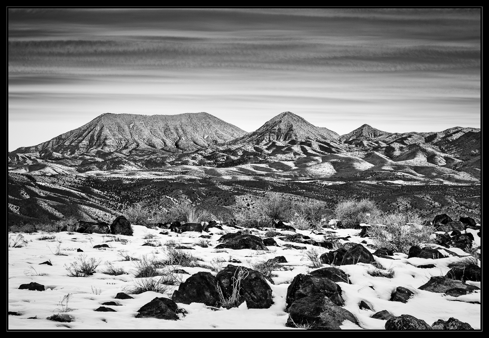
We had a pretty heavy snowfall the first week in January followed by some warmer weather closer to normal in our neck of the woods.  The warmer temps started melting the south exposures and I had a pretty good idea that the empty country close to home might provide some good b/w opportunities.  The sunset was amazing, but my affinity for b/w led me to this composition.  I loved the layered sky and the tonal richness of this open country.

iso 100, 24-105 @73mm, f/8, .8s, tk's magic

your comments and critiques are greatly appreciated and very helpful

way better large

Comments

19 comments
Comment posted by Stuart Williams on January 19, 2016 at 1:50 AM
i love the scene and the layers here, each with distinctive interesting features.  it does seem to me that the processing may be a touch overcooked - the sliders pushed slightly too far? at least for my eye!  the contrasting texture between the sky and earth-bound features is also interesting and adds tension.  I wonder what the effect of running those clouds through TK's cloud sharpening magic would be?
Registered on December 7, 2007, 247 Posts, 4792 Comments
Comment posted by Jim Jirka on January 19, 2016 at 10:18 AM
The smaller version looks good to me but when I look at the larger, something just doesn't look right. I think the image is fine for me.
Registered on November 1, 2003, 254 Posts, 1620 Comments
Comment posted by Harry Lichtman on January 19, 2016 at 10:24 AM
Beautiful comp, lots of interest throughout. Some of the shadow look like they might have been opened a little too much?  Maybe that is what the others are referring to.  Would also crop that very tiny slice of bright sky off the top, near the boarder. Pretty country out your way, and more snow than out east!
Registered on September 17, 2010, 304 Posts, 3507 Comments
Comment posted by Roel Wijtmans on January 19, 2016 at 12:25 PM
Soooo much to like about this one, but the absolute star are the patterns in the distant hills, they are amazing. But, as said, a lot to like about this one, and the sky is another one of those things. The only thing that I thought right away was that I would like to see some more detail in the rocks in the foreground, that would balance the overall tonality a bit more for me. Fantastic shot, Gary!
Registered on September 30, 2012, 116 Posts, 2257 Comments
Comment posted by D.A. Edwards on January 19, 2016 at 12:56 PM
Very engaging B+W image, Gary. My initial nit was what Harry said about that sliver of white on the top edge. The FG shadow areas look just fine to me. However I might try burning those bare bushes in the MG to try and get some visual separation from the dark hills in the distance.
Registered on October 8, 2014, 226 Posts, 1187 Comments
Comment posted by Dietrich Gloger on January 19, 2016 at 2:12 PM
I like the composition and scene a lot. The bw processing looks good on the land - it has a vintage look for me. The land is rendered with such detail, it comes across as 3D, particularly the distant mountains, which is a good thing.
However, I think the stark contrast of the landscape makes a too sharp distinction to the softer sky.
I think this is what Jim refers to as "something just doesn't look right". To me, the sky (or land) looks pasted in. I am not suggesting you did this, but this is the impression the processing gives me. I don't know how to solve this - perhaps just trying to match contrast and sharpening of sky and land a bit more..?


Registered on January 26, 2007, 360 Posts, 9876 Comments
Comment posted by Dave Dillemuth on January 19, 2016 at 2:47 PM
Gary,
Stunning B&W image. Those clouds really add a lot of drama. If it were mine, I think I would burn down the bright sky areas just immediately above the peaks.  
Registered on December 10, 2015, 104 Posts, 1112 Comments
Comment posted by David Schoen on January 19, 2016 at 5:43 PM
I did this to be interestingly layered.  The sky is very soft and linear while the mountains are very sharp and defined.  The foreground snow with rock is once again less defined leaving the center mountain layer to be the target.  This works well as BW!
Registered on November 6, 2006, 1213 Posts, 4587 Comments
Comment posted by David Schoen on January 19, 2016 at 5:44 PM
I did this to be interestingly layered.  The sky is very soft and linear while the mountains are very sharp and defined.  The foreground snow with rock is once again less defined leaving the center mountain layer to be the target.  This works well as BW!
Registered on November 6, 2006, 1213 Posts, 4587 Comments
Comment posted by Ryan Shain on January 19, 2016 at 7:42 PM
Hi Gary,

This is a striking black and white image, and I really enjoy the details and contrast in the land area. I too like how the clouds in the sky create beautiful layers, and the soft sky creates some tension with the stark land.

Diggin it Gary
Registered on February 20, 2007, 226 Posts, 4571 Comments
Comment posted by gary phillips on January 19, 2016 at 8:26 PM
I am including the RAW jpeg here because it might help to see the image in color.  This is a 3 image focal stack with edges cropped from the stack.  I further cropped from the left and top in my presented image.
Registered on October 24, 2013, 185 Posts, 4136 Comments
Comment posted by Alberto Patiño on January 19, 2016 at 10:57 PM
The B&W certainly has a lot more impact that the unprocessed color version, although I think that the color version has potential. Back to the B&W, I like the composition and tonality, but I do think that the image is a bit too sharp. This is not a problem on the small image, but the full resolution image is definitely too "harsh" - I would soften it (less sharpness) but increase the overall contrast - does this make sense?
Registered on December 2, 2014, 278 Posts, 1736 Comments
Comment posted by Marylynne Diggs on January 19, 2016 at 11:31 PM
Hi Gary,
I like the composition, but there is something  funky about the mid-ground.  I don't  think it's just over sharpening.  Maybe there is sharpening and noise reduction both?  it's super high contrast and low detail, which combine in a funky way.  It's worth taking another shot at it. Snow is tricky in b/w.
ML
Registered on December 14, 2010, 122 Posts, 1034 Comments
Comment posted by Lon Overacker on January 20, 2016 at 12:24 AM
Gary,

This is quite the grand landscape. You've got it all from the foreground interest, the expansive mid/far ground and the great sky.  I like this very much.

I don't agree that it seems over processed, "cooked" or perhaps even over sharpened, but there is something that I just can't put my finger on.  Contrast?  not sure, over sharpening? perhaps in the mid/far ground landscape.  Still, the large view portrays such a grand landscape and I find myself exploring every part of the presented image.  the more I look at this, the more I think what a fantastic print this would make.  It's almost like how I would like the brilliance of a color print to look, but it's b&w.  I'm not explaining myself very well.

Lon
Registered on November 24, 2006, 521 Posts, 19147 Comments
Comment posted by Albert Darmo on January 21, 2016 at 6:52 PM
Hi  Garycrying  I think  this stark  dramatic scene  is  made  for  , and benifits  from  the B&W version.   excellent  photography 

Albert Darmo
Canada
Registered on November 25, 2008, 1386 Posts, 11978 Comments
Comment posted by Nick Bristol on January 22, 2016 at 5:05 PM
Gary, This really is a great looking landscape with so many elements to enjoy. I do agree that something seems just a bit off and especially through the middle (mid-ground) of the scene. Maybe kind of like a combination of sharp and soft at the same time. I guess that probably doesn't make much sense though. Might just be a contrast issue but i really don't know. Anyways, still a cool shot that I enjoyed seeing. I do think Lon might be on to something about this looking great in a print.

Nick Bristol
Lone Rock, WI
Registered on February 1, 2004, 752 Posts, 14140 Comments
Comment posted by Harley Goldman on January 23, 2016 at 9:34 AM
I like this a lot. I think the issue with it is due to the high contract in the middle ground and mountains, it appears over-sharpened. It gives it a crunchy look to my eye, especially when the mountains are against clouds like those (look like they were moving fast).  Real nice image. 
Registered on November 19, 2003, 586 Posts, 11271 Comments
Comment posted by Chris Chamberlain on January 23, 2016 at 3:09 PM
Wow! Amazing detail in those hills. The soft sky really adds a nice counter to that. While to me, it does not look so much  like a photograph. It does look like a pencil drawing though. I like it a lot! I wonder if the clarity slider is contributing to that. I used to add clarity to every image I processed. A lot of my winter images had the etching/pencil sketch look to them. A while back, I started going the other way. Now, I reduce clarity in all but maybe 10% of my images. The main reason is for the soft slightly dreamy effect it has. I like what that does for the appearance of my prints.
Registered on March 13, 2007, 500 Posts, 8365 Comments
Comment posted by Paul Breitkreuz on January 28, 2016 at 3:59 PM
Congrats Gary on the WP recently in the ever strong NPN Landscape gallery........devil
Registered on February 25, 2006, 525 Posts, 8448 Comments