Gallery: LandscapePosted January 8, 2016178 views9 comments
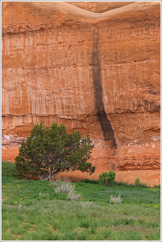
I took this last May along one of the roads on the east side of Canyonlands NP. I had considered cropping a bit off the bottom, but left it full frame for comment.
7D2, 24-105 on tripod, 1/80 f8 -1/3EV
Comments
9 comments
Comment posted by Lon Overacker on January 8, 2016 at 7:12 PM
Bill,
I like the natural colors here and the arrangement of elements. What is especially cool is the inclusion of the depression up top which really tells the story of why the wall is stained or "varnished" - clearly at times water flows over this and down the rock face. At least I'm pretty sure that's what is happening.
As far as a bottom crop goes, I don't think it's needed. However, a very slight crop wouldn't hurt either. If it were mine, I might crop up to the bottom of the darkest line of grasses; there's kind of a natural break in there anyway. But minor.
I did mention the colors look natural. I do think this could benefit from a very shallow s-curve in a curves layer to just add a tiny bit of contrast. Just a thought and not to correct an issue, just an idea to make this nicer than it already is.
Lon
Registered on November 24, 2006, 521 Posts, 19147 Comments
Comment posted by Harry Lichtman on January 8, 2016 at 8:30 PM
I think I would crop off the bottom, as most of the interest isn't in the bottom 1/3. Maybe to the lower sedge bush. The color contrasts really highlights this unique area. Bone dry and lush next to each other. Well seen.
Registered on September 17, 2010, 304 Posts, 3507 Comments
Comment posted by Roel Wijtmans on January 9, 2016 at 5:21 AM
Such a simple yet effective comp! I really like it. The lonely tree fits perfect with the stripe in the rock. My only suggestion would be a slight crop from the bottom as you mentioned, but that's it, since this is really neat!
Registered on September 30, 2012, 116 Posts, 2257 Comments
Comment posted by Mark Seaver on January 9, 2016 at 9:37 AM
Bill, the large swatches of color and texture look very good here. I too like that you included the depression up top. I could see cropping off the lighter section of grass at the bottom. The colors and contrast show much better in the large version.
Registered on January 23, 2011, 1103 Posts, 17270 Comments
Comment posted by Harley Goldman on January 9, 2016 at 11:06 AM
Great combo of the strong greens and the red earth tones. The varnish is a cool addition. This is very well done.
Registered on November 19, 2003, 586 Posts, 11271 Comments
Comment posted by gary phillips on January 9, 2016 at 12:03 PM
Nicely seen Bill. I think I agree with the crop suggestions. Love the texture in the sandstone wall.
Registered on October 24, 2013, 185 Posts, 4136 Comments
Comment posted by David Schoen on January 9, 2016 at 2:14 PM
A nice blend of reds and greens, typical Red rock land colors. But I would also crop some of the bottom. Very nice rock textures.
Registered on November 6, 2006, 1213 Posts, 4587 Comments
Comment posted by Bill Fach on January 9, 2016 at 7:26 PM
Bill: A place I've yet to visit but plan to. I would definitely crop from the bottom and also a bit from the right to maintain the same aspect ratio and give the tree and the stained rock face a bit more emphasis. >=))>
Registered on November 1, 2003, 1805 Posts, 26981 Comments
Comment posted by Albert Darmo on January 9, 2016 at 10:35 PM
Hi Bill Well composed showing very good natural colors. and interesting patterns in the stone. agree with Lon about a tiny boost in contrast.
Albert Darmo
Canada
Registered on November 25, 2008, 1386 Posts, 11978 Comments

Comments
9 commentsI like the natural colors here and the arrangement of elements. What is especially cool is the inclusion of the depression up top which really tells the story of why the wall is stained or "varnished" - clearly at times water flows over this and down the rock face. At least I'm pretty sure that's what is happening.
As far as a bottom crop goes, I don't think it's needed. However, a very slight crop wouldn't hurt either. If it were mine, I might crop up to the bottom of the darkest line of grasses; there's kind of a natural break in there anyway. But minor.
I did mention the colors look natural. I do think this could benefit from a very shallow s-curve in a curves layer to just add a tiny bit of contrast. Just a thought and not to correct an issue, just an idea to make this nicer than it already is.
Lon
Albert Darmo
Canada