Nature Photographers Network
This is the preserved archive of the original Nature Photographers Network. The community continues at naturephotographers.network.
Merced River Scenic
‹ PreviousLandscape GalleryNext ›

Merced River Scenic

by Lon Overacker

Gallery: LandscapePosted December 28, 2015263 views18 comments
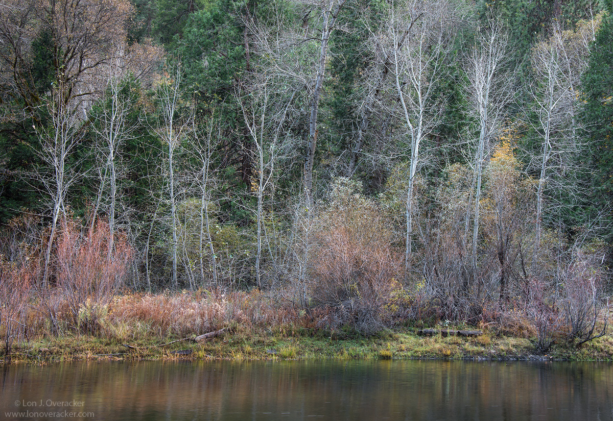
Early on in the series Preston posted an image from this location.  Slightly different angle of view since we weren't standing next to each other.  I had commented to him that I had deleted the images from this location because I wasn't happy with them and didn't consider working them up.  While I had deleted them from the computer, some weeks later I discovered they were still on the SD card and I found this and thought I would work with it.  Lesson learned.... disk space is cheap and I should be more attentive to what I keep and delete.  Still a digital rookie.

As always, you comments, critiques and suggestions welcome.  I'm particularly interested in your thoughts on color/sat and also sharpening for the web. Over sharpened?

Nikon 800E
Tamron 24-135mm at 40mm
f/16 2-image focus stack

Thank you for looking!

Comments

18 comments
Comment posted by Nick Bristol on December 28, 2015 at 6:50 PM
Lon,

This is wonderful. Your composition works perfectly and I absolutely love the colors in this. The fine details of the small branches really keeps me looking at this. Something about it just draws me to this scene! I like the web sharpening very much and even more as I keep looking. Right at first I though it might be border line over sharpened but I really don't think it is because I enjoy looking at it so much (large version). Web sharpening really makes and brakes a lot of images and in this one I think you have brought out all that fine detail and kept it looking beautiful.

Looks like this would make a wonderful print!!

Nick Bristol
Lone Rock, WI
Registered on February 1, 2004, 752 Posts, 14140 Comments
Comment posted by Alberto Patiño on December 28, 2015 at 7:10 PM
I really like the depth layering in this image, Lon. The green grass, then the reddish bushes, then the bare grey trees, and finally the evergreens. It slowly draws you in, and there is a softness in the barre branches that gives a very special intimate feeling. It must be seen in full resolution to be fully apprecated!! (But I think that this is almost always the case cool).
Registered on December 2, 2014, 278 Posts, 1736 Comments
Comment posted by Dave Dillemuth on December 28, 2015 at 7:20 PM
Lon,
This is very beautiful. I love the textures in those bare trees and color palatte rendered under the soft lighting conditions. The image has a painterly look. I can see that this was very carefully composed and procssing looks natural so nothing to suggest. 
Registered on December 10, 2015, 104 Posts, 1112 Comments
Comment posted by David Schoen on December 28, 2015 at 8:03 PM
Another calming serene Yosemite scene.  Nice palatte and layering.  The tree contrast & regular spacing with the greens makes this work.  Oversharpened?  I think its ok as the larger image doesn't seem to be too rough.
Registered on November 6, 2006, 1213 Posts, 4587 Comments
Comment posted by Pete Bengeyfield on December 29, 2015 at 11:07 AM
I like the subtle colors.  Very nice.
Registered on December 2, 2003, 1247 Posts, 3439 Comments
Comment posted by Reno DiTullio on December 29, 2015 at 1:45 PM
It's all about the colors and textures for me, Lon, excellent, love it.
Registered on November 14, 2003, 130 Posts, 1644 Comments
Comment posted by Harley Goldman on December 29, 2015 at 5:47 PM
Pretty little delicate scene. Nice rescue from the digital dustbin.
Registered on November 19, 2003, 586 Posts, 11271 Comments
Comment posted by Harry Lichtman on December 29, 2015 at 8:43 PM
I think the image might be stronger without the water reflection.  Not sure what is gained by that portion of the image other than a base for the trees to rest on.  But the edge above the water would do that.  Wonderful textures make this image for me, as it's not an over the top colorful image.  Maybe a similar one has been posted as a BW?  The sharpening looks fine to me, really brings out the details of the fine branches. Doesn't appear chunky to me.
Registered on September 17, 2010, 304 Posts, 3507 Comments
Comment posted by Bill Fach on December 29, 2015 at 11:05 PM
Lon: A scene a lot of folks would pass by but I'm glad you didn't and then thought better of it. I especially like the color palette and the reflections in the river. I like the texture of the growing stuff and your processing brings it out well. Not oversharpened for my tastes. Good vision, good photography. >=))>
Registered on November 1, 2003, 1805 Posts, 26981 Comments
Comment posted by scott lanz on December 30, 2015 at 7:19 AM
I've looked a this a few times now, Lon, and it grows on me with each view. Wonderful combination of sharp details and nice subtle colors. Does not look oversharpened to me, but, for some reason, I want to rotate the image ccw just a pinch. 
Registered on November 14, 2003, 840 Posts, 12902 Comments
Comment posted by Roel Wijtmans on December 30, 2015 at 9:53 AM
Nice diverse scene, very sweet with those subtle colors and structures. Great you found it back on the memory card! Minor nit is that it feels a bit tight at the top. Sharpening looks good to me!
Registered on September 30, 2012, 116 Posts, 2257 Comments
Comment posted by Mark Seaver on December 30, 2015 at 11:01 AM
This is a lovely, restful scene, Lon.  The muted colors work very well at conveying a sense of peace.  The sharpening looks fine to me.
Registered on January 23, 2011, 1103 Posts, 17270 Comments
Comment posted by Ed Lowe on December 30, 2015 at 11:40 AM
Color/sat and sharpening all look good to me, Lon. This has a quiet painterly feel to it because of the delicate beauty you captured with the desiduous FG trees. I for one am glad you came across this file on your card. The understated transition of seasons in the scene is quite lovely IMO.

Ed
Registered on February 7, 2004, 414 Posts, 7115 Comments
Comment posted by Lon Overacker on December 30, 2015 at 3:55 PM
Thank you all for the comments, I really appreciate it.

Scott, I see that rotation now, thanks for mentioning.  I also wish there was a bit more room up top.  I was going to go back and check my RAW file, but now I can't find it!  I guess I really did delete it - although now I have my master PSD file, I just don't remember if or how much I may have cropped off the original.  grrrr.

Thanks folks!
Registered on November 24, 2006, 521 Posts, 19147 Comments
Comment posted by Prashant Khapane on December 30, 2015 at 4:24 PM
except the rotation issue this is a delight.
Registered on November 1, 2003, 492 Posts, 4580 Comments
Comment posted by Sandro Bisotti on January 2, 2016 at 6:52 PM
Classic and 100%convincing light and tones volumes, with the river to build a base and the dark green to frame the white trees.
A pleasure to see, and also very good sharpness at these dimensions (and I think also at greater).
All the best,
Sandro
Registered on February 8, 2015, 30 Posts, 265 Comments
Comment posted by Albert Darmo on January 4, 2016 at 11:33 AM
Hi  Lon crying  I could cry.wink   i just noticed  that  my comment did not go through. did i not press  the add comment button  enough.angel  in any event..   the combination of detail ,light & color   in  this image  is  exceptionaldevil


Albert Darmo
Canada
Registered on November 25, 2008, 1386 Posts, 11978 Comments
Comment posted by Youssef Ismail on January 5, 2016 at 3:58 PM
Hmm...Deleting a RAW file sucks.  Its kind of like throwing a 4x5 tranny in the round file and emptying the office round file in the dumpster on garbage day and realizing you wanted it back as the garbage truck is hoisting the dumpster.  Yeah...that never happens. blush
Registered on November 1, 2003, 474 Posts, 5555 Comments