Nature Photographers Network
This is the preserved archive of the original Nature Photographers Network. The community continues at naturephotographers.network.
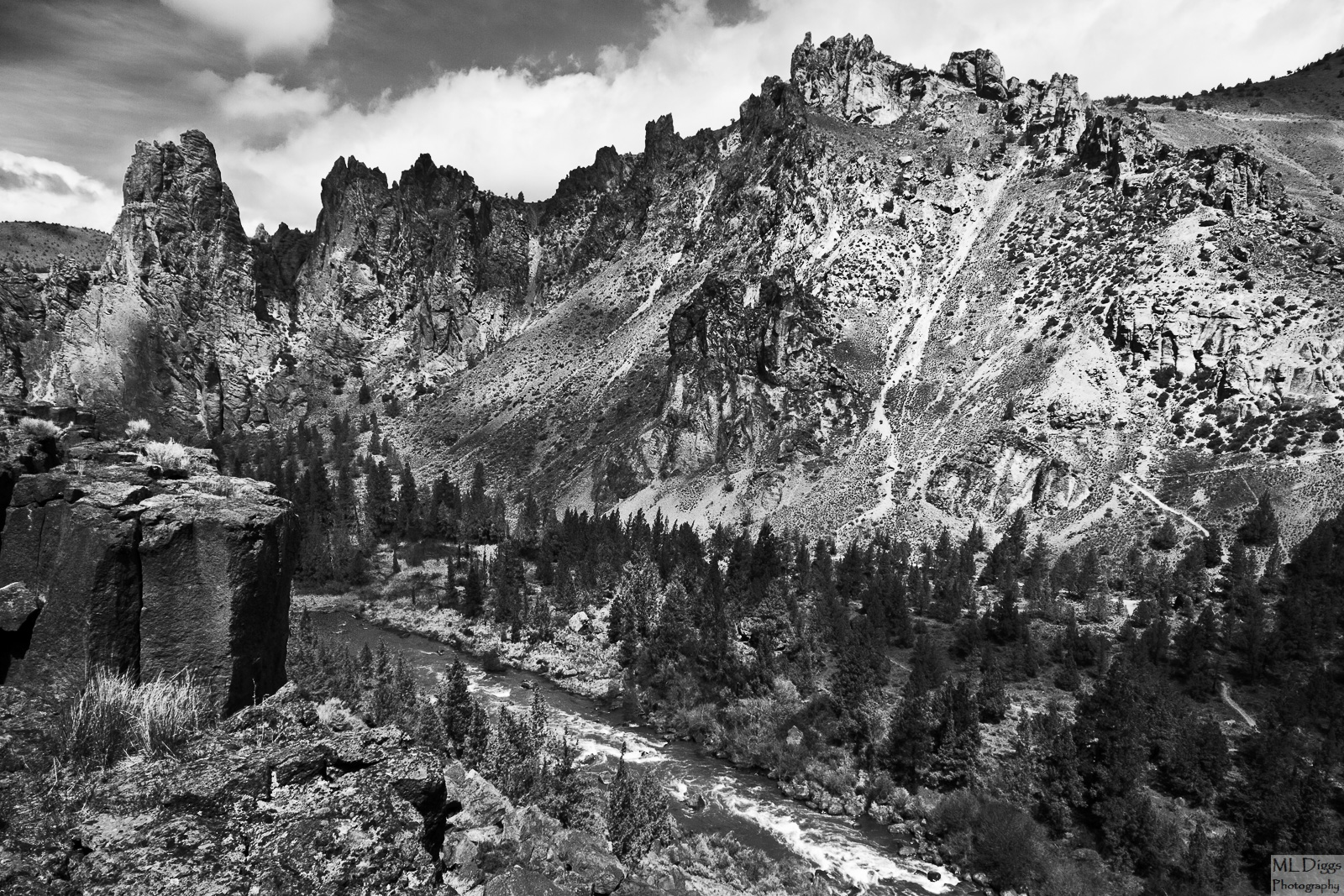
Smith Rock Monochromatic
‹ PreviousMan & Nature GalleryNext ›

Smith Rock Monochromatic

by Marylynne Diggs

Gallery: Man & NaturePosted December 16, 20152,066 views5 comments
Hi Folks,
Here is another in my series of B/W conversions.  This is the Crooke River from Smith Rock State Park in Central Oregon.  I post here due to the trails on the far side (and old cattle paths as well).  I continue to test a theory about what looks good in BW with this one.  Let me know if you have any suggestions or composition, contrast, etc.  This is actually quite fantastic in color, so I'm undecided about whether it works in BW.  The light and shade on the ridge across the river redeem it, I hope, but please feel free to tell me if you don't think it's working.

Canon 7D with 10-20mm at 13mm
ISO 160, f/16, 1/45s
Nik conversion

Comments

5 comments
Comment posted by Reno DiTullio on December 16, 2015 at 4:48 PM
Marylynne, great location and I'm sure the color version is very nice (I've been there before and love the red rocks) but the BW version isn't working for me, it all seems too harsh, too much contrast for me; probably due to the time of day and lighting conditions.
Registered on November 14, 2003, 130 Posts, 1644 Comments
Comment posted by Igor Doncov on December 16, 2015 at 5:51 PM
This isn't working for me in B&W. The problem as I see it is that the tones in the fg are close to that of the background and the 2 are visually merging. There isn't enough to separation to suggest space or to immediately recognize the separation. In reality the fg is dark basalt and the background are green pine trees and warm toned cliffs. So in color you get that separation but here it's lost. I shoot this area quite often. IMO you need an in your face fg here or none at all. 

The image has more detail and is more impressive in the larger version. 
Registered on November 22, 2014, 189 Posts, 2733 Comments
Comment posted by David Schoen on December 18, 2015 at 1:28 PM
I'm in agreement with the others.  Its just to busy to work, probably because of the harsh lighting.  The clouds have little texture and the rocks have too much.  It is probably nicer in color.
Registered on November 6, 2006, 1213 Posts, 4587 Comments
Comment posted by Marylynne Diggs on December 18, 2015 at 2:33 PM
Thanks everyone.  This has confirmed my working theory about b/ and simplicity.  I really apprciate your feedback and honesty.
Registered on December 14, 2010, 122 Posts, 1034 Comments
Comment posted by Patrick O'Healy on December 18, 2015 at 3:53 PM
Marylynne,
At the risk of piling on, I agree with the others.  Compared to your other photos, this one does not stand up.  It may be stunning in color, and if you post it I would like to compare.  Your other work is stunning. 
Registered on March 13, 2011, 326 Posts, 1679 Comments