Nature Photographers Network
This is the preserved archive of the original Nature Photographers Network. The community continues at naturephotographers.network.
Out of Nowhere +++
‹ PreviousMan & Nature GalleryNext ›

Out of Nowhere +++

by Marylynne Diggs

Gallery: Man & NaturePosted December 9, 2015148 views11 comments
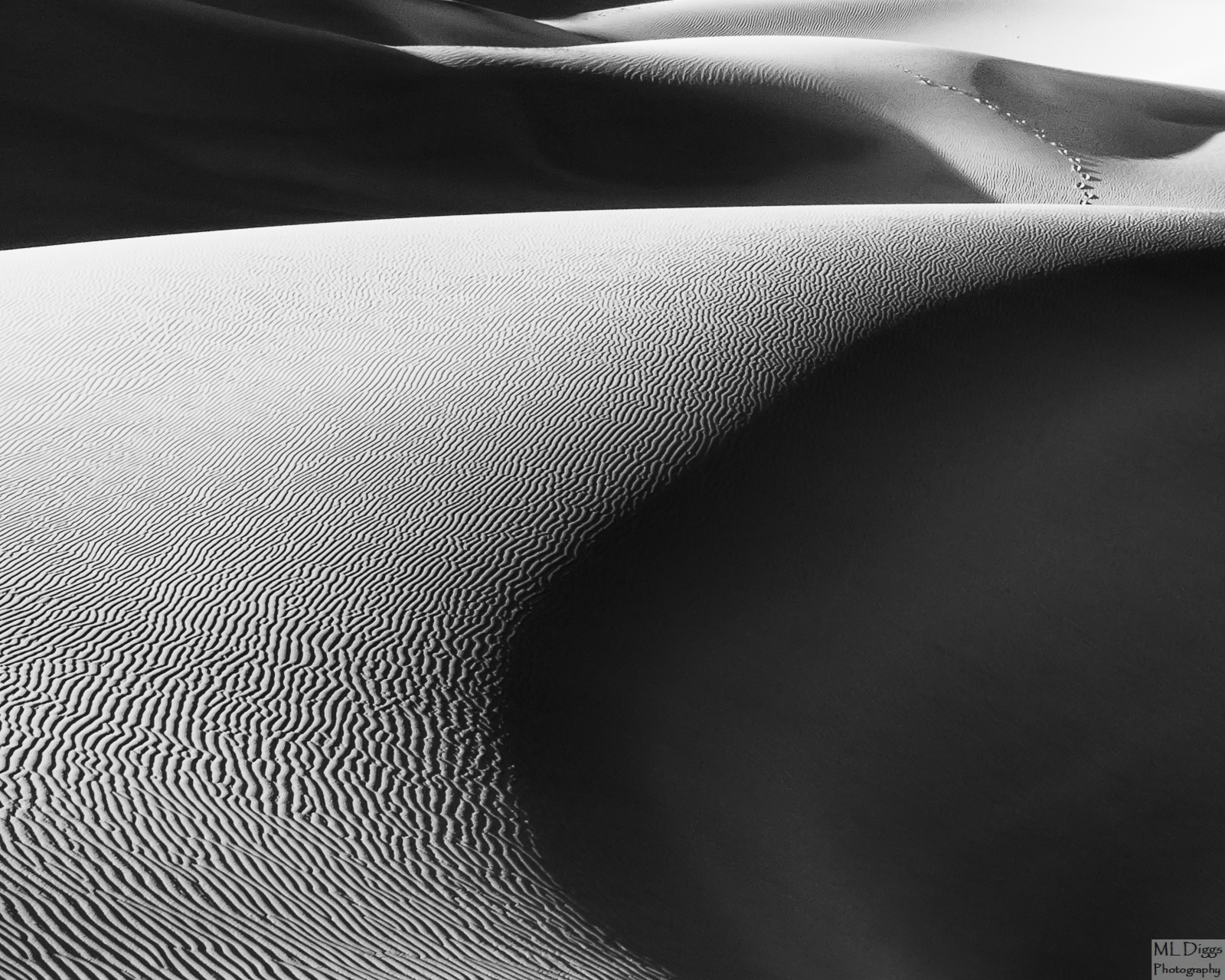
Here is another of my black and white conversions.  Some of you might remember a number of images I shared from a workshop in Death Valley.  A few of these have been converted to b/w with great results (one ended up in a member gallery show at Newspace Center for Photography in Portland).

I'm playing with two others that I think might work well in black and white.  With this one, I'm not convinced I have a good composition, but I like it for some reason.  There are footsteps (human) in the top right 1/4, hence its location here.

As always, let me know what you think about composition, contrast, etc. I'm always eager for feedback and suggestions, and with this one in particular, thoughts on its potential.

Canon 7D with 24-105mm at 35mm
ISO 125, f/14, 1/60s
Conversion in Nik with LR finishing

Comments

11 comments
Comment posted by Ian Wolfenden on December 10, 2015 at 6:01 AM
Very accomplised image, Marylynne !  I love the high contrast light, the swirl of the dunes and the incident of the footsteps - all this works perfectly for me; it seems to convey a sense of human smallness in a vast wilderness.
Registered on May 18, 2007, 1108 Posts, 7647 Comments
Comment posted by Roel Wijtmans on December 10, 2015 at 12:08 PM
Amazing patterns, they are very nice! I like this a lot, and my one and only small nit would be to darken the brightest highlights just a tiny bit so that they show a bit more detail. Especially the upper part of the main dune. But this is nice as is!
Registered on September 30, 2012, 116 Posts, 2257 Comments
Comment posted by Marylynne Diggs on December 10, 2015 at 8:37 PM
Thanks, everyone.  I can't pull that urc down much, unfortunately, but here is a slightly burned edge.  I could croppe it out more, maybe with some ccw rotation to avoid cutting in the dune there.

Let me know if this is better.  It's just toned down, not rotated.
Registered on December 14, 2010, 122 Posts, 1034 Comments
Comment posted by Ken Henke on December 10, 2015 at 9:08 PM
This is simply an exceptional image and does B&W quite well!
 
Registered on February 20, 2012, 117 Posts, 285 Comments
Comment posted by Nick Bristol on December 11, 2015 at 4:15 PM
Marylynne, This looks great! I love the composition you came up with here. The shadow and light works so nice and I love the looks of that rippled sand. I actually like the brighter highlite of the urc in the first one for some reason. Just enjoy the contrast I guess. Really nice work on this! 

Nick Bristol
Lone Rock, WI
Registered on February 1, 2004, 752 Posts, 14140 Comments
Comment posted by Marylynne Diggs on December 11, 2015 at 5:32 PM
Thanks, Nick and Ken.  I did another (rotated slightly) which seems to reduce the moire I get occasionally on the non rotated version.  I also have a wider comp.  Feel free to let me know if either of these strike a stronger chord than the first two.

 
Registered on December 14, 2010, 122 Posts, 1034 Comments
Comment posted by Marylynne Diggs on December 11, 2015 at 5:33 PM
And this is the wider composition.  I think I like the more square version better, but I'm open to persuasion.
Registered on December 14, 2010, 122 Posts, 1034 Comments
Comment posted by David Schoen on December 11, 2015 at 6:27 PM
The tonality in #3 seems the best to me and the crop in #2 at the top seems the best.  There is a difference in the central top of the image crop.  The curves in this image are very nice in combination with the textures and the interplay between the shadows and highlights.   I like your approach.
Registered on November 6, 2006, 1213 Posts, 4587 Comments
Comment posted by Patrick O'Healy on December 12, 2015 at 2:48 PM
Marylynne,
Thank you for your willingness to experiment based on the feedback you get.  I like the second iteration best.  You doubted your composition, but I think it is very strong and pleasing to my eye.  My eye travels along the ridge and then footprints emerge.  "Wait a minute, where did those come from?  Why are there no footprints in the foreground dune?"  Not only did you give us a pleasing shot, but you engaged us in it.  Now our questions make us part of your image.  I think this is a home run. 

Patrick
Registered on March 13, 2011, 326 Posts, 1679 Comments
Comment posted by Reno DiTullio on December 13, 2015 at 12:46 AM
Number two for me, love the sweeps, curves and ripples of the dunes, wonderful contrast, excellent graphic.
Registered on November 14, 2003, 130 Posts, 1644 Comments
Comment posted by Barry Ashenhurst on December 15, 2015 at 4:45 PM
Very nice Marylynne. Makes me wish I hadn't given my 24-105 to my son. I really like the textures and patterns here and I think it probably works better in B&W than it would have i
n colour.
Registered on August 4, 2009, 253 Posts, 455 Comments