Nature Photographers Network
This is the preserved archive of the original Nature Photographers Network. The community continues at naturephotographers.network.
Mono Punch Bowl Repost
‹ PreviousLandscape GalleryNext ›

Mono Punch Bowl Repost

by Marylynne Diggs

Gallery: LandscapePosted December 9, 2015151 views7 comments
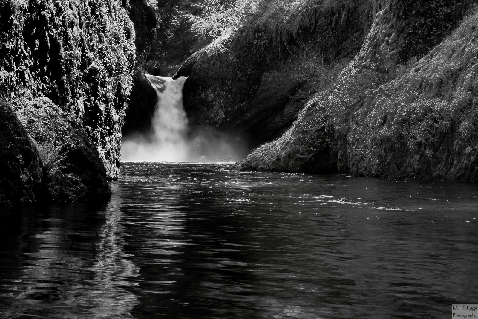
Here is another one of my black and white landscape images (I think I have just 3-4 more).   As always, please let me know what you think about contrast, composition, etc.  I'm always eager for suggestions. 

Canon 7D with 24-105 at 45mm
ISO 125, f/16, 1/15s

Let me know what you think.  This was not originally planned as a b/w conversion, and I'm wondering what you think of it here and what you think of its potential for that.

Comments

7 comments
Comment posted by Harry Lichtman on December 10, 2015 at 8:57 AM
I like the BW take on the falls.  The vibrant green versions can get old, so I like the fressh take.  The bright areas of the walls created nice textures and the reflection light is a nice touch as well. 
Registered on September 17, 2010, 304 Posts, 3507 Comments
Comment posted by Igor Hoveijn on December 10, 2015 at 3:55 PM
The flow of the water from upper left to lower right is the same as my eyes go through the picture, which makes it pleasant to 'read'. The light on the walls nicely accentuates their forms. The most important shapes are also visible as reflections in the water. Only the   lower right part feels a little bit empty. Nonetheless, I find it a very peaceful and calming scene to look at. Well chosen shutterspeed so that the fall is neither milky nor frozen.
Registered on November 2, 2015, 18 Posts, 192 Comments
Comment posted by Roberto Facchini on December 10, 2015 at 4:15 PM
I like the composition and the dark color of the water in the foreground in contrast to the sparkling white waterfall.
Registered on November 15, 2012, 35 Posts, 202 Comments
Comment posted by Preston Birdwell on December 10, 2015 at 7:53 PM
I like this. The tones look good, and really like the reflections on theleft. I do suggest cropping from the left to eliminate that very dark area of rock near the left edge. For some reason, it grabs my eye. You've got a nice B&W series going. Keep it up!

--P
Registered on November 1, 2003, 471 Posts, 5188 Comments
Comment posted by Marylynne Diggs on December 10, 2015 at 8:44 PM
Thanks everyone.  I really appreciate the feedback and the encouragement.  I trimmed a bit from both sides and the bottom to reduce the black corner and the empty corner.  Let me know whether you think this is an improvement.  To me, it feels more balanced, but I always like a few extra sets of eyes.
Registered on December 14, 2010, 122 Posts, 1034 Comments
Comment posted by gary phillips on December 10, 2015 at 10:19 PM
I like the crop and I think the image works well as a B/W.  Plenty of good tonal range.  I would burn the light coming in from the right on the bushes and grass.  The brightness stops the view to the nice light above the falls and further back.  
Registered on October 24, 2013, 185 Posts, 4136 Comments
Comment posted by Ryan Shain on December 15, 2015 at 9:30 PM
The image has plenty of impact for me in the black and white version presented. The tonal range is very appealing, and the position of the camera is a nice point of view. The re-work looks even better, and some really nice work on this image Marylynne.
Registered on February 20, 2007, 226 Posts, 4571 Comments