Gallery: LandscapePosted November 23, 2015211 views15 comments
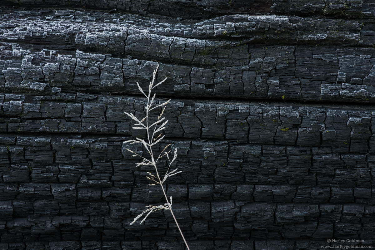
Another from Yosemite. Lon and Preston posted a few charred images, so I figured I would too.
D810, 70-200mm
Comments, critiques and suggestions are always welcome.
Comments
15 comments
Comment posted by Jim Jirka on November 23, 2015 at 9:56 AM
This is such a quiet image to me. A sort of death and rebirth theme. I like it.
Jim
Registered on November 1, 2003, 254 Posts, 1620 Comments
Comment posted by Roel Wijtmans on November 23, 2015 at 11:17 AM
I'm pretty sure I would have temporarily bended the grass out of frame and go for the more abstract pic if I were the one controlling the camera. But after looking at it for some time it is growing on me. The symbolism you captured is indeed very nice. Maybe dodge the lower right a bit so it is more balanced with the other charred parts?
Registered on September 30, 2012, 116 Posts, 2257 Comments
Comment posted by John Freeman on November 23, 2015 at 11:27 AM
I love just the way it is.
Registered on September 27, 2013, 16 Posts, 33 Comments
Comment posted by David Schoen on November 23, 2015 at 12:13 PM
nice juxtapositions
Registered on November 6, 2006, 1213 Posts, 4587 Comments
Comment posted by Richard Teller on November 23, 2015 at 1:05 PM
Nice simple image that tells a story well.
Registered on August 23, 2010, 1162 Posts, 6692 Comments
Comment posted by Lon Overacker on November 23, 2015 at 2:55 PM
Harley,
Simplicity of design is just about always a winner, and this one most certainly is. I like the juxtaposition between the two elements as David mentioned. I can't think of any nits or suggestions (darn it.) A simple and beautiful image, I wouldn't change a thing.
Lon
Registered on November 24, 2006, 521 Posts, 19147 Comments
Comment posted by Preston Birdwell on November 23, 2015 at 7:04 PM
The dichotomy of light and dark, and scruffy vs. delicate works very well, Harley. No nits or suggestions.
Well seen, and beautifully done!
--P
Registered on November 1, 2003, 471 Posts, 5188 Comments
Comment posted by Mark Metternich on November 23, 2015 at 8:28 PM
Excelleny Harley.
Registered on June 19, 2009, 276 Posts, 6240 Comments
Comment posted by scott lanz on November 23, 2015 at 9:51 PM
To me, the frosted grass makes the image, Harley. It ptovides the needed contrast, focal point, interest, and artistry (although I also like the frost at the top of the wood). Very nice.
Registered on November 14, 2003, 840 Posts, 12902 Comments
Comment posted by Kathy Barnhart on November 23, 2015 at 11:14 PM
Simple and elegant, yet different too. Excellent! Love it just as it is.
Registered on November 11, 2011, 404 Posts, 1639 Comments
Comment posted by Alberto Patiño on November 23, 2015 at 11:45 PM
I love the contrast. The very small patches of green moss add a lot, talk about understated colors working! My only suggestion: the sprig a bit further to the left?
Registered on December 2, 2014, 278 Posts, 1736 Comments
Comment posted by Albert Darmo on November 25, 2015 at 12:35 PM
Hi Harley I like the contrasts of the light and dark color tones and the contrast of the elements in this image
Albert Darmo
Canada
Registered on November 25, 2008, 1386 Posts, 11978 Comments
Comment posted by gary phillips on November 25, 2015 at 4:22 PM
Simple, tidy, and very effective Harley. Not nits from me. Love it.
Registered on October 24, 2013, 185 Posts, 4136 Comments
Comment posted by Aaron Feinberg on November 26, 2015 at 12:01 AM
So. Good. Woah.
Registered on October 26, 2009, 399 Posts, 2789 Comments
Comment posted by Igor Doncov on November 26, 2015 at 9:12 AM
I like this Harley. Charred wood is so beautiful. For some reason the smaller version is darker and more appealing than the larger. I think that's because of the black frame you chose. The larger version shows more texture in that wood and that's great. My only suggestion is to darken the plant just a tad so that it shows some texture rather than being a white silhouette.
Registered on November 22, 2014, 189 Posts, 2733 Comments

Comments
15 commentsJim
Simplicity of design is just about always a winner, and this one most certainly is. I like the juxtaposition between the two elements as David mentioned. I can't think of any nits or suggestions (darn it.) A simple and beautiful image, I wouldn't change a thing.
Lon
Well seen, and beautifully done!
--P
Simple and elegant, yet different too. Excellent! Love it just as it is.
Albert Darmo
Canada