Thank you everyone for your comment on previous images.
Any suggestions on a title would be appreciated. Kinda drawing a blank on this one.
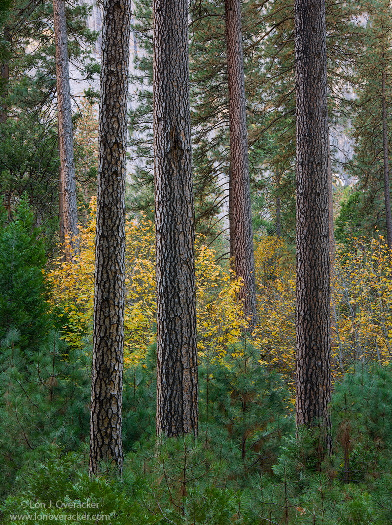
This is a retake on a scene I photographed 3 years ago. Now that I have a DSLR, one the things I'm doing now is to potentially re-shoot some of my favorite scenes. This is one of those.
Here is my 4x5 version from 2012. I look back now at this one and think, "yikes, the saturation and red is killing me!" At least to my eye, I think the previous version is over saturated. So now how can I really compare? Processing is key to how well our images are perceived. Also, the conditions aren't the same between captures, growth, amount of color, fewer leaves, etc. I guess maybe I have less to learn and less to prove by making such comparisons.
This was captured in an area not far from the Ahwahnee Meadow where there used to be a campground. It was washed away in the 1997 flood and Park management decided to let it return to it's natural state.
So, your comments, critiques and suggestions on current history will be appreciated!
Nikon D800E
Tamron 24-135mm @60mm f/16
3-image focus stack
Tony Kuyper's Luminosity and saturation masks

Comments
19 commentsI used to camp in this campground back in the 1970's. It was called Upper River, then. I am glad the NPS decided to allow this area, and the other campground that was across the road, to return to their natural state.
My images from this area this trip went into the digital dustbin. I am glad you got this exceptionally fine one!
--P
@David - excellent observation about the sharpness and detail throughout the depth of this image. Now in this particular image, I think the detail front to back works. However, I've already learned that just because focus stacking is a great and valuable technique, it doesn't mean it should be applied all the time. There are lots of times where we want the bg to be soft, emphasizing whatever subject we have up front. I found this so true in some aspen images I have from October. A 5-image stack with detail throughout just didn't look good. It wasn't until I let the background go soft that the image had a much more pleasing glow to it because all the leaves way in the back were soft and out of focus.
Just like everything else, using the tools, techniques, etc. not just because they're neat stuff, but because it's the right thing for a particular image. Good stuff.
Thanks for comments so far. I hope the repost looks better.
As always this is a great comp. I saw the repost after scrolling down and agree that it has more life to it. To my eye the original doesn't appear over-saturated, I think it's just a function of the different conditions as you noted. I definitely admire your ability to see the order in these complex forest scenes.
Jim
Albert Darmo
Canada