Gallery: LandscapePosted November 20, 2015202 views13 comments
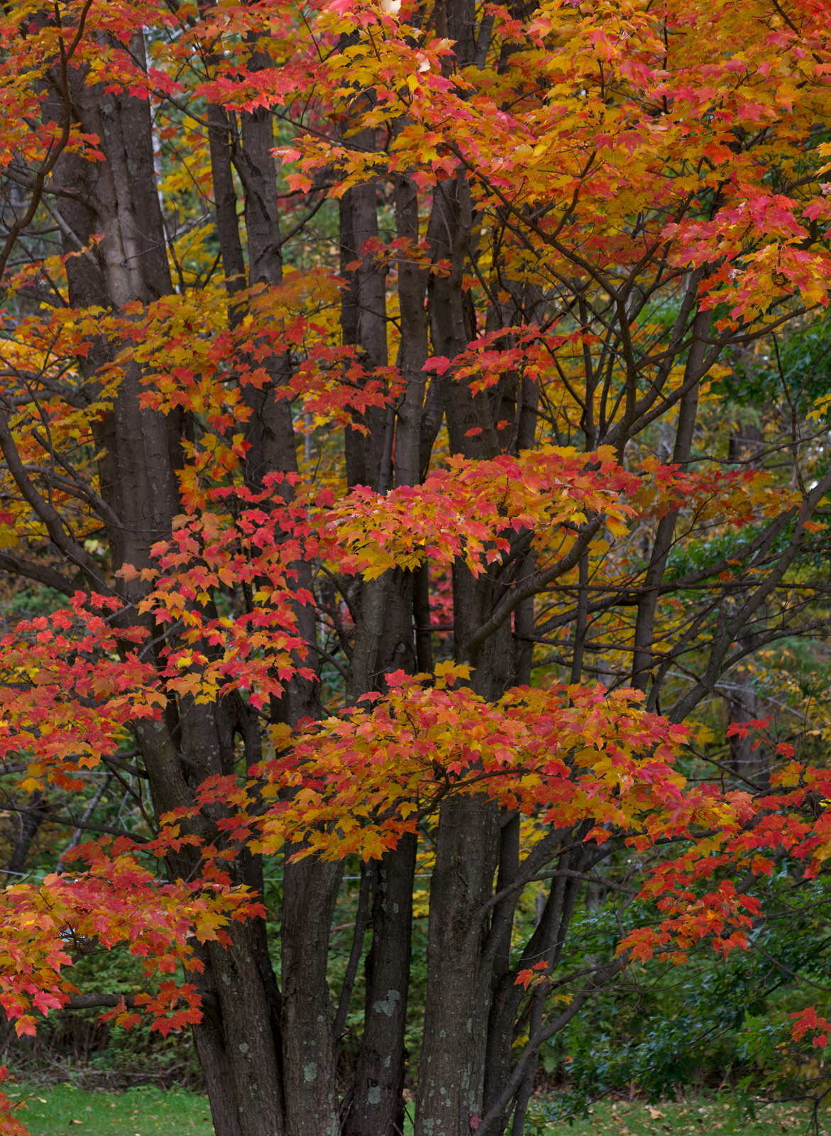
I could not decide what composition i liked better, both taken from the same image. so i posted both versions. comments appreciated
D600.... 150 mm .. f/9. 1./80 sec. iso.200 cable release mirror-up
Comments
13 comments
Comment posted by Albert Darmo on November 20, 2015 at 3:09 PM
The second version.... comments appreciated
Registered on November 25, 2008, 1386 Posts, 11978 Comments
Comment posted by Jim Jirka on November 20, 2015 at 5:04 PM
Albert,
Out of the 2 I like the second better for the flow on the image. A nice sampling of the autumn maples.
Jim
Registered on November 1, 2003, 254 Posts, 1620 Comments
Comment posted by Preston Birdwell on November 20, 2015 at 5:37 PM
They are both very nice, Albert. I do prefer the horizontal one because I think flows better. My only suggestion would be to brighten it just a bit: It feels a little too dark. But, that's minor. The color and textures work vry well.
--P
Registered on November 1, 2003, 471 Posts, 5188 Comments
Comment posted by Jeffrey Sipress on November 20, 2015 at 5:39 PM
I prefer the first one by quick reaction test. I like the 'fill the frame' approach.
Registered on February 17, 2004, 236 Posts, 1197 Comments
Comment posted by scott lanz on November 20, 2015 at 6:54 PM
Put me down for the horizontal, Albert. To me it better fills the frame. Very nice.
Registered on November 14, 2003, 840 Posts, 12902 Comments
Comment posted by Nick Bristol on November 20, 2015 at 8:14 PM
Hi Albert, Both of these are nice but the second version (horizontal) works best for me. I like the tighter feel of the comp which has such a nice flowing feel. Like Preston I think just a bit brighter would work well on this image. I have enjoyed your fall images very much.
Nick Bristol
Lone Rock, WI
Registered on February 1, 2004, 752 Posts, 14140 Comments
Comment posted by Mark Seaver on November 20, 2015 at 10:07 PM
You've got some glorious colors in the leave here, Albert. I like both views a lot, with the vertical being a fine look at the leaves and the tree's shape, while the crop emphasizes the leaves nicely.
Registered on January 23, 2011, 1103 Posts, 17270 Comments
Comment posted by gary phillips on November 21, 2015 at 12:34 AM
Albert, this may be my favorite of your fall series so far. My preference is for the vertical image. Love the dark trunks which show off the color of the leaves perfectly.
Registered on October 24, 2013, 185 Posts, 4136 Comments
Comment posted by Igor Doncov on November 21, 2015 at 1:17 AM
I'm glad you brought this up. I can agonize over choices like this for days sometimes. They are both great compositions but the vertical composition is clearly superior. The horizontal version is more about design but the first tells you more about the subject. The 2nd image is much easier to come up with than the first in my experience. When I shoot my main shot is usually the close up and the larger image is invariably a 'just in case' image and it's that image that is superior in the end. Just my thoughts.
PS I think you went too far with those reds. I would back off on their saturation a bit.There are also a few sky white spots which should be cloned out. I do like the inclusion of the grass at the bottom.
Registered on November 22, 2014, 189 Posts, 2733 Comments
Comment posted by Roel Wijtmans on November 21, 2015 at 2:28 AM
The vertical version is the winner for me, looks more coherent in my eyes.
Registered on September 30, 2012, 116 Posts, 2257 Comments
Comment posted by Lon Overacker on November 21, 2015 at 1:15 PM
Albert,
A lovely autumn image. I too prefer the vertical, but with one suggestion. If it were mine, I would crop the bottom to eliminate the grass. For me, the inclusion of it makes this look like a more traditional tree image. but without any reference to the ground, it tells me more about the intention of the image and what really attracted you to this intimate scene. I hope that makes sense.
The horizontal crop works well for design and color, but I find it makes for a ping-pong effect with my eye bouncing between the two main branches. Of course that doesn't mean everyone sees it like that.
Registered on November 24, 2006, 521 Posts, 19147 Comments
Comment posted by David Schoen on November 21, 2015 at 3:49 PM
These are both strong comps but I prefer the landscape presentation due to simplicity. There are 2 swaths of maple as opposed to 5 in the portrait view. I do think the landscape view could be a tint bit more saturated or bright but not quite as bright or saturated as the portrait view.
Registered on November 6, 2006, 1213 Posts, 4587 Comments
Comment posted by Mark Metternich on November 23, 2015 at 8:44 PM
Marvelous is right!
Registered on June 19, 2009, 276 Posts, 6240 Comments

Comments
13 commentsOut of the 2 I like the second better for the flow on the image. A nice sampling of the autumn maples.
Jim
--P
Nick Bristol
Lone Rock, WI
PS I think you went too far with those reds. I would back off on their saturation a bit.There are also a few sky white spots which should be cloned out. I do like the inclusion of the grass at the bottom.
A lovely autumn image. I too prefer the vertical, but with one suggestion. If it were mine, I would crop the bottom to eliminate the grass. For me, the inclusion of it makes this look like a more traditional tree image. but without any reference to the ground, it tells me more about the intention of the image and what really attracted you to this intimate scene. I hope that makes sense.
The horizontal crop works well for design and color, but I find it makes for a ping-pong effect with my eye bouncing between the two main branches. Of course that doesn't mean everyone sees it like that.