Gallery: LandscapePosted November 16, 2015237 views15 comments
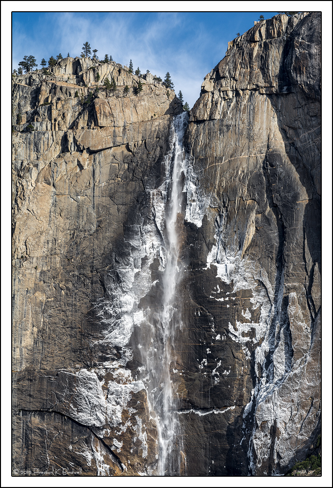
Yosemite Details #2
Nikon D-7100
Nikkor 70-300 mm
ACR and TK's Burn/Dodge Action.
Please see the large version. Thanks!
Your thoughts are always appreciated.
--P
Comments
15 comments
Comment posted by Harley Goldman on November 16, 2015 at 4:08 PM
Excellent take on Yosemite Falls!!! I like this a lot. The white ice fan at bottom is great.
Registered on November 19, 2003, 586 Posts, 11271 Comments
Comment posted by Jim Gavin on November 16, 2015 at 4:57 PM
Besides the right on techs and a beautiful image, I like this because of the many different animals in the details. (Big Teddy Bear, cow's head and neck, hieroglyphics, person reaching out with her left hand, butterfly wing. . . .)
Registered on August 14, 2008, 293 Posts, 1250 Comments
Comment posted by Prashant Khapane on November 16, 2015 at 5:20 PM
love the whites. Different capture of a well known place.
Registered on November 1, 2003, 492 Posts, 4580 Comments
Comment posted by Ken Smith on November 16, 2015 at 6:40 PM
I like the stark contrasts and tight crop. The lack of water drives the eye towards the other elements. I bet a b/w rendition would also be pleasing to see.
Registered on September 5, 2008, 449 Posts, 2444 Comments
Comment posted by Ryan Shain on November 16, 2015 at 10:38 PM
Hi Preston,
This image has such a beautifully rustic feel about it, and the details are truly wonderful. I really enjoy how the cliff face is dusted in snow, and the inclusion of the sky gives some perspective on the size of the fall. There is something about this image is so very pleasing for me eyes.
Just some really sweet photography
Registered on February 20, 2007, 226 Posts, 4571 Comments
Comment posted by Alberto Patiño on November 16, 2015 at 11:44 PM
I like this one much more than the previous one. I can immediately relate to this image! But then, I tend to be drawn to the "big picture" rather than details.....
Registered on December 2, 2014, 278 Posts, 1736 Comments
Comment posted by Roel Wijtmans on November 17, 2015 at 11:39 AM
Hmmm, somehow I missed your previous post, but this one is just as beautiful as that one. Absolutely stunning ice patterns in both. Would not be able to choose between them, they both have their own qualities. No nits!
Registered on September 30, 2012, 116 Posts, 2257 Comments
Comment posted by Tom Falley on November 17, 2015 at 11:43 AM
I always love the ice rim of the falls in the right season. I have a scan of an ancient slide (1970) taken in the Spring whe the falls is at full force, but still has the ice rim, and my 1963 Volvo in the foregroind!
Thanks for sharing more Valey images, always a magical place!
Registered on November 21, 2014, 189 Posts, 454 Comments
Comment posted by Lon Overacker on November 17, 2015 at 12:14 PM
Mr. PB! This is a wonderful capture of this iconic waterfall. The water, ice spray and of course the granite detail are all wonderful, but what tops this off (literally) is the blue and whispy clouds. Without the clouds, I think the impact of the image is dimished. They just add that final piece to this excellent image. Very nicely processed I might add.
Registered on November 24, 2006, 521 Posts, 19147 Comments
Comment posted by Nick Bristol on November 17, 2015 at 1:15 PM
Preston, This is so nice and I just love looking at it. Wonderful composition, great exposure and I love the details showing in the larger version. Great sky / clouds too.
Nick Bristol
Lone Rock, WI
Registered on February 1, 2004, 752 Posts, 14140 Comments
Comment posted by David Schoen on November 17, 2015 at 6:57 PM
Real nice image. I would like to see this side by side with and without the Tony Kuiper luminosity masks to see the differences and what exactly they did for this image.
Registered on November 6, 2006, 1213 Posts, 4587 Comments
Comment posted by Igor Doncov on November 17, 2015 at 9:04 PM
I like this one more than the previous abstract, I think. The processing is excellent. The granite has that rich texture of a larger format camera. Just beautiful. Sharp and yet not gritty sharp. I agree with the previous poster that it would be nice to see what the TK masks did for this image - if possible.
Registered on November 22, 2014, 189 Posts, 2733 Comments
Comment posted by Jim Greenwood on November 17, 2015 at 11:45 PM
This composition is much more appealing to me than #1. This one is more powerful as a result of the sense of scale and location compared to the more abstract nature of #1.
Registered on November 9, 2003, 229 Posts, 1523 Comments
Comment posted by Harry Lichtman on November 18, 2015 at 7:55 PM
I prefer this view over the tight image presented earlier. I think it is the trees that give scale to the image that I like, and the clouds that appear as mist from the falls. The water looked cut off near the top of the tighter view. The recognizeable aspect of the falls doesn't bother me at all since this is a unique, and marketable view I think! A beauty.
Registered on September 17, 2010, 304 Posts, 3507 Comments
Comment posted by Preston Birdwell on November 19, 2015 at 2:35 PM
David and Igor:
It turns out that I did most most of the tonal and color corrections in ACR. I did not use TK's masks. I did, however, use Hue/Sat, Selective Color, and TK's Burn/Dodge action on layers.
Hue/Sat: Yellows +35
Selective Color: Blues, add Black +40 (Absolute)
Burn/Dodge: A couple of small hotter spots burned down a bit.
I don't recall what I did in ACR.
Thanks for your comments!
--P
Registered on November 1, 2003, 471 Posts, 5188 Comments


Comments
15 commentsThis image has such a beautifully rustic feel about it, and the details are truly wonderful. I really enjoy how the cliff face is dusted in snow, and the inclusion of the sky gives some perspective on the size of the fall. There is something about this image is so very pleasing for me eyes.
Just some really sweet photography
Thanks for sharing more Valey images, always a magical place!
Nick Bristol
Lone Rock, WI
It turns out that I did most most of the tonal and color corrections in ACR. I did not use TK's masks. I did, however, use Hue/Sat, Selective Color, and TK's Burn/Dodge action on layers.
Hue/Sat: Yellows +35
Selective Color: Blues, add Black +40 (Absolute)
Burn/Dodge: A couple of small hotter spots burned down a bit.
I don't recall what I did in ACR.
Thanks for your comments!
--P