Gallery: LandscapePosted November 10, 2015253 views10 comments
Please click on the image above to see a larger view.
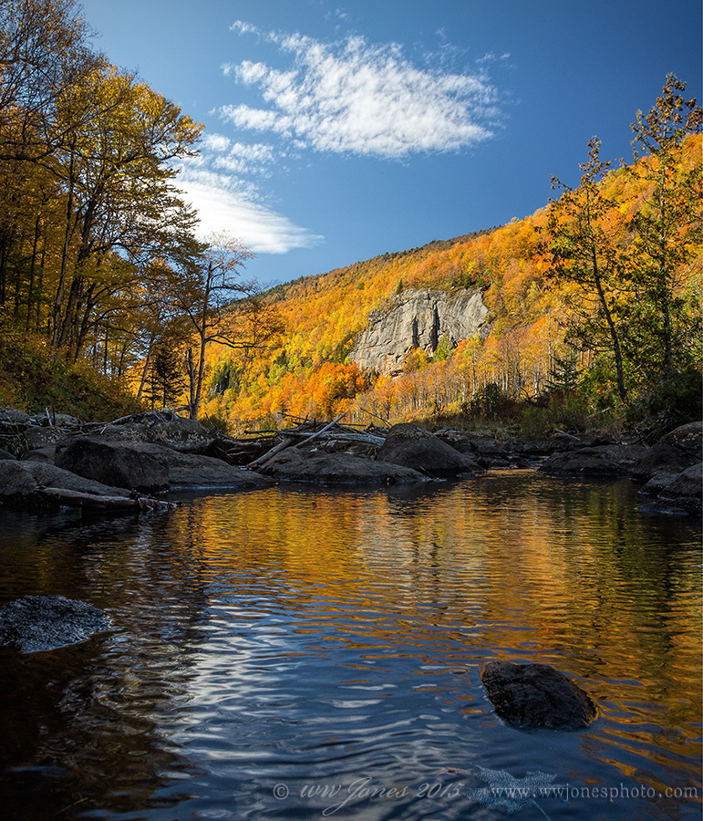
This is an alternative crop of the image I posted a couple of days ago, HERE. At that time, I asked "Is there too much going on here? I tried several crops, eliminating the foreground leaf and the overhead cloud, but this seems the most balanced to me. It would be easy to clone out that floating beech leaf, but I didn't think of that until just now."
Half of the comments favored getting rid of the leaf on the bottom. Gary voted for that even though he thought this was another one of my floating leaf shots. Actually I did not even notice that leaf when I shot it, because I was awkwardly balancing on rocks trying to compose in the LCD at the time, concentrating on more distant objects and assuming I would not use the bottom. The problem was that my other test compositions cut off some of the left side as well as the bottom, throwing the balance off; I wanted to keep the shady trees on the left to counter-balance the brilliant triangle of the background. I had tried a square crop to address that, but it cut off too much of the top and/or bottom. Eva gave me the solution for that by suggesting a 6x7 crop (something I don't normally think of because my old medium format film camera was a 6x6). Where else but NPN can you get such great advice?
Canon 5D3; Canon 24-105 mm.
1/40 sec. @ f/16; ISO 640; Circ. Pol.
Camera braced on a rock (instead of using a tripod).
Comments
10 comments
Comment posted by Harley Goldman on November 10, 2015 at 5:51 PM
Works for me without the leaf.
Registered on November 19, 2003, 586 Posts, 11271 Comments
Comment posted by Nick Bristol on November 10, 2015 at 6:41 PM
Wayne, Just what I was thinking and I like it very much! Nice work! Nick
Registered on February 1, 2004, 752 Posts, 14140 Comments
Comment posted by gary phillips on November 10, 2015 at 6:48 PM
What, you didn't intentionally float that leaf? I like this one, but both are very nice.
Registered on October 24, 2013, 185 Posts, 4136 Comments
Comment posted by Philip Hodgkins on November 10, 2015 at 8:57 PM
I'll stick with the 4 x 5. The leaf doesn't bother me either way. The 6 x 7 just feels odd to me.
Registered on July 24, 2006, 2741 Posts, 12349 Comments
Comment posted by Angela Classen on November 10, 2015 at 9:16 PM
They are both beautiful but I think I prefer this one slightly better. Gorgeous colors and great composition. The ripples in the pond create some nice texture.
Registered on June 13, 2007, 434 Posts, 2742 Comments
Comment posted by Mark Seaver on November 10, 2015 at 9:30 PM
This has a fine "clean" look to it Wayne and both versions are beautiful. I prefer the original post, because the extra complexity added by the leaf "feels" more natural, but that's not the direction that I see photography today trending.
Registered on January 23, 2011, 1103 Posts, 17270 Comments
Comment posted by Roel Wijtmans on November 11, 2015 at 12:47 PM
I must have missed the previous version.... Anyway, this one works much better for me, the leaf was a bit distracting in the other comp. It gives this version more calmness which I find very welcoming, since it fits the scene so well.
I find it very interesting that you think in terms of 6x6, 6x7, 4x5, etc when cropping, and I know you're definitely not the only one. When I crop something, I do not care at all about dimensions and just go after what my gut feeling tells me. Very interesting difference in workflow!
Registered on September 30, 2012, 116 Posts, 2257 Comments
Comment posted by D.A. Edwards on November 11, 2015 at 4:24 PM
I think that I prefer this one, Wayne. The original version did seem a little "forced" with the inclusion of the floating leaf. Either way though they are both outstanding images of fall.
Registered on October 8, 2014, 226 Posts, 1187 Comments
Comment posted by Richard Teller on November 11, 2015 at 4:36 PM
The autumn colors are nice. but I think I like the composition best. I like the way the water pulls your eye into the image to the trees that frame the fall color.It moves the eye right up to the clouds.
Registered on August 23, 2010, 1162 Posts, 6692 Comments
Comment posted by Ryan Shain on November 12, 2015 at 6:14 PM
I like both of these image, and I can see where a lot of people will go for this clean presentation over the slightly more complicated presentation. I think most people would like this image if you where appealing to the masses, but I like both for different qualities they bring out in nature. I still think just the one beech life could be sweet too.
Nice work
Registered on February 20, 2007, 226 Posts, 4571 Comments

Comments
10 commentsI find it very interesting that you think in terms of 6x6, 6x7, 4x5, etc when cropping, and I know you're definitely not the only one. When I crop something, I do not care at all about dimensions and just go after what my gut feeling tells me. Very interesting difference in workflow!
Nice work