
by Jeff Martyka
Howdy folks,
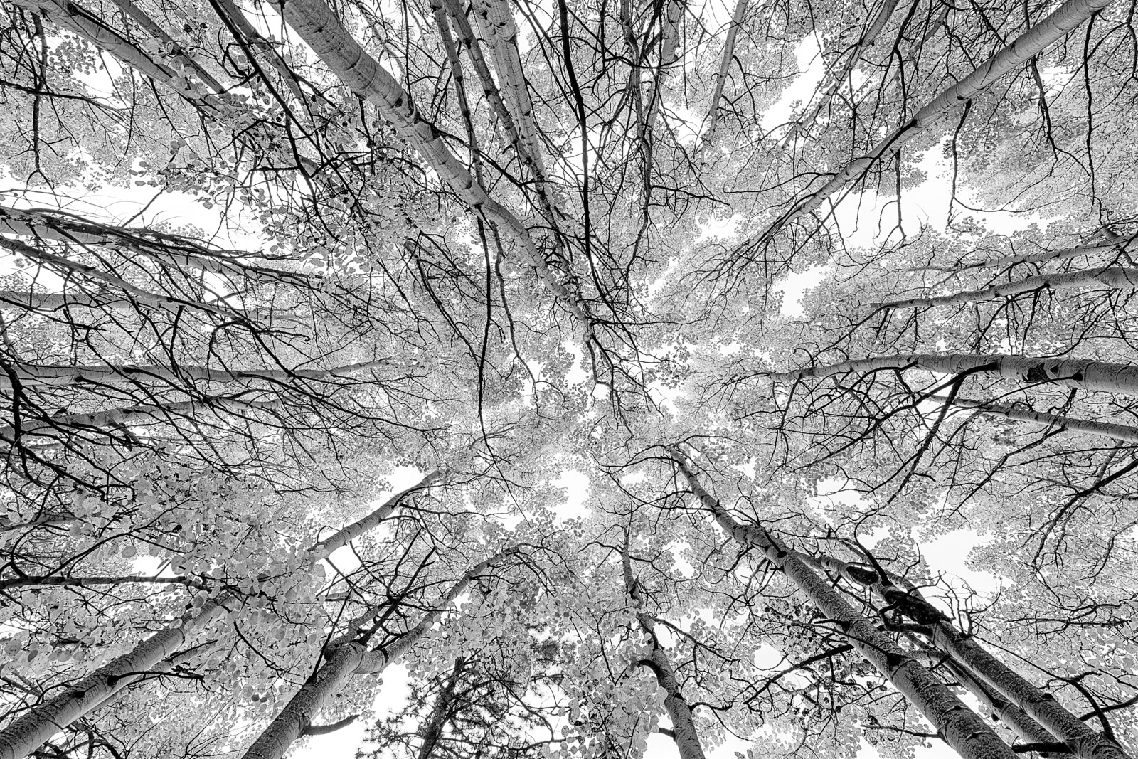
I'm out playing in Colorado where the aspens have begun going brilliantly gold up high. I really like the structure in the trees so I took the gold away and went B&W. Who needs gold anyways? I do like the single pine as well as the two trees play off each other so beautifully in color.
I'd appreciate your thoughts on this. I plan to get out and play in these trees more later this week before I have to head home.
(large version is posted)
Thanks,
Jeff
a7rii, 16-35 @ 16mm, F11, 1/20 sec, ISO 100
Comments
12 commentsI love this perspective and like that you went with B&W rather than in-color. Makes it have more of a design-quality.
Hi Jeff,
There's a lot of depth to the grays in the scene. The center point of the comp is well done. Please post the color version too..........................Jim
Thanks for the comments.
Here's the color version that I used as input for the B&W. I'm much more into the B&W version myself so I wouldn't call this a final.
I really like the B&W take on a classic fall color comp. Very well done.
Now that's how to say "autumn color" without even using any color ink! The gray tones make it obvious that we are not looking at dark green leaves. In fact, given the small amount of color in the sky in your color image, it's obvious that your black and white conversion makes a much more exciting image. Have fun out there!
Love the perspective and this groupof trees worked really well for this type of shot. Where symmetry is important, I might have tried placing the center of the trees in the center of the image - seems a little of center to the right. Also might try toning down the leaves just a bit so as to separate them better from the sky - or darket the sky areas to provide the separation. Very minor adjustments, quite impressive as is.
The symmetry is definitely a challenge. I was wandering around in a roadside grove looking up trying not to run into any trees to find this set. ;) I think that set of trees on the top (especially that long one) push the center off a bit. In composing, I was basing my center point on the 2 trees coming out from the bottom corners and the two centered on the sides. The bright open sky center left/right, but a bit below the vertical center felt good being there as well. Thats how I got to this framing.
So now in photoshop I thought it would be a good excercise to see where everything actually converges. I drew some lines in along trees. Some single and some closer clumps as triangles. The yellow area represents where those trees converge. The blue lines mark the center of the photo. If I bring the center over to that area it actually feels more unbalanced to me. I'd lose the balanced lengths of the trees on the sides as well as my corner anchor trees and their matched lengths. I see its something I'd have to adjust the angle and perspective in the field.
I like pulling back the leaves a bit to get more separation.
Thanks! Gives me food for thought as I get back out to exploring the next couple days. I will probably head out from work tonight in Avon, CO and start slowly working my way back to Chicago via Rocky Mountain Natl Park. Never been there.
A great rendition, with almost a wintery feel due to the amount of white in the frame. I guess the yellow would have contrasted nicely with a blue sky, so I imagine a color version would look very nice too. But I like the choice of B&W and the resulting emphasis on shapes and pattern.
Hi, Jeff, really like the B/W version, (though I think a colour version could work if pushed/pulled hard to giving a much more 'abrstract' feel that moves a away from a documentary type shot). I think you would have been hard done to find a better balance than the one you have already chosen. I could image this large on archive paper ... The light coloration of the foliage gives it an almost IR feel to it for me.
Cheers, Mark
The B&W is excellent, Jeff. The converging lines and the symmetry work very well. Nicely done!
--P
Nice work on this, Jeff. I like the b&w version very much and the impact it seems to have. I think your framing works great. It feels good... and if it feels good it must be! Nick
Like the BW Version. The delicate details are very appealing to explore.