
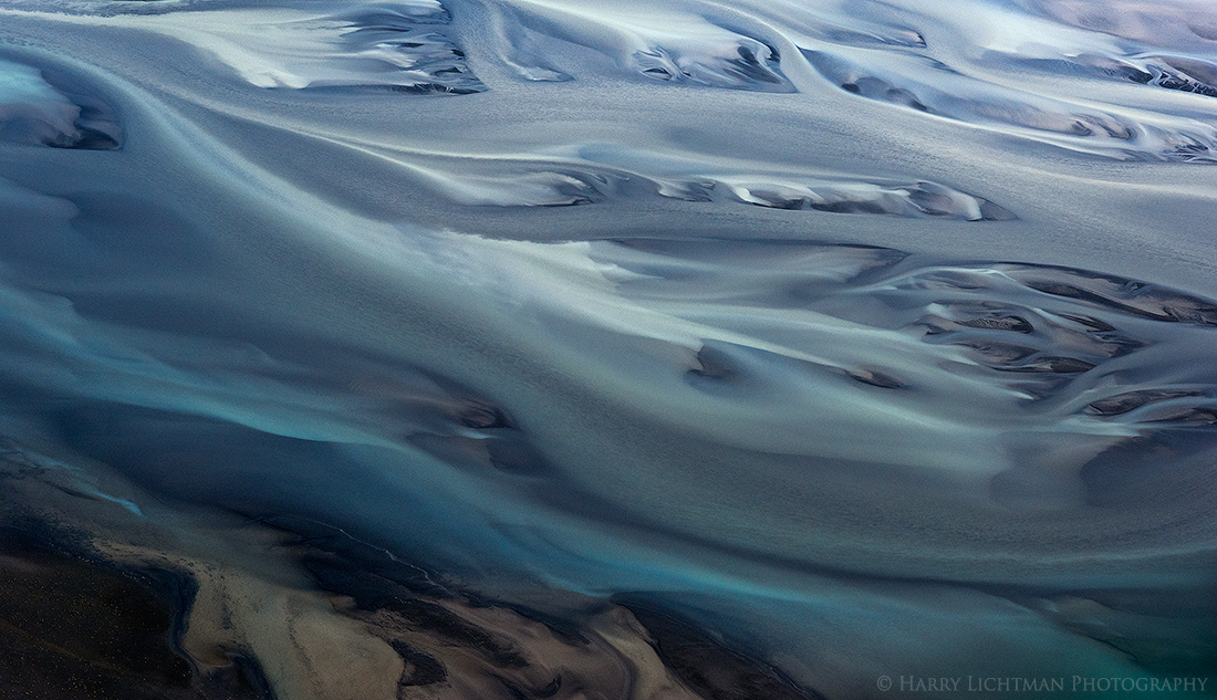
An abstract view of a glacial river in south west Iceland. The rivers lend themselves to this type of presentation, as they contain many different colors, shapes and textures. While I like some things about the image, I am having difficulty with the comp and really not satisfied with cropping options. I have already cropped some land off the top which really competed with the water. Some of the more interesting parts of the image are the top most features, but they are much brighter in comparison to the lower parts. They seem too close to the edge of the frame for me. Also not sure about the muted land a tht LLC as it is not balanced with anything similar on the top. So, I am on the fence about holding onto this one at all - maybe does work as a pano?
I looked at it too long, so more objective eyes are welcome.
Nikon D810, 24-120, polarizing filter.
Large Version Included
Comments
16 commentsI love the color and swirl of the water, Harry. One of the first things I noticed was that the more complex patterns are near the top. I assume you don't have another capture of this that eliminates the land and shows more of the water at the top? If not,then what about a pano crop with a slight rotation to provide more water, less land? Since it is abstract, we might not notice if you give it a tilt. That might also enable inclusion of some land at the top to balance the LLC, or perhaps remove the LLC land through rotation while including moreof the water in the upper middle.
Nice abstract. Might a crop off the left to remove the darkest area in the LLC and off the bottom to remove the brown work for you?
This photo grabs the imagination. I like the soft lines and colours. Without the darker land area it would be more abstract, but in my opinion it adds some context and also works for me as interesting patterns are present here too.
Thanks for the ideas. I think I will try your idea Marylynne as this was the only frame of the image. As you will see, land abuts the upper most edge, but the land is more defined, as if a thin film of water covered the shallows in the bottom of the image so they will look distinctly different. I will process with a rotation and repost in this thread.
Doug - That might be a good compromise. Thanks.
I rotated the image slightly then warped the edges and I think it looks a whole lot better. Any other ideas welcome. Thanks Marylynne!
Such amazing texture and color. I assume helicopter? I might suggest rotating the piece 30degrees or so and then cropping the bottom llc out. Out of the box suggestion but maybe? So much coolness going on in the top 1/2.
aF
This is stunning, Harry. It's the kind of image that invites the viewer to sit down and study the various textures, colors and forms. I love it.
Both are very nice, Harry. As an option, I'm leaning more toward an abstract with none of the land included. Fascinating.
Harry, I definitely prefer the original image. The upper land and the warp in the repost aren't really working for me. I think the colors, lines, and textures are excellent.
--P
Great work once again. Of the two options presented, I prefer the re-post. But in fact, I'd be curious to see what happens when you crop some more off the bottom of the initial version to get rid of the dark stretch of land at the bottom. I would hope that this could place even more emphasis on the interesting shapes in the river.
I definitely prefer the abstract first post. I might burn down the top some and lighten the lower area just a bit to avoid having the top pull my attention out of the frame. But not much, as it is a nice tonal gradient upward. This works for me.
I prefer the OP by far. The top of the repost seem obtrusive to me.
I like the texture you achieved very much. The Ice looks like sandpaper...
I love the swirls and the texture and gradient of this. I like the original much better. I don't like the land at the top, and I have no problem with the darker, muted LLC. The image has a nice gradient from bright URC to dark LLC. Just a great image, Harry!
I also prefer the original without the land at the top but then I don't have a problem with the area in the LLC. Don't always need to have "balance" especially in an abstract in my opinion. Great work!
Thanks for all of the input. While my vision of the original shot was to just include the water, my zoom wasn't tight enough so I tried to iclude land forms that would not detract. I think the following edit is now my current favorite We'll see how I feel in a week! Thanks for all of the ideas. A little crop, rotation and warp was used to keep the most interesting aspects of the image while maintain a good sized file dimension. Just cropping would have eliminated too much of the areas I wanted to keep.
I like this, Harry. The now smaller bit pf brown in the llc doesn't bother me and the top edges give the most interesting forms just enough space.