Nature Photographers Network
This is the preserved archive of the original Nature Photographers Network. The community continues at naturephotographers.network.
Mallard Portrait + RP
‹ PreviousAvian GalleryNext ›

Mallard Portrait + RP

by John Launstein

Gallery: AvianPosted March 29, 201586 views11 comments
OK, I know this probably won't work for all of you (heck, I may be the only one in my own family that this really "speaks to")! :biggrin: BUT--I really like this image and comp and desperately could use some objective feedback on it (so thanks in advance!).

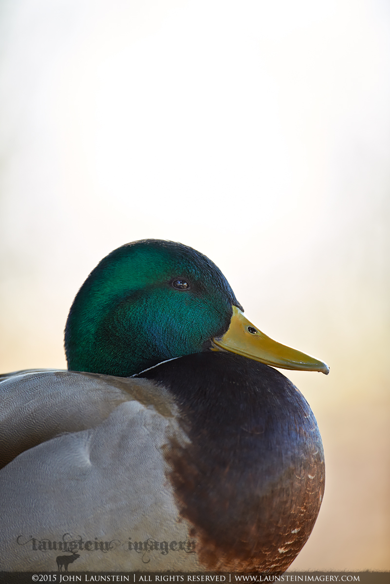
Photographed at Reifel Bird Sanctuary in Delta, BC while out on the Coast with Jenaya and Josiah last month. I was hoping for two things on this day at Reifel: mallards in flight, and a portrait of a pintail (a species I adore but rarely see). I came close but didn't really hit either. SO, I did what any other frustrated wildlife photographer would do: I took a break. (OK, not sure if any other wildlife photographers do this, but I do!) And when I sat down beside my tripod, I noticed this handsome mallard drake doing the same--taking a break under a shade tree. The resulting open light with high key background was just WAY too intriguing for me, and I dropped my tripod legs down to the ground and framed a few compositions up. He looked so elegant sitting there, and I wanted to capture that if possible. For some reason, this is the one that I liked best.

So--whatcha think? At the very least, it looks like a cool stamp to me as a thumbnail :rolleyes: but please view the LARGER version...much better detail and IQ. Thanks!

Nikon D600
Nikkor AF-S 500mm f/4D IF-ED
ISO 640
1/250sec @ f/4.5
Tripod mounted
Full Frame

Not a lot done in post...very slight bump to colour temperature and brightness, selective curves, very light dodging. I left the rather noticeable vignette I get with this lens near-open as I thought it added something.

Comments

11 comments
Comment posted by Ken Watkins on March 29, 2015 at 7:59 AM
John,
The "glow" on the Mallard is magical, certainly works very well for me.
:toast: :toast: :toast:
Registered on December 15, 2010, 1537 Posts, 4877 Comments
Comment posted by Keith Bauer on March 29, 2015 at 8:59 AM
Hi John: Yes, taking a break sometimes is exactly the right thing to do. You just never know what you might see while you are relaxing!! I like the pose of the mallard and the very tight crop on him from left to right. The space above..... If this were to be used on a stamp, or on a magazine cover, then the negative space would be an added benefit. As a straight photo to print and hang on the wall, I don't care for it. I always ask if I were a painter would I have added a component to an image to help gauge its' value. Of course that is subjective as well so there isn't a singular answer.

Details: At f/4.5 there wasn't enough depth to cover front to back and the closest part of the brown breast isn't quite there. Since it was sitting still, I'm assuming you could have gained more DOF at the expense of shutter speed or if needed, push the ISO up a bit.
Registered on November 20, 2003, 458 Posts, 4836 Comments
Comment posted by Hans Overduin on March 29, 2015 at 9:53 AM
I'll go along with the Stamp-theory along with Keith. Besides that the image appeals to me as well, because of the fine feather detail and the unusual approach :wink: , Cheers, Hans
Registered on August 31, 2011, 491 Posts, 3807 Comments
Comment posted by Dennis Plank on March 29, 2015 at 5:47 PM
I like this, John. I looked at it first on a tablet and wasn't sure about all that negative space, but on the computer it comes across differently. I think you might want to play with a border around it and see what that does to the effect, but you're certainly not alone in liking this treatment.

:toast:
Registered on January 28, 2008, 1767 Posts, 23192 Comments
Comment posted by Kurt Bowman on March 30, 2015 at 1:36 AM
Hey John, another vote to remove a lot of the negative space (unless you send it in to a magazine). There than that, I dig it. I normally don't like a lot of dark subjects against a light BG, but this one really works for me in that area.
Registered on June 19, 2008, 1005 Posts, 8028 Comments
Comment posted by David Rowe on March 30, 2015 at 4:33 AM
Hi John, I like the steely stare of this mallard with his inflated curved breast – gives him a good impression of satisfied fulfillment!

Interesting graduated tones on the cheek and behind the eye. DOF fine detail is limited to the regions where it counts most, namely to the side of the head and beak. I think I would have cropped a centimeter or two from the top edge of the original file. Vignette isn’t an issue here and the portrait is fine as it stands.

There’s a wealth of opportunity in photographing mallard drakes and the females too. Keep on shooting them!

Regards, David
Registered on December 20, 2013, 133 Posts, 286 Comments
Comment posted by John Launstein on March 30, 2015 at 4:58 AM
Thanks so much for your feedback, Ken, Keith, Hans, Dennis and Kurt! I've incorporated most of your suggestions in this repost I think, adding a light border, trimming it to 4X5 aspect ratio to lose some of the additional negative space, and I corrected a toning issue in the high key area that I noticed on the original caused by a selective curves adjustment. I've also brightened the middle lights SLIGHTLY here. If the colour is different that's probably because I only uploaded a 1200px file on the original post, and I've noticed NPN's reduction algorithms shift the colour a bit for the 720px post.

Anyway, aside from the lack of DOF to include the side feathers, is this an improvement? Thanks in advance!
Registered on April 5, 2011, 223 Posts, 1193 Comments
Comment posted by Hans Overduin on March 30, 2015 at 6:36 AM
Hey John, the repost is even better ! Although I do like negative space, the overall composition seems more balanced now. The tonal adjustments are well done as well - although I did not have any problems here in the original post ! Cheers, Hans
Registered on August 31, 2011, 491 Posts, 3807 Comments
Comment posted by Dennis Plank on March 30, 2015 at 9:11 AM
Even better than the original, John. And still the right format for a magazine!

:toast:
Registered on January 28, 2008, 1767 Posts, 23192 Comments
Comment posted by Keith Bauer on March 30, 2015 at 10:26 AM
Hi John:

I think the repost has better tones. As you noted, if you only post the 1200 px version, the NPN software has a flaw in that it does NOT honor the color space when it creates the 720 px version. I strongly discourage the use of that option until it is corrected. I've pointed out the error and have not seen any movement on getting it corrected.

This version would work well on a greeting card with that aspect, while the original would work well on a magazine cover with the typical aspect ratio for that presentation. Certainly a different look.
Registered on November 20, 2003, 458 Posts, 4836 Comments
Comment posted by Wayne Jones on March 30, 2015 at 9:52 PM
Well, I see Keith beat me to it. My first thought was "This is a cover shot! Some editor is bound to want the name of their magazine up there on top."
Looks like you enticed the drake to come into your studio so you could give it the full treatment with the ideal lighting and background.
Registered on April 18, 2007, 953 Posts, 6435 Comments