Nature Photographers Network
This is the preserved archive of the original Nature Photographers Network. The community continues at naturephotographers.network.
Bald Eagle
‹ PreviousAvian GalleryNext ›

Bald Eagle

by Luke Ormand

Gallery: AvianPosted March 9, 20151,281 views9 comments
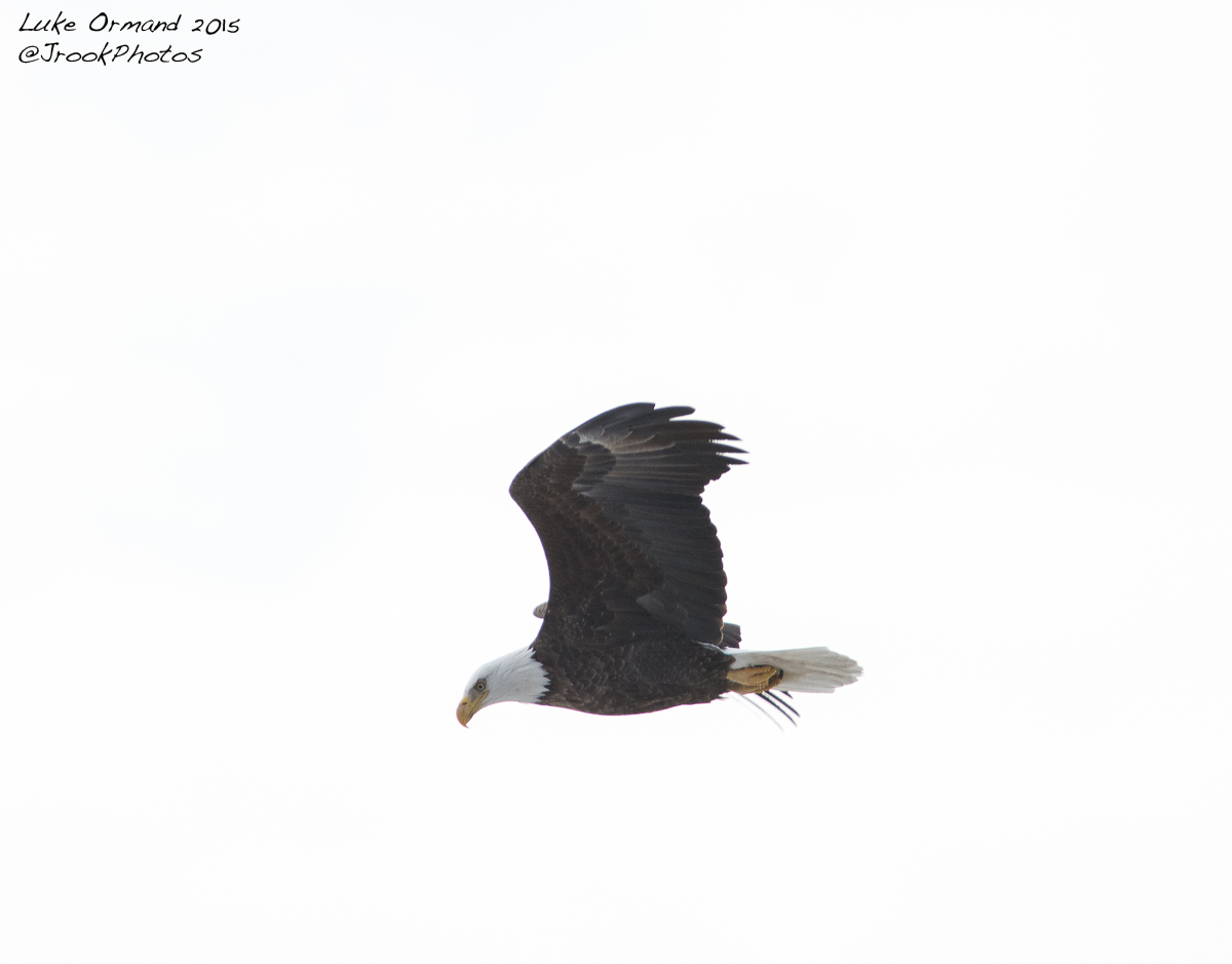
Here is another image - just a click or two after the previous. Due to the clean BG I could place this bird anywhere in the frame I want so I'm curious to hear how others feel about the composition.

Nikon D7100 300mm f4 + 1.7X TC HH


- Luke

Comments

9 comments
Comment posted by Allen Brooks on March 9, 2015 at 9:43 PM
Good detail and I like the pose-the way he's looking down intently as if he has spied some prey. For my taste, I might at least like to see how this would look with the eagle more towards the upper right corner, as it might give the eagle more room to fly into and more of a sense of him looking down from a height. He seems too centered as it is now. That's my two cents worth. :toast:
Registered on July 27, 2011, 262 Posts, 2597 Comments
Comment posted by Wayne Jones on March 9, 2015 at 11:18 PM
Congrats again in finding your Long Island eagle, Luke. This is very nice action position, just as Allen already said. Not as "pretty" as your previous post, but more interesting. In addition, the techs on this one look nice -- sharp and well exposed. I'll also add another two cents to Allen's suggestion about the comp, especially since would like to see it looking down into the frame instead of out of the bottom. (Pretty soon you may have more than a nickel's worth of advice!) :smile:
Registered on April 18, 2007, 953 Posts, 6435 Comments
Comment posted by Brian Gatlin on March 9, 2015 at 11:21 PM
Luke, this looks sharper but still has that dull low light/low contrast look to me. I pulled it into PS and used a levels layer to pull the black point in to about 25 and the white point in a ways too (and maybe further with some masking so you don't lose the brightest whites in the head and tail), then added a bit of contrast in curves and thought it brought out a little more.
Registered on March 21, 2009, 202 Posts, 4187 Comments
Comment posted by Luke Ormand on March 10, 2015 at 9:43 AM
Brian,

Feel free to post the image or e-mail it to me. The sky was overcast (obviously) and the sun (behind the clouds) was behind the subject. Since this is the first time I've photographed an adult BE I don't have a lot of experience in what it "should" look like (how dark the darks and how white the whites) so any help is appreciated.

I did also push things in Lightroom to make it more of a high-key image. And If I'm really lucky I can get a dimes worth out of you guys!
Registered on February 4, 2009, 1093 Posts, 7035 Comments
Comment posted by Barb Pflaum on March 10, 2015 at 12:01 PM
Nice sharp image of this Eagle and I like the pose. I agree with Allen and Wayne about the comp.
Registered on January 14, 2009, 316 Posts, 2724 Comments
Comment posted by Kurt Bowman on March 10, 2015 at 9:20 PM
This one definitely looks sharper Luke; however, I don't like the wing position as much in this one. i agree with the comp suggestion below moving it top right.
Registered on June 19, 2008, 1005 Posts, 8028 Comments
Comment posted by Mike Ramy on March 10, 2015 at 11:04 PM
Hey Luke,
I'm liking your Eagle series so far and as you are finding out, any encounter with an Eagle is a good thing. There have been some excellent comments and advice so far and none that I can argue with. Now here is another 2 cent suggestion towards filling up your change purse. In the shooting conditions that I am seeing here, the best results are accomplished by setting your exposure compensation somewhere between + 2/3 to + 1 and 2/3 to obtain proper exposure of your subject against this type of sky. Sometimes there is little time for setting EC and that is why anticipation is key in these situations.
:cool: Man !
Registered on June 16, 2012, 567 Posts, 2809 Comments
Comment posted by Brian Gatlin on March 11, 2015 at 8:32 AM
Luke, here's a quick version. I cropped your 1200 pixel image down to 720 pixels to focus on how the changes impact the eagle (i.e., this is not a comp suggestion). This is with the blacks pulled in to 25 in levels and a bit of contrast in curves. let me know what you think.
Registered on March 21, 2009, 202 Posts, 4187 Comments
Comment posted by Luke Ormand on March 11, 2015 at 7:48 PM
Brian - thanks a lot for the changes I really see the improvement.

Thanks to all for the info and encouraging me to take the few extra minutes to get things right
Registered on February 4, 2009, 1093 Posts, 7035 Comments