Nature Photographers Network
This is the preserved archive of the original Nature Photographers Network. The community continues at naturephotographers.network.
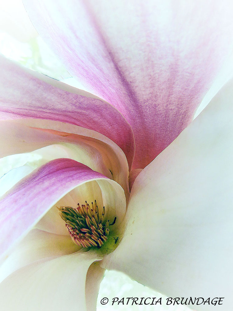
Magnolia in B&W
‹ PreviousFlora GalleryNext ›

Magnolia in B&W

by Patricia Brundage

Gallery: FloraPosted January 1, 2015356 views12 comments
Color version posted as the large image. Was drawn by the graceful flow of the petals. Converted to black & white and can't decide which I like better so would like your input. Taken with Powershot SX50 in macro mode... F4, 1/80 sec. ISO 80, -0.3 exposure.

Your suggestions and comments are always appreciated.

Comments

12 comments
Comment posted by scott lanz on January 1, 2015 at 9:16 AM
Beautiful, Patricia. Nicely composed. I agree that the petals curving over the center gives this a very graceful look. I like both versions, but I think I prefer the color. I personally would back off on the sharpening and otherwise try to soften the image just a bit. Is that an insect to the right of center?
Registered on November 14, 2003, 840 Posts, 12902 Comments
Comment posted by Bill Fach on January 1, 2015 at 9:41 AM
Patricia: What a wonderful New Year gift to have you posting again and a beautiful image for sure. I do like them both and especially like the conversion. My only suggestion would be to clone away the center debris and then print it large. >=))>
Registered on November 1, 2003, 1805 Posts, 26981 Comments
Comment posted by Nancy Lea Sandy on January 1, 2015 at 10:29 AM
Wow. that would be a hard choice but I'm leaning towards the b&w version. It is sooooo elegant! I would get rid of the little bug in the center, though. Nice work
Registered on January 24, 2011, 576 Posts, 6942 Comments
Comment posted by Mike Ramy on January 1, 2015 at 10:53 AM
Hey Patricia,
My vote is for the color version, the B&W is very nice and has a unique charm but loses definition in the lines of the petal edges that the color version demonstrates. I agree with the removal of the debris.
Well done on a very interesting comparison of a lovely image.
Happy New Year . . . :wavey:
Registered on June 16, 2012, 567 Posts, 2809 Comments
Comment posted by Allen Brooks on January 1, 2015 at 1:34 PM
I was initially drawn to the graceful geometry of the black and white photo. In the color version my eye is drawn more to the colors, so I guess it depends what one is after. I find the black and white photo more unique. I might clean it up a bit (remove some of the green background) to accentuate the edges of the petals.
Registered on July 27, 2011, 262 Posts, 2597 Comments
Comment posted by Alberto Patiño on January 1, 2015 at 2:13 PM
Definitely the color version for me, Patricia! I can see the point about cloning out the smudges near the center, but I think that the image also works as it is - it gives more realism, I think. :toast:
Registered on December 2, 2014, 278 Posts, 1736 Comments
Comment posted by Ian Wolfenden on January 1, 2015 at 5:46 PM
So nice to see you posting again, Patricia !! I will put my vote in for the b&w version - I like its gentleness and the softness which comes through better, I feel, in the subtlety of the greys of the shadows. Beautiful !!!
Registered on May 18, 2007, 1108 Posts, 7647 Comments
Comment posted by Mark Seaver on January 1, 2015 at 11:19 PM
While the b&w version has lots of interesting flow, the color version is dynamite! It has the flow plus all of the great colors.
Registered on January 23, 2011, 1103 Posts, 17270 Comments
Comment posted by Philip Hodgkins on January 2, 2015 at 11:58 AM
The B/W is OK, but I fall firmly on the side of color. This is such a recognizable and iconic color on the petal, and very photogenic. On the B/W, it just looks like noise. Also, as Scott pointed out, removing the bug and backing off on the sharpening would improve this excellent pic even further. You might look further into cloning out some or all of the defects in the petals. Anything which interferes with the visual flow of the petals. :smile:
Registered on July 24, 2006, 2741 Posts, 12349 Comments
Comment posted by Catherine Reilly on January 3, 2015 at 4:01 AM
Magnolias are challenging subjects for me and yet I can't resist trying the capture because, as you point out, the petals are so graceful. I'll usually prefer a color image over a B/W; in this case because of the black lines that look out of place. Guess I would have been tempted to blend them away... The color image provides the context for the black lines, and to me, shows off the flower better. B/W is more abstract, artistic in how it looks like a pencil sketch.
Registered on August 16, 2006, 603 Posts, 9192 Comments
Comment posted by Giuseppe Guadagno on January 14, 2015 at 3:03 PM
Sorry Patricia, I can't help you because I love both in the same way; they both create a splendid design with their flying petals. Bravo!
Registered on February 3, 2007, 827 Posts, 5052 Comments
Comment posted by Lucy Aron on May 19, 2015 at 11:12 PM

Works beautifully as b & w,  However the white areas between petals seem less well integrated with subject.

Registered on February 25, 2011, 189 Posts, 1160 Comments