Nature Photographers Network
This is the preserved archive of the original Nature Photographers Network. The community continues at naturephotographers.network.
Parting Shot 2 + Original
‹ PreviousLandscape GalleryNext ›

Parting Shot 2 + Original

by Bill Fach

Gallery: LandscapePosted December 10, 2014573 views29 comments
Sony A77
Sony 70-400G @ 280mm CPL
ISO 100, 1/640 @ f8
Great Sand Dunes NP

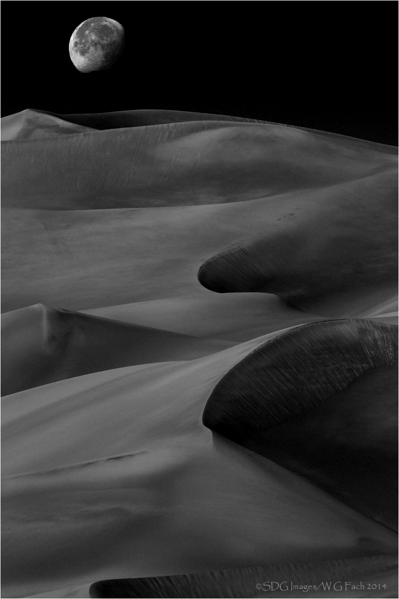
OK, this is way out of my comfort/expertise zone so please critique with brutal honesty. I do very little B&W as I just don't seem to see in tones but I wanted to try something with this image. All suggestions and comments extremely welcome. >=))>

Comments

29 comments
Comment posted by Carey Closs on December 11, 2014 at 12:18 AM
This is an amazing pic. Looks like something that could have been taken by one of the rovers on Mars I'm sure you could have a lot of fun and come up with some equally good versions just by selectively dodging and burning the dunes but as is, the processing looks pretty good. Great shot, wall hanger for sure.
Registered on April 15, 2012, 107 Posts, 326 Comments
Comment posted by Preston Birdwell on December 11, 2014 at 1:05 AM
First, let me say: View the Large Version, folks!

I think this is gorgeous, Bill! The shadows and the mid tones look very nice with good separation. You might look at bringing up the higher values in the dunes just a bit. The Moon looks perfect, to me. I love the composition, and the almost dreamy feel, but it also has a dynamism I really like.

Nicely done!

--P
Registered on November 1, 2003, 471 Posts, 5188 Comments
Comment posted by Grant Collier on December 11, 2014 at 5:18 AM
I really like this shot, and I think it's a very good artistic rendering of the scene. You didn't really say how you created the image, but since you asked for brutal honesty, I'll say that I don't see how it could be anything other than a composite of two images at different times. With the camera settings you posted (and considering the lighting and phase of the moon), the dunes shot must have been taken in bright daylight. The moon would appear much fainter and with much less detail in daylight, like it does in your other shot with the moon. So it looks like the moon was shot when it was dark. I have no problem with combining images this way and this came out very well. I'd just say that in a critique forum, it's good tell the full process you used to capture the image. Unless, of course, your reason for asking for brutal honesty was to see if others could tell it was a composite. :cool:
Registered on July 29, 2005, 73 Posts, 430 Comments
Comment posted by Bill Fach on December 11, 2014 at 9:01 AM
Grant: Thanks for the feedback but this was a single capture. I did the conversion in CS5 using the channel mixer in a B&W layer and processed the moon as a separate layer. Here's the RAW original.>=))>
Registered on November 1, 2003, 1805 Posts, 26981 Comments
Comment posted by Rick Turner on December 11, 2014 at 10:38 AM
Wow. Wow Bill. Stupendous :jump:
Registered on February 18, 2012, 534 Posts, 2755 Comments
Comment posted by Alberto Patiño on December 11, 2014 at 11:09 AM
Bill, this is gorgeous. At first I though too that this was a composite image. Seeing that it is not makes it even more remarkable in my view. I think that the original color version could work too if you can darken the sky and increase the contrast with the moon, but the B&W version is gorgeous!
Registered on December 2, 2014, 278 Posts, 1736 Comments
Comment posted by D.A. Edwards on December 11, 2014 at 12:21 PM
I'm with Carey on this, just a bit of highlighting of the dune tops to help lead the eye to the moon and this one should be good to go. Looks like a comfort zone to me, Bill. :toast:
Registered on October 8, 2014, 226 Posts, 1187 Comments
Comment posted by Ed Lowe on December 11, 2014 at 2:04 PM
Otherworldly. I love it, Bill.

Ed
Registered on February 7, 2004, 414 Posts, 7115 Comments
Comment posted by Jared Warren on December 11, 2014 at 2:44 PM
Fantastic, Bill. I wondered if it was a composite as well, but, man, well done! I think bringing up the lightest tones in the dunes slightly would improve an already outstanding image. Congrats!!! :toast:
Registered on May 11, 2012, 84 Posts, 931 Comments
Comment posted by Grant Collier on December 11, 2014 at 3:51 PM
Hmm, that's interesting how the b&w conversion can really make the moon stand out. I don't do much b&w either, but I played with one of my own in b&w and the moon can really pop if you don't include cyan in the conversion. I'm glad to be proven wrong since I learned something.
Registered on July 29, 2005, 73 Posts, 430 Comments
Comment posted by Mark Metternich on December 11, 2014 at 5:06 PM
Cool shot!

I think I'd like to see the moon smaller and on the right side so that eye flow leads to it better. Also smaller so that my mind does not immediately think fake. Other than that maybe a little more contrast and slightly sharper in the land.
Registered on June 19, 2009, 276 Posts, 6240 Comments
Comment posted by Vance Gese on December 11, 2014 at 5:14 PM
Absolutely stunning, Bill. Absolutely stunning. Fine art photography at its finest.
Registered on November 13, 2008, 298 Posts, 6629 Comments
Comment posted by Harley Goldman on December 11, 2014 at 5:55 PM
Beautiful image!! I would concur with Preston's suggestion, but minor stuff. Excellent image. Love the wavy lines leading out to the moon.
Registered on November 19, 2003, 586 Posts, 11271 Comments
Comment posted by Michael Lowe on December 11, 2014 at 8:09 PM
Where's the flowers? All kidding aside, awesome work. :toast: :toast:
Registered on February 11, 2004, 777 Posts, 5252 Comments
Comment posted by Mark Pelton on December 11, 2014 at 8:13 PM
what you did with the moon is remarkable. Actually the whole image processing is remarkable. I agree about lightening the dunes somewhat. very creative.
Registered on November 25, 2003, 380 Posts, 4647 Comments
Comment posted by Thomas Haney on December 11, 2014 at 8:39 PM
Extraordinary shot and processing Bill! I was surprised after looking at the shot to read "this is way out of my comfort/expertise zone", because I'd call the conversion pretty close to masterful. The raw file isn't very impactful but has a lot of "raw" potential, and I think you realized it 100%. I hesitate to suggest anything because I like it so much, but it feels right at the top to me and experimenting with adding a bit of black canvas would be easy, and on the bottom I would try cropping up a bit to eliminate the small dark area at lower left. Really great shot Bill, I'd be proud of this one.
Registered on April 7, 2013, 138 Posts, 537 Comments
Comment posted by Mark Seaver on December 11, 2014 at 10:28 PM
This is wonderfully mysterious, Bill. The details in the moon are great and there's such a fine sense of flow (to the point of feeling like wave action) in the dunes and their shadows. I would try bringing up the brightness just a bit in the dunes, but am not sure that would be an improvement. Looking at the original, it's clear that your b&w transformation changes a pleasant scene into something special.
Registered on January 23, 2011, 1103 Posts, 17270 Comments
Comment posted by gary phillips on December 11, 2014 at 10:50 PM
This is just fantastic, Bill. If I were you, I would go back thru the catalog of images and begin to look at converting a fair amount of them to mono. I'm not kidding. My love of black and white images started with not feeling the color image told the story I wanted to tell. It is a wonderful journey and I think after this image you will be irretrievably hooked. Beautiful job on this. Bravo :toast:
Registered on October 24, 2013, 185 Posts, 4136 Comments
Comment posted by Aaron Feinberg on December 12, 2014 at 2:33 AM
Unreal. SICK work.

aF
Registered on October 26, 2009, 399 Posts, 2789 Comments
Comment posted by Stuart Williams on December 12, 2014 at 8:29 AM
bill - intriguing image and it tickles me that people immediately assume that the moon is faked. Says something, methinks! I'm glad that you posted the original, raw image. my immediate thought, on seeing the raw image, is that this would look gorgeous as a high key image (such as those by Huntington Witherill - e.g., this one). There is such a temptation to ratchet up the contrast slider that I think we lose sight of other interpretations. I'd love to see how it turns out if you do try it.
Registered on December 7, 2007, 247 Posts, 4792 Comments
Comment posted by Mark Zelinka on December 12, 2014 at 12:46 PM
This is a very strong image, beautifully processed. I like the feeling one gets of following the sand dune ridges up towards the moon, like something out of a fantasy.
Registered on August 20, 2007, 206 Posts, 998 Comments
Comment posted by Nick Bristol on December 12, 2014 at 3:43 PM
Bill, Wow, I'm really enjoying this one! Great comp and I love the textures this has. A little crop of the bottom is all that I would do but just fine as is. Very nice work! :smile:

Nick Bristol
Lone Rock, WI
Registered on February 1, 2004, 752 Posts, 14140 Comments
Comment posted by R.Bill Moser on December 13, 2014 at 6:19 AM
I really like the shot. Coll idea! I would like to see a bit more contrast and maybe the highlights a tad brighter.
The land looks a bit soft to me, though. It looks very artistic.
Registered on January 29, 2010, 285 Posts, 4281 Comments
Comment posted by Patricia Brundage on December 13, 2014 at 7:23 AM
The chosen composition of the image is striking with the leading lines to the moon. Would like to see a little more tonal range in the conversion to b&w. You've hit a home run with this one Bill!
Registered on March 23, 2006, 1111 Posts, 6531 Comments
Comment posted by John Williams on December 13, 2014 at 11:54 AM
This is just brilliant Bill. The comp is so amazing that even the flat raw looks great to me. With that out of the way, what Stuart said, what Stuart said! :jump:
Registered on September 6, 2007, 221 Posts, 5985 Comments
Comment posted by Stan Rose on December 13, 2014 at 9:20 PM
Here's my take :wink:
Im glad you posted the raw...cause if you hadn't I would have said "the moon is too dark relative to the lit portion of the dunes"--that's because I assumed this was a night shot, with the moon shining real bright and the dunes moonlit. As the raw demonstrates, it's actually a day shot... so I guess it all depends on your goals--if you want to create photo art, have at it! If you want to convey the real experience, personally Id process it with a subdued sky/moon cause that's how it would have appeared. I aint against 'manipulation'--in fact id 'add' some sky up top so it's not so tight--but it depends on you goals with the image.
Registered on September 15, 2005, 836 Posts, 17099 Comments
Comment posted by Bill Chambers on December 15, 2014 at 3:04 PM
The B&W version is so otherworldly! Very neat. That said, I find myself enjoying the original more than the B&W. Beautiful.
Registered on April 10, 2005, 753 Posts, 21216 Comments
Comment posted by Pat Sampson on December 28, 2015 at 3:20 PM
Bill,

The black and white doesn't work for me and I think it's mostly because the moon doesn't have the same degree of clarity as the sand and I see the moon as the main subject of the image - it's where my eye comes to rest.  However, I like the color version a lot.  The softness (low contrast) in the sands and shadows matches the faint detail and presence in the moon.  Great sense of mystery and nature magic as well as a superb composition.

pat
Registered on May 19, 2007, 953 Posts, 15989 Comments
Comment posted by Marylynne Diggs on January 3, 2016 at 12:48 PM
I really like this, Bill.  The conversion looks good to me.  As presented, I strongly prefer the b/w version, but that is partly because the color version is raw and underdeveloped, amd partly because I am personally in a b/w phase.

The moon looks natural to me, given the focal length, and the daytime exposure combined with b/w conversion.  Sometimes I think we photographers know the art and process so well that we critique the how rather than just appreciating the wow.  I get a wow out of it. and I like that.
Registered on December 14, 2010, 122 Posts, 1034 Comments