Nature Photographers Network
This is the preserved archive of the original Nature Photographers Network. The community continues at naturephotographers.network.
The Magestic
‹ PreviousLandscape GalleryNext ›

The Magestic

by Harry Lichtman

Gallery: LandscapePosted November 10, 2014431 views19 comments
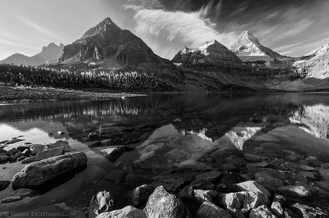
My time in the Mount Assiniboine area coincided with the Larch display, so I tried to include them in my images whenever possible. I selected this comp. to include the backlit trees as well as the peaks n the area.

I do like the BW conversion, but I am concerned that it may be too busy as a BW. Your thoughts appreciated. The original below for comparison.

Thanks!

5DII, 16-35L, ISO 100, f14 single exposure

Comments

19 comments
Comment posted by Harry Lichtman on November 10, 2014 at 11:12 AM
The original version.
Registered on September 17, 2010, 304 Posts, 3507 Comments
Comment posted by Ronald Murphy on November 10, 2014 at 12:13 PM
I much prefer the color version. On the other hand, that haze in the ULC is a little distracting and may be less so in the B&W version.
Registered on March 13, 2012, 279 Posts, 975 Comments
Comment posted by Louis Pattis on November 10, 2014 at 12:23 PM
I love the black and white conversion and the trees really pop, I would like to see the (blue) above the clouds a little lighter.
Great to see both, conversion and original, on my monitor the original could do with a little more contrast in the upper quarter. Your love for the mountains is greatly expressed through this image. :toast: :toast:
Registered on March 30, 2012, 0 Posts, 164 Comments
Comment posted by Mark Seaver on November 10, 2014 at 12:30 PM
Both versions look great to me, Harry. Yes, the b&w version is busy, but if you printed it large and hung it on a wall, that would keep me enjoying it daily for many years. I also think going b&w lets the left 1/4 of the sky work better. The color version is spectacular in its own right, especially with the warm light on the foreground rocks and the perfect reflections, but the haze in the left quarter of the sky becomes a slight distraction.
Registered on January 23, 2011, 1103 Posts, 17270 Comments
Comment posted by Bill Reid on November 10, 2014 at 1:34 PM
Both versions look good to me Harry. I might lighten the central sky area in the B&W to balance the sky better. I think I like the color version better by a nose. Both are great. Wonderful detail in both images.
Registered on January 27, 2013, 65 Posts, 2460 Comments
Comment posted by Pat Sampson on November 10, 2014 at 1:59 PM
I'm surprised Harry but I prefer the color. I think because of the warmer mood it conveys. I like the composition a lot in both and the comp is not too busy for me in the B&W. I suppose I might consider a crop in from the viewer's left to reduce the impact of the upper left corner but it's no big deal either way. I love the complexity of the composition in your recent images.

pat
Registered on May 19, 2007, 953 Posts, 15989 Comments
Comment posted by R.Bill Moser on November 10, 2014 at 2:14 PM
Great black and white Harry! I do love both version but the black and white is so strong. Great tones and well processed
Registered on January 29, 2010, 285 Posts, 4281 Comments
Comment posted by Wayne Jones on November 10, 2014 at 5:31 PM
Man, both of these are fantastic, Harry.
I can't say exactly why, but for some reason the bright foreground seems to work better in the color version (maybe because it's in balance with the colors in the distance on the right 1/3 of the comp?); but it seems to me to be a distraction in the black & white version. In fact, now that I think about it, the main attraction for me in the whole image is beyond that flashy foreground. So -- especially in the black and white, I would like this even better if the brightest parts of the foreground were toned down or even partially cropped out.
Registered on April 18, 2007, 953 Posts, 6435 Comments
Comment posted by Harley Goldman on November 10, 2014 at 5:59 PM
Both work for me, but I prefer the B&W. To my eye, it has more dramatic impact. Real nice, Harry.
Registered on November 19, 2003, 586 Posts, 11271 Comments
Comment posted by Mark Metternich on November 10, 2014 at 8:20 PM
Powerful black and white. Everything works for me. I like both versions.
Registered on June 19, 2009, 276 Posts, 6240 Comments
Comment posted by gary phillips on November 10, 2014 at 8:58 PM
Not surprising but I like the B/W version slightly more than the color. I suspect that clients will follow their preferences. The mono version is very strong and I love the detail and complexity of tonality. I am viewing on a IPad and there appears to be a pretty strong halo on most of the ridge line that may have to dealt with before making any large prints. Otherwise a tremendous presentation. :toast:
Registered on October 24, 2013, 185 Posts, 4136 Comments
Comment posted by Daniel Rappaport on November 10, 2014 at 9:14 PM
Definitely a lot going on, but perfect tones and all of the elements add interest and work together well. I like the BW better.
Registered on September 9, 2009, 294 Posts, 2006 Comments
Comment posted by Harry Lichtman on November 11, 2014 at 6:55 AM
Thanks for all of the comments. I guess not too busy for most, and the preference for color or BW seems a bit split which is expected. Thanks again! :wavey:
Registered on September 17, 2010, 304 Posts, 3507 Comments
Comment posted by D.A. Edwards on November 11, 2014 at 12:05 PM
I prefer the B+W primarily because of the ULC haze that others have mentioned. I don't find the image to be "too busy." Rocky mountains are rocky. :wink:
Registered on October 8, 2014, 226 Posts, 1187 Comments
Comment posted by Ryan Shain on November 11, 2014 at 6:47 PM
Harry,

I like both images, but I am leaning towards the color because I feel the tones, light, and depth are such a beautiful aspect to this fine image. They shine for me in the color.

fantastic view :toast:
Registered on February 20, 2007, 226 Posts, 4571 Comments
Comment posted by Ed Lowe on November 11, 2014 at 8:49 PM
Hard to choose a favorite because they are both beautifully done., Harry. For me the B&W is so dynamic that I have to give it the edge. You really can not go wrong with either one. BTW not to busy for me.

Ed
Registered on February 7, 2004, 414 Posts, 7115 Comments
Comment posted by Ian Cameron on November 12, 2014 at 7:18 PM
Glad you posted the colour version too. I much prefer the colour one. I think it needs the combination of blues and yellows to resolve the image best.
Registered on August 6, 2004, 1125 Posts, 3318 Comments
Comment posted by Nick Bristol on November 13, 2014 at 11:06 AM
Harry, I love the look and feel of this image. It is a beautiful place and you captured it in some wonderful light and conditions. The b&w version looks great but I especially like what the color does for this one. Beautiful work! :toast:

Nick Bristol
Lone Rock, WI
Registered on February 1, 2004, 752 Posts, 14140 Comments
Comment posted by Lucy Aron on January 1, 2015 at 1:23 PM
The light is captured very well but maybe cropping the bottom bright rocks might allow the eye to focus more agreeably. Also seems a bit oversharp.
Registered on February 25, 2011, 189 Posts, 1160 Comments