Gallery: LandscapePosted November 4, 2014232 views17 comments
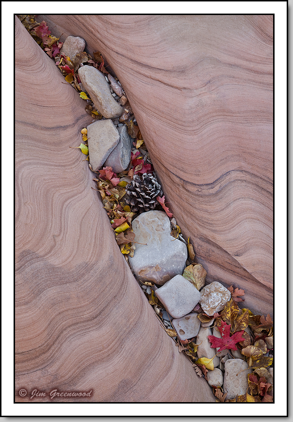
East Zion
Canon 5D II
Canon 24-105mm f/4L IS
67mm, f/20, 0.8 second, ISO 50
Comments
17 comments
Comment posted by Stuart Williams on November 5, 2014 at 1:40 AM
being an upstanding citizen of the world, i prefer this vertical (as opposed to those horizontally oriented folks out there ...). i reckon that with some judicious tweaking, you might get some more pop from the colours in this (particularly in the rock).
Registered on December 7, 2007, 247 Posts, 4792 Comments
Comment posted by Riccardo Boesso on November 5, 2014 at 5:31 AM
In my opinion both versions work well.
But if I should choose...I'd choose this one. :)
Registered on October 15, 2014, 13 Posts, 72 Comments
Comment posted by scott lanz on November 5, 2014 at 6:49 AM
I like the "flow" of this image better than the horiz, but for some reason the lines in the rock seem more distinctive in the horiz. Either works beautifully, however; just depends on personal preference and image use. One last thought - what about flipping the horiz so that the crack "flows" narrower to wider?
Registered on November 14, 2003, 840 Posts, 12902 Comments
Comment posted by Jim Greenwood on November 5, 2014 at 9:18 AM
Hmmm ... Scott, interesting suggestion. To my eye this looks unexpected, I guess because this is not how I viewed the scene and framed it when I photographed it. But to the viewer who of course wasn't there, maybe one or the other (comparing the horizontal versions) seems more appealing.
Registered on November 9, 2003, 229 Posts, 1523 Comments
Comment posted by Pat Sampson on November 5, 2014 at 10:04 AM
I like all three a lot Jim but my favorite is the second on this post. Love the pattern in the stone.
pat
Registered on May 19, 2007, 953 Posts, 15989 Comments
Comment posted by Harley Goldman on November 5, 2014 at 10:21 AM
Hmmm, very interesting study. I like this one, but I was going to say I like the first post (horizontal) best, until I got to your flipped version below. I like that one best. The flow of the repost leads me up from the bottom up to that one really nice red leaf top right. You really can't go wrong with any, but put me down for the flipped repost.
Registered on November 19, 2003, 586 Posts, 11271 Comments
Comment posted by Bill Chambers on November 5, 2014 at 10:23 AM
Beautiful Jim. I think I like this format even better than the horz. one. Both are beautiful though.
Registered on April 10, 2005, 753 Posts, 21216 Comments
Comment posted by gary phillips on November 5, 2014 at 11:02 AM
For me the vertical version is the best, although the flipped horizontal is pretty darn nice. I'd say that someone's wall is going to be much nicer as a result of these images.
Registered on October 24, 2013, 185 Posts, 4136 Comments
Comment posted by Swathiraj G on November 5, 2014 at 11:49 AM
This is a very nice composition and people have noticed this. I can read it from all the comments below. Thanks for sharing this.
Below uploaded horizontal frame is excellent which gives a different dimension to the design of rock.
Registered on April 26, 2014, 71 Posts, 153 Comments
Comment posted by Ryan Shain on November 5, 2014 at 6:31 PM
This one and the flipped one are in a tie for me, it depends on my mood, but these are so sweet Jim. Just beautiful vision to see images like this in nature!!
Registered on February 20, 2007, 226 Posts, 4571 Comments
Comment posted by Jared Warren on November 5, 2014 at 8:13 PM
Wonderful, Jim! I'd hang this on my wall any day. Really nice mix of elements. My preference is for the vertical.
Registered on May 11, 2012, 84 Posts, 931 Comments
Comment posted by Ed Lowe on November 5, 2014 at 8:27 PM
This is certainly a wow intimate landscape, Jim. Everything works beautifully here from the graceful lines in the rock to the collection of items in the diagonal notch. Outstanding image.
Ed
Registered on February 7, 2004, 414 Posts, 7115 Comments
Comment posted by scott lanz on November 5, 2014 at 8:43 PM
Jim, not to confuse the issue any more, but what I actually meant was to "flip" the original horiz image so that narrower part of the crack was at the top, and the wider at the bottom, as is the case in the vertical. You could obviously do the same with the horiz repost image. Of course, you really can't go wrong any way you orient this one.
Registered on November 14, 2003, 840 Posts, 12902 Comments
Comment posted by Vance Gese on November 6, 2014 at 12:10 AM
Stunning image, Jim, simply stunning. Don't see how this could be any better. In comparing with your second, 'flipped' version, I have to say that I prefer this vertical version. The flow of your vertical composition is perfect to my eye.
Registered on November 13, 2008, 298 Posts, 6629 Comments
Comment posted by Jim Greenwood on November 6, 2014 at 9:57 AM
Scott ... well that really looks strange to my eye. It looks up-side-down, as if the rocks and leaves in the crack are defying gravity. I didn't shoot these images from directly over the scene looking straight down. So there is definitely a "top" and a "bottom". The reposted horizontal, even though it has been flipped, still looks like the top is the top and the bottom is the bottom.
Registered on November 9, 2003, 229 Posts, 1523 Comments
Comment posted by Lucy Aron on November 26, 2014 at 2:46 PM
Marvelous collection of goodies. There's so much "stuff" in the crevice that I like to choice of subdued rather than over-saturated colors.
Registered on February 25, 2011, 189 Posts, 1160 Comments
Comment posted by Lucy Aron on January 1, 2015 at 1:26 PM
Lovely. Has the illusion of a "staged" landscape. Colors also wonderful as well as textures.
Registered on February 25, 2011, 189 Posts, 1160 Comments

Comments
17 commentsBut if I should choose...I'd choose this one. :)
pat
Below uploaded horizontal frame is excellent which gives a different dimension to the design of rock.
Ed