Nature Photographers Network
This is the preserved archive of the original Nature Photographers Network. The community continues at naturephotographers.network.
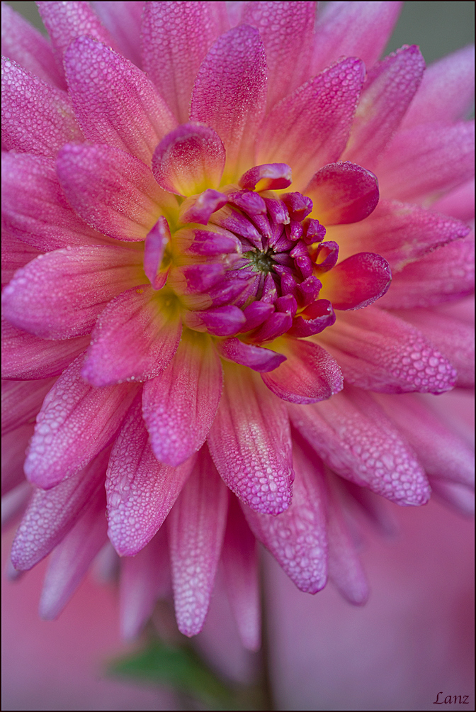
Dewey Dahlia Duo 2
‹ PreviousFlora GalleryNext ›

Dewey Dahlia Duo 2

by scott lanz

Gallery: FloraPosted October 5, 2014166 views9 comments
Here is a softer version of Dewey Dahlia Duo (my previous post). One of the things I really struggle with is deciding which version of an image is better/best and is the one that is saved. So which version of this image is better and should be saved? D600, 150 macro, cpl, f8, 1/320, iso 500. Thanks for looking and giving an opinion. Much appreciated. :wavey:

Comments

9 comments
Comment posted by Pat Sampson on October 5, 2014 at 6:02 PM
Really tough call Scott. I like the detail in the first but I think I prefer the mood conveyed by the softness in the second. In the second, I might also prefer a tighter crop that eliminates any of the green bg from the image. Not an improvement just an alternative. Beautiful work on both.

pat
Registered on May 19, 2007, 953 Posts, 15989 Comments
Comment posted by Ian Wolfenden on October 5, 2014 at 6:13 PM
A very sensuous image, Scott ! Unusual perhaps to have glimpses of leaf and stem but I think it works here because of the angle on the flower centre. Superb rendering of the droplets. Comparing with the previous version I think I like the soft one better.
Registered on May 18, 2007, 1108 Posts, 7647 Comments
Comment posted by Bill Fach on October 5, 2014 at 8:38 PM
Scott: I do prefer this version for the position of the subject in the frame. I think I would also crop about 10% off the bottom and then print it large.>=))>
Registered on November 1, 2003, 1805 Posts, 26981 Comments
Comment posted by Albert Darmo on October 5, 2014 at 10:54 PM
Hi Scott :wavey: I too prefer the second soft version :wink: :smile: :smile: ..like Pat said " i prefer the mood conveyed by the softness of the second" Extraordinary light and color in both versions :toast: :toast:


Albert Darmo
Canada
Registered on November 25, 2008, 1386 Posts, 11978 Comments
Comment posted by Ken Smith on October 6, 2014 at 12:06 PM
Lovely with those dew-jewels! Nicely done! I prefer this version…the blurred b/g and softer contrast keeps the focus firmly on the flower.
Registered on September 5, 2008, 449 Posts, 2444 Comments
Comment posted by Nathan Buck on October 6, 2014 at 1:05 PM
I think I like this one a bit better Scott. Mainly how the flower fills the top portion on the frame a bit better. I also like the added softness at the bottom. Very nice.

Nathan
Registered on November 1, 2003, 1101 Posts, 13589 Comments
Comment posted by S Govindarajan on October 6, 2014 at 2:24 PM
Wonderful image, Scott. While I like the overall softness in the second image, I slightly prefer the first one. I find the green in the bottom a little distracting. Nevertheless, both are exquisite. :toast:
Registered on April 19, 2008, 115 Posts, 1921 Comments
Comment posted by Ramamohan Pai on October 7, 2014 at 7:38 PM
Scott - another superb take. Prefer this over previous but tough call :cool:
Registered on November 1, 2003, 550 Posts, 9037 Comments
Comment posted by Mike Ramy on October 9, 2014 at 10:21 AM
Hey Scott,
My vote will also be 'Tough Call'
Hope this helps !
Registered on June 16, 2012, 567 Posts, 2809 Comments