Nature Photographers Network
This is the preserved archive of the original Nature Photographers Network. The community continues at naturephotographers.network.
Kiwi Dreams
‹ PreviousPhoto Art GalleryNext ›

Kiwi Dreams

by Jeff Martyka

Gallery: Photo ArtPosted September 10, 201499 views6 comments
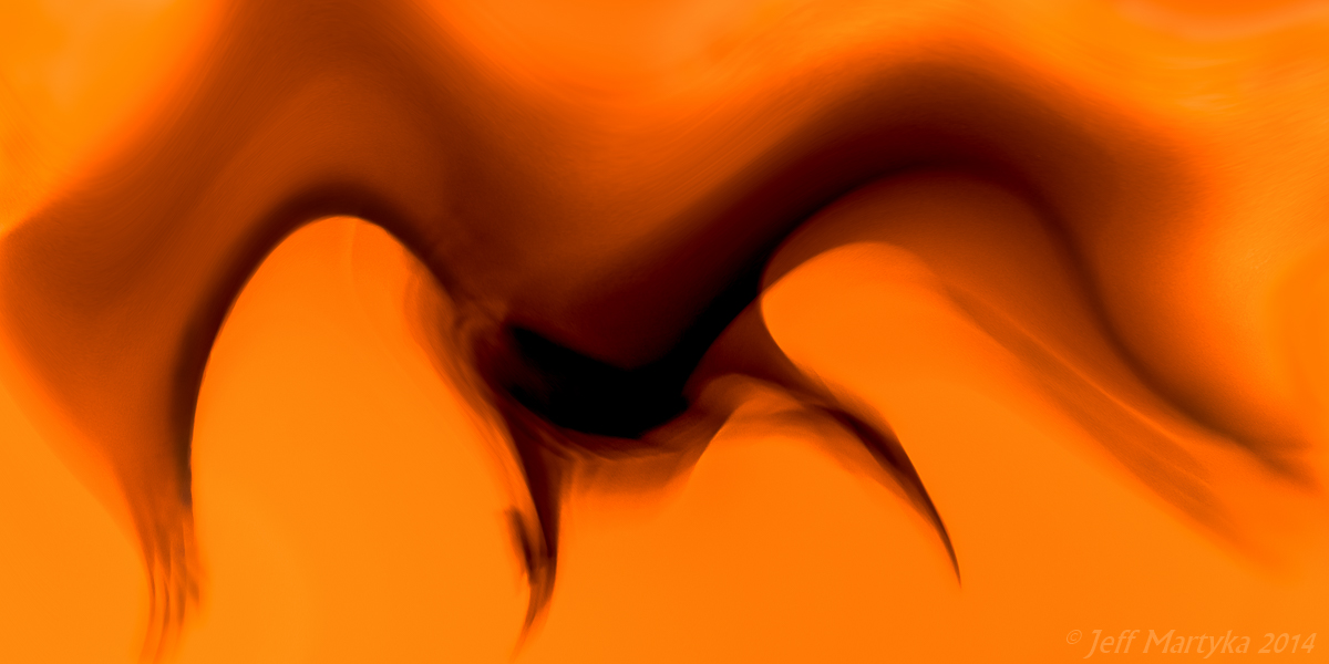
I couldn't sleep last night, so I thought why not play around in Photoshop and see what some filters do. Slightly sleepy is a great time to be creative!

This started as one of those images of a bird flying through the sky where the exposure is long enough to capture the wings from top to bottom. It was a bit after a great sunset... the background was a bluey purple. Lilac I suppose. The bird (a sandhill crane, Jasper County Park in Indiana) was flying straight as an arrow.

I used the speherize filter in the vertical only and it took the wings and gave them these great curves and moved the feet beneath as though the bird had just launched straight up. I colorized it to get the orange instead of purple background.

Finished it off with some burning to accentuate the curves and bring out the feathers on the tips.

Regarding the title: Kiwi Dreams. The compression of the neck and body makes it look more like a Kiwi than a sandhill crane...and what Kiwi bird wouldn't dream of launching into flight?

Looking forward to your thoughts.

Thanks,
Jeff

Comments

6 comments
Comment posted by Gary McGhee on September 11, 2014 at 3:00 AM
Very creative Jeff, great imagination. I like it. It could maybe do with a touch more space around the frame. Looks good.

Cheers, Gary.
Registered on April 15, 2010, 142 Posts, 2416 Comments
Comment posted by Catherine Reilly on September 11, 2014 at 6:19 PM
Boy, what a great conversation piece to hang in a place where people gather! I couldn't figure out what I was looking at until I read your description. Then, of course, the bird popped out. I think it's wonderful-- abstract, thought-provoking and very creative.
Registered on August 16, 2006, 603 Posts, 9192 Comments
Comment posted by Karen Kane on September 12, 2014 at 2:02 AM
I really love the fluid nature of this Jeff, and also the minimalistic nature. Perhaps, as Gary suggested, a bit of extra canvas - but this is quite easy to look at as-is :toast:
Registered on August 4, 2012, 66 Posts, 726 Comments
Comment posted by Mark Seaver on September 12, 2014 at 4:45 PM
This is neat, Jeff. The color is great and you've created a fine sense of motion. (I'm might have called it Pterodactyl Attack. :biggrin: ) I too wonder about more space around the frame, but I'm not sure it would be an improvement.
Registered on January 23, 2011, 1103 Posts, 17270 Comments
Comment posted by Jeff Martyka on September 13, 2014 at 11:23 PM
Thanks for the comments! Quite helpful!

I went back through my iterations and was able to find one that had a bit more room on the right and bottom. There isn't more space to work with on the top or left. I think I like the extra bit of space and that the left wing still reaches to the bottom.

A couple people thought it looked like a bat. Pterodactyl attack gives me an idea though...need to get to a museum sometime.

Thanks,
Jeff
Registered on June 20, 2014, 30 Posts, 155 Comments
Comment posted by Mike Ramy on September 18, 2014 at 12:46 AM
Far Out Man . . .
This takes me back to my hippie days,
I like the second version best with more room and the colors and abstract aspects are superb.
If I can find my old Lava Lamp, I'm going to order a print to go with it.
:cool: Man !
Registered on June 16, 2012, 567 Posts, 2809 Comments