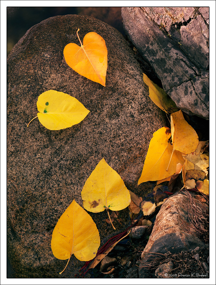
I found this nice grouping of Fremont Cottonwood leaves adjacent to McGee Creek in the Sierra.
Tachihara 4x5
180mm Fujinon
Fuji 160 Pro-S Color Negative
TK's Masks
October 2008 Recently Reworked
Color negative film is notoriously difficult to scan. So, obtaining the best color balance is often (always?) a challenge. I think this looks pretty good in those terms, but I would appreciate your thoughts. I did not make any changes to saturation; only to color balance and contrast.
Note: In IE 11 the reds and yellows are much more saturated than with FireFox. Therefore, I'd suggest viewing this in any browser other than IE.
Please see the larger version. Thanks!
Your comments are always appreciated.

--P

Comments
13 commentsThe color looks good to me on both my MacBook and my big Dell. I use a Chrome browser. I don't care much for IE in any version. (smile)
pat
I've always found fall colors with yellows and reds hard for me to work out on my own stuff, and that's transparency. Not sure I could get things this close using color neg. I do also use Firefox latest version all the time. It works best for my viewing for sure.
btw: I totally agree about your comment on my posted image.....thank you. I'll post an update tomorrow when I've collected better sight.
OK, I've got some eyes back this morning. I did update my image. I think the only item on your image I might change is maybe a bit opposite of mine. This is slightly intense by a hair. Colors look fine, just maybe a little too much yellow pop. Could be just me.
John
Peter
Ed
Here's the result. What say you?
Large Version is Here
Many Thanks,
--P