Nature Photographers Network
This is the preserved archive of the original Nature Photographers Network. The community continues at naturephotographers.network.
Seal Rock Monochrome
‹ PreviousLandscape GalleryNext ›

Seal Rock Monochrome

by Joseph Campisi

Gallery: LandscapePosted July 23, 2014122 views10 comments
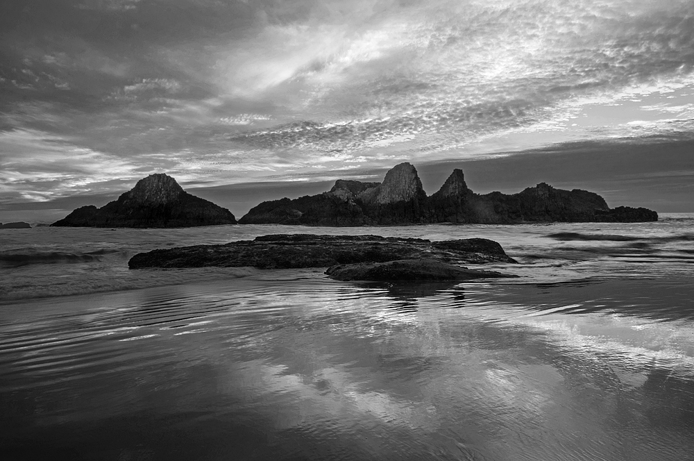
The sunset colors never developed fully due to the clouds that moved in rather quickly...as happens frequently on the coast.

I converted this to black and white, and was pleased with the contrast and tonal range, making it a much more striking presentation in my opinion. Your opinions and suggestions are always appreciated of course... :smile:

I'm also posting the color version below for comparison.

Nikon D5000
18mm, F/22, 1/2, ISO-100

Comments

10 comments
Comment posted by Joseph Campisi on July 23, 2014 at 4:06 PM
Here's the color version for comparison...
Registered on November 24, 2008, 304 Posts, 3211 Comments
Comment posted by Harley Goldman on July 23, 2014 at 5:57 PM
I think they both work well and convey far different moods. Great sky and reflection.
Registered on November 19, 2003, 586 Posts, 11271 Comments
Comment posted by Richard Teller on July 24, 2014 at 7:09 AM
I like the image and the composition. I think I lean towards the color image because of the color in the reflection in the foreground. It seems to balance the picture more for me.
Registered on August 23, 2010, 1162 Posts, 6692 Comments
Comment posted by Pat Sampson on July 24, 2014 at 6:50 PM
Beautiful images Joseph. I prefer the color in this case. Blue and yellow works well together and the complements are very striking to me.

pat
Registered on May 19, 2007, 953 Posts, 15989 Comments
Comment posted by scott lanz on July 25, 2014 at 4:47 PM
I agree with Pat, Joseph. Also, the nice reflection stands out more in the color version.
Registered on November 14, 2003, 840 Posts, 12902 Comments
Comment posted by Preston Birdwell on July 25, 2014 at 7:01 PM
I like them both, Joseph. Each tells a different story. You did a great job with both.

Well done!

--P
Registered on November 1, 2003, 471 Posts, 5188 Comments
Comment posted by Tony Kuyper on July 25, 2014 at 11:10 PM
Works nicely in B&W. The shapes and texture come out very nicely. I like the glassiness of the reflectin.
Registered on November 1, 2003, 364 Posts, 22328 Comments
Comment posted by Joseph Campisi on July 26, 2014 at 12:03 AM
Thank you all for your feedback. I'm kind of surprised that the consensus is for color. Not that I don't like it, but as Tony mentioned, the shapes and textures really come out in the monochrome version. Maybe a little more contrast in the color version might yield similar results?
Registered on November 24, 2008, 304 Posts, 3211 Comments
Comment posted by Mark Metternich on July 26, 2014 at 3:53 AM
Simple and works great! I like the B+W. :toast: :toast: :toast:

Maybe a little halo disguising?
Registered on June 19, 2009, 276 Posts, 6240 Comments
Comment posted by Nick Bristol on July 26, 2014 at 4:26 PM
Joe, This is a very nice shot! I'm all for the b&w version here and especially when looking at the large version. I agree the shapes and textures through out are wonderful. Nice work Joe! :smile:

Nick Bristol
Lone Rock, WI
Registered on February 1, 2004, 752 Posts, 14140 Comments