Nature Photographers Network
This is the preserved archive of the original Nature Photographers Network. The community continues at naturephotographers.network.
Sun, Moon, and Stars (+)
‹ PreviousLandscape GalleryNext ›

Sun, Moon, and Stars (+)

by Jared Warren

Gallery: LandscapePosted May 4, 2014441 views17 comments
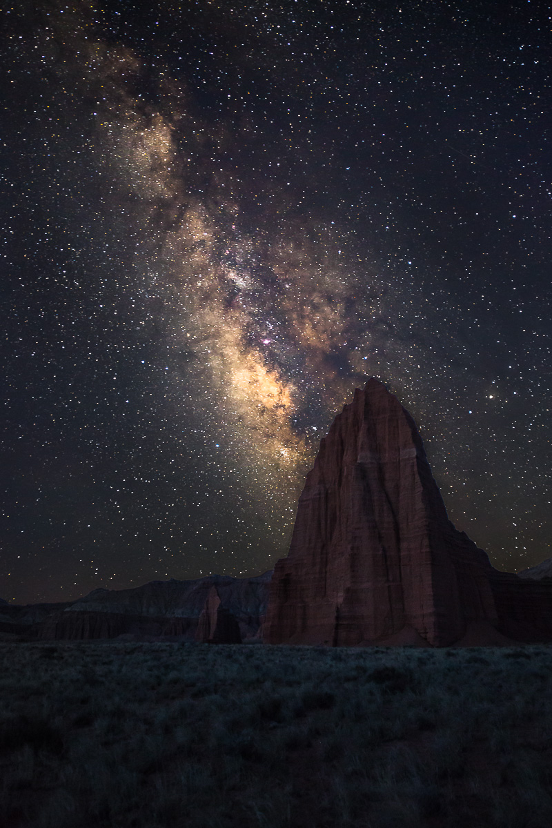
Temples of the Sun and Moon, Lower Cathedral Valley, Capitol Reef National Park. This is a 2-image blend (one for sky/stars, one for foreground/monolith). Both were at f/2.8, 24mm, 25 sec, ISO 5000. The star exposure was at about 4:00am; the foreground exposure taken a little later as the first light appeared on the horizon.

Any C&C is appreciated, but what I'm particularly wondering about is the foreground brightness. I want it to be dark, of course, but just bright enough to make out some detail.

I have to say, standing beneath this monolith, alone, at 4am, looking up at the multitude of stars, was an interesting exercise in feeling small and insignificant. At the same time it was a feeling of peace and grandeur, a feeling that I am an active participant in this great cosmos. :cool:

Comments

17 comments
Comment posted by Scott Fricke on May 4, 2014 at 5:00 PM
Amazing scene Jared! Nothing beats being out in the desert with the Milky Way in the night sky. I love the comp and I think you have the perfect exposure on the Temples and foreground. I much prefer the relative darkness, it gives the appearance of being moonlit. So often you see blends where the foreground looks like it was taken at sunset, or worse during the day, this has a very natural look to it.
Registered on January 19, 2007, 133 Posts, 1448 Comments
Comment posted by Stan Rose on May 4, 2014 at 5:37 PM
Im gonna be a bit tough on you, cause this is a terrific comp with a lot of potential. Milky Way photos are a dime a dozen, so only the strongest survive :wink:

1) Sky is nice and clear, and good contrast--I think a very subtle boost in the blue (via WB) would help counter the overall monochrome look of the photo.
2) Might burn down the brightest portion of the galaxy just a bit, for a little more texture/separation
3) Lose half the field, it doesn't add anything here.
4) Push the fg contrast as hard as you can--it's appropriately dark but also as a consequence very flat. Boosting the contrast would also boost the color (which IMO could use a boost, unless you want a monochrome look)

Just my opinions-YMMV
Registered on September 15, 2005, 836 Posts, 17099 Comments
Comment posted by Sairam Sundaresan on May 4, 2014 at 5:50 PM
Beautiful starry sky Jarred. I echo a lot of what Stan has said. Also brightening the foreground a little a making the white balance a little less green would be nice too. Lovely attempt Jared, it's totally worth the effort! :toast:
Registered on March 14, 2013, 100 Posts, 643 Comments
Comment posted by R.Bill Moser on May 4, 2014 at 6:01 PM
Jared, this is a good comp. I agree with what Stan said about the processing. I think this image is worth the effort and to work a little bit on it
Registered on January 29, 2010, 285 Posts, 4281 Comments
Comment posted by Jared Warren on May 4, 2014 at 8:05 PM
I tried to incorporate the helpful feedback so far in this edit. Your thoughts? Let me know if I went too far with the slightly lighter and "contrastier" foreground (wish it could be viewed on black). I don't want the foreground to look "detached" from the sky.
Registered on May 11, 2012, 84 Posts, 931 Comments
Comment posted by Joseph Campisi on May 4, 2014 at 8:33 PM
The repost looks great Jared! I think you could darken the foreground a bit more to make it look more natural. Other than that, great image! I like how the sky looks relatively noise free, an issue I see with a lot of night sky images. Great job!
Registered on November 24, 2008, 304 Posts, 3211 Comments
Comment posted by John Mumaw on May 4, 2014 at 9:13 PM
That's a lot better, Jared. Those were some great ideas posted by Stan.
This is a terrific image, and my one suggestion would be to back off on the 'harshness' (for lack of a better word) of the Milky Way itself. Yes, our cameras can capture an amazing amount of stars in the sky, but do they need to? As Stan says, these types of images are becoming quite common and I'm finding myself drawn to the 'less is more' starscape.
One question....why ISO 5000 for the foreground?
Registered on September 9, 2005, 62 Posts, 2289 Comments
Comment posted by Stan Rose on May 4, 2014 at 10:32 PM
HUGE improvement! :toast:
Registered on September 15, 2005, 836 Posts, 17099 Comments
Comment posted by Ken Smith on May 5, 2014 at 12:01 AM
Nicely done! Esp ++ for the repost. Shooting the foreground with a bit of light on horizon seems ideal when the size and scope of paint lighting is beyond reason. I just can’t see exposing for too long as at 4am and the noise that would be generated. Stars need moonless sky and foreground needs moon or light lingering from the sunset or at early morning. Nice comp too.
Registered on September 5, 2008, 449 Posts, 2444 Comments
Comment posted by gary phillips on May 5, 2014 at 3:01 AM
Really a winner, Jared. I think the foreground looks fine, particularly in the large view. I love everything about this. I'm heading out in the morning for a few days in and around Capitol Reef. Looking forward to some solitude and hopefully some good light. :toast:
Registered on October 24, 2013, 185 Posts, 4136 Comments
Comment posted by Jared Warren on May 5, 2014 at 3:32 AM
Thanks, fellas. I'm still figuring out my own style for this kind of image, and the feedback here is very helpful. As to Milky Way images being a dime a dozen: I had completely clear skies for practically my whole photo trip last week, and I could probably give you another eleven star field images. Who's going to pay up? :wink:

John, the 5000 ISO for foreground was due to… sleep deprivation. I suppose a longer exposure with lower ISO would have produced less noise, but my 5DIII handles high ISO noise pretty well and I had planned on keeping it pretty dark anyway. Still, 5000 for foreground was probably overkill.
Registered on May 11, 2012, 84 Posts, 931 Comments
Comment posted by Mark Seaver on May 5, 2014 at 1:21 PM
Great catch, Jared, it's a lovely night shot. The differences between the two are pretty amazing. In comparing the two, I find that I much prefer the crop in the repost, but after spending some time looking, the original processing feels much more natural, with the larger version show enough details in land to hold interest. (When I only looked at the original post, I too felt that the foreground was too dark, but I think the larger version takes care of that nicely.) In the repost, the added brightness in the sky and on the temple seem too much, plus the sky is showing some blue.
Registered on January 23, 2011, 1103 Posts, 17270 Comments
Comment posted by Nick Bristol on May 5, 2014 at 2:19 PM
Jared, That must have been quite a feeling being there for this! I pretty much agree with what Mark has just mentioned and especially in the sky. I like the look and feel of the original sky and maybe something in between the two for the foreground. The large version of the original does look good to me so it does make a difference looking at a larger file. :smile:

Nick Bristol
Lone Rock, WI
Registered on February 1, 2004, 752 Posts, 14140 Comments
Comment posted by Bill Reid on May 5, 2014 at 2:44 PM
Great shot Jared. I agree that I like the fore ground in the repost and I think I like the original sky. But a great image though. :toast:
Registered on January 27, 2013, 65 Posts, 2460 Comments
Comment posted by Kane Engelbert on May 6, 2014 at 12:48 AM
Jared, what a great shot. Cathedral Valley is one of those places that makes memories, especially at night. Its such a quite and lonely place.

I prefer the second version, I prefer the new WB and the crop. I'm also curious as to what a slightly warmer WB might look like on the Temple of the Sun. Also, I would play around with the idea of rendering the sky almost black, which would emphasize the stars without brightening them. Try a quick selection tool/refine edge for the sky only, selective color/blacks and adjust to taste. See if you like that.
Registered on June 14, 2009, 63 Posts, 291 Comments
Comment posted by John Williams on May 6, 2014 at 3:41 AM
Love it Jared. The repost is most excellent.
Registered on September 6, 2007, 221 Posts, 5985 Comments
Comment posted by Kah Kit Yoong on May 6, 2014 at 8:08 AM
Great advice from Stan and I think the edit is a clear improvement. Love the mystical feel to this.
Registered on September 27, 2006, 636 Posts, 10682 Comments