Nature Photographers Network
This is the preserved archive of the original Nature Photographers Network. The community continues at naturephotographers.network.
Trying to Remember
‹ PreviousLandscape GalleryNext ›

Trying to Remember

by Nathan Apodaca

Gallery: LandscapePosted April 1, 2014144 views7 comments
I'll keep the pano format theme going... :smile:

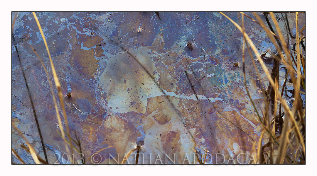
This was taken a few days, or perhaps even a week after "Artist's Palette", which I posted a bit ago (here in Colorado). The complex film of shapes and an array of colors on the stagnant water surface made me revisit this specific area more than twice over the course of a few weeks.

There's a few things I'd like to bring up, however, about this particular photo...

1.) Yes, the colors were bright and vivid in person, however by adding some (not a whole lot) of contrast to the scene using curve adjustments, etc., it did bring the image more to life, and enhance the image. In other words, this is not an exact replica, or complete representation of what I saw that evening. Now this may sound corny, but every now and then (and I let people know this when I do it), I will *slightly* enhance an image to better show what I was feeling when I saw it. So, while this is pretty close to what I actually saw, yes, it is a bit enhanced, but I will stress that it is not at all significantly altered from the original.

2.) I think I can sense the fact that some of you may think this is a bit busy! It may be, so please speak up if you think so. The foreground grasses were included to give some context, slightly frame the subject, and show what is casting that long shadow running through the middle of the frame. Let me know if you find that 'context' too distracting.

Ok, one last thing. :smile: If you didn't already figure this out, the main shape which is the actual subject, is what was left after a leaf was placed there a few days earlier. A leaf-print, I guess!

Canon 60d 55-250mm @ 116mm
ISO 100 -- f/6.3 -- 1/50 sec -- tripod -- no filters

Always appreciate the comments!

Make sure and view this one LARGE... :smile:

Comments

7 comments
Comment posted by Jim Gavin on April 1, 2014 at 8:57 PM
I have seen this fairly often on water in some ponds where we have a duck club. Especially where there is shallow water and reeds. (Mostly I just take photos). While you have added some contrast, I have seen this color without added contrast. Bit busy? Not for me. That's what it was in "real" life. I like it!
Registered on August 14, 2008, 293 Posts, 1250 Comments
Comment posted by Stan Rose on April 2, 2014 at 12:25 AM
Honestly, the fg grasses just kill it for me, they're a big distraction. Context can be fine, but here the bg is aesthetic, the fg stuff isn't. You don't 'need' to show anything, it already an abstract subject so it needs no context. Just my take. :wavey:
Registered on September 15, 2005, 836 Posts, 17099 Comments
Comment posted by Mark Seaver on April 2, 2014 at 9:00 AM
Nathan, the shapes and textures in oil sheen here are especially fine and the colors look very much like what I've seen on such films. I find the grasses and their shadows, especially the ones in the middle very distracting. If there's a way to go back and get a cleaner look at the sheen it would be a significant improvement.
Registered on January 23, 2011, 1103 Posts, 17270 Comments
Comment posted by gary phillips on April 3, 2014 at 12:08 AM
I agree with what has already been said, Nathan. Good eye to spot this and hope you have one without the grass.
Registered on October 24, 2013, 185 Posts, 4136 Comments
Comment posted by Nathan Apodaca on April 3, 2014 at 11:12 AM
Thanks for the honest critiques, everyone! Fortunately I do have some images of just the "leaf" that excludes the foreground grasses, which I may eventually post.

Mark---I think I see what you're talking about. This version has sort of a burnt feel to it. Going back to the original it shouldn't be hard to give it the cleaner look. Thanks for the comment.
Registered on November 16, 2011, 67 Posts, 1127 Comments
Comment posted by Dan Kearl on April 3, 2014 at 8:14 PM
I really like the main abstract shape and color, I might crop the stems off the right side.
Registered on September 2, 2013, 209 Posts, 1514 Comments
Comment posted by Kathy Barnhart on April 4, 2014 at 1:35 AM
Love the colors and designs in this one, but I want the grass to either be in focus or outta there! Could you crop the grass out?
Or get busy with the healing brush in PS? I do love the center part so it may be worth working on.
Registered on November 11, 2011, 404 Posts, 1639 Comments