Nature Photographers Network
This is the preserved archive of the original Nature Photographers Network. The community continues at naturephotographers.network.
Bavaro Dreams
‹ PreviousLandscape GalleryNext ›

Bavaro Dreams

by Matt Anderson

Gallery: LandscapePosted March 4, 2014611 views14 comments
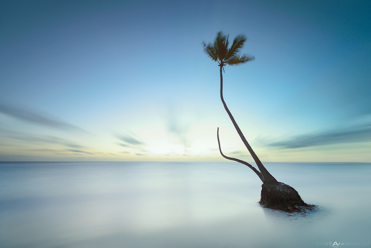
Large version shows color, Purchase Print shows a larger bw version from G+

Bavaro beach on the island of the Dominican Republic. A long exposure at sunrise. As you can see, a lone split palm, missing a crown. My experience on this coast was so peaceful with the waves slowly crashing, sun casually rising, and the new day beginning. I was accompanied only by the imperfect, yet character ridden tree.

Comments

14 comments
Comment posted by Louis Pattis on March 4, 2014 at 9:00 PM
Greeting a new day in dreamland, a spiritual take and the B&W conversion is outstanding, nothing more to say. :toast: :toast:
Registered on March 30, 2012, 0 Posts, 164 Comments
Comment posted by Jared Warren on March 4, 2014 at 9:33 PM
Gorgeous, Matt. The B&W version is more to my taste, more impactful IMO. I'm loving your bw work. Thanks for sharing. :toast:
Registered on May 11, 2012, 84 Posts, 931 Comments
Comment posted by David Chauvin on March 4, 2014 at 10:58 PM
Everything about this has a dreamlike like feel. Even though all of the elements suggest a relaxing beach there is something slightly disturbing about it. :cool: :cool:
Registered on August 5, 2004, 1007 Posts, 5595 Comments
Comment posted by gary phillips on March 4, 2014 at 11:28 PM
Way cool, Matt. I like both versions, but the b/w holds the drama and loses the yellow cast on the horizon line. . Another sweet shot. :cool:
Registered on October 24, 2013, 185 Posts, 4136 Comments
Comment posted by Harley Goldman on March 5, 2014 at 10:02 AM
Very dreamy image. I prefer the B&W, more in touch with the surreal look for me. Nice and simple image, works well.
Registered on November 19, 2003, 586 Posts, 11271 Comments
Comment posted by Rick Turner on March 5, 2014 at 10:07 AM
Surreal and beautiful. :toast:
Great b&w choice.
Registered on February 18, 2012, 534 Posts, 2755 Comments
Comment posted by Roel Wijtmans on March 5, 2014 at 10:07 AM
wow, amazing and peaceful picture! I'm a bit torn between color and b&w.... I really like the soft colors, but the bright part is a bit too washed out for me in the color version (not in the b&w version).
Registered on September 30, 2012, 116 Posts, 2257 Comments
Comment posted by R.Bill Moser on March 5, 2014 at 12:31 PM
Simply awesome. :toast: :toast: :toast:
Registered on January 29, 2010, 285 Posts, 4281 Comments
Comment posted by Stuart Williams on March 6, 2014 at 12:36 AM
pretty graphic image - i like the luminosity of the colour version but the graphical quality of the b&w. the clouds work very well in the b&w. nice work.
Registered on December 7, 2007, 247 Posts, 4792 Comments
Comment posted by Nick Bristol on March 6, 2014 at 9:31 AM
This is very nice, Matt. I like the dreamy feel this has... and I'm wishing I was there! 7" of snow again yesterday and below zero again this morning. I love the winter but this one is getting pretty long. The b&w version works especially well for me.

Nick Bristol
Lone Rock, WI
Registered on February 1, 2004, 752 Posts, 14140 Comments
Comment posted by Bill Reid on March 6, 2014 at 9:40 AM
Very surreal and wonderful tones in this Matt. Much prefer the B&W version for it's drama. Very nice.
Registered on January 27, 2013, 65 Posts, 2460 Comments
Comment posted by Chris Chamberlain on March 6, 2014 at 11:50 PM
Dude, you always manage to capture cool stuff, and present it in a very compelling and/ or evocative way!

Chris
Registered on March 13, 2007, 500 Posts, 8365 Comments
Comment posted by Mark Metternich on March 9, 2014 at 5:08 PM
Love your work dude!!!! :toast:
Registered on June 19, 2009, 276 Posts, 6240 Comments
Comment posted by Tim Mulholland on March 13, 2014 at 4:26 PM
A very nice, simple and well-executed composition.

Tim!
Registered on April 24, 2006, 14 Posts, 139 Comments