Nature Photographers Network
This is the preserved archive of the original Nature Photographers Network. The community continues at naturephotographers.network.
Mt. Morrison + repost
‹ PreviousMan & Nature GalleryNext ›

Mt. Morrison + repost

by Richard Castillo

Gallery: Man & NaturePosted January 28, 201474 views10 comments
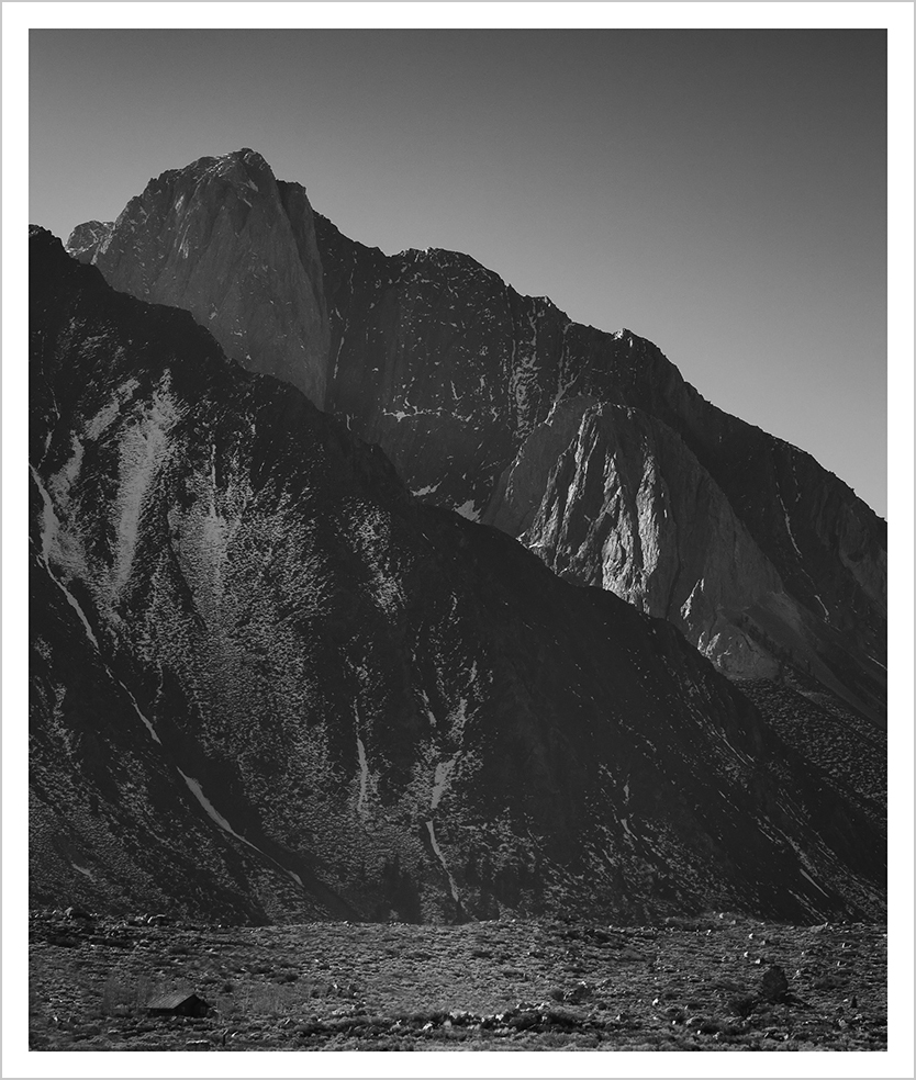
I took this on the Sierra Eastside. I'm trying to make a connection between the summit of Mt. Morrison in the ULC, with the foreground, especially the central foreground. I want to emphasize how the mountain is overlooking the area, and how more generally, the mountain environment has a certain kind of intangible presence as well. C & C welcome.

Comments

10 comments
Comment posted by Luke Ormand on January 28, 2014 at 9:34 PM
I like the lines of this image and the overall composition. The image looks good in B&W however there is a lack of contrast - everything just seems to be a different shade of grey (there is no "black" and no "white" in the image). I would play around with your levels to see if you can make this more visually interesting
Registered on February 4, 2009, 1093 Posts, 7035 Comments
Comment posted by Reno DiTullio on January 29, 2014 at 9:04 AM
I agree with Luke, the image is very flat. However, the images on your website are striking with the full range of tones, beautiful work.
Registered on November 14, 2003, 130 Posts, 1644 Comments
Comment posted by Richard Castillo on January 30, 2014 at 5:14 PM
Luke and Reno, thank you for your C&C's! I worked on the image, especially the contrast. I'm interested to know how this one may or may not work.
Registered on October 20, 2013, 9 Posts, 37 Comments
Comment posted by Reno DiTullio on January 30, 2014 at 5:38 PM
Richard, the second view doesn't look much different on my laptop; I viewed the first image on my desktop computer with calibrated monitor.
Registered on November 14, 2003, 130 Posts, 1644 Comments
Comment posted by Richard Castillo on January 31, 2014 at 3:06 PM
Thank you again, Reno!

Well, I tried to be pretty subtle with my changes, and now I'm thinking, way too subtle, since it isn't looking much different. If you really want to hear the whole tape of what I did, it's below, but I'll keep looking at the image, and I'll be tweaking it some more.

Have a good one!


In Silver Efex 2 I slightly brightened, about 3%, the summit of Mt. Morrison, moved into zone 1 from zone 2 (in S Efex 2, anyway) the LR dark area of the foreground mountain that's in front of Morrison. Slightly burned the foreground ridge just below the summit of Morrison, darkened the snow in the middle of the foreground mountain, and slightly increased the global contrast for the whole image. I burned the highlights, about 3%, on the sub-summit tower of Morrison, down and to the right of the main summit, so it wouldn't compete too much with the main summit. I increased the brightness of the middle near foreground area, about 15%, increased contrast slightly there, and increased structure in that area about 9%.
Registered on October 20, 2013, 9 Posts, 37 Comments
Comment posted by gary phillips on February 1, 2014 at 12:18 AM
Richard, I enjoyed your website. Excellent b/w images. I try to fit most of what I see into b/w images. Color is way harder for me. However, I find that sometimes, as hard as I try, I can't make it happen. I think that is the challenge to render an emotional feeling and certainly the sense of being there into a coherent b/w image. I truly get what your trying to do here, it's a powerful scene and the scale provide by the cabin being dwarfed by the towering peaks, it's all there, but the tonal range. Its in every one of your other images but it's not here. Maybe in the winter you will find what this image lacks .I really like your work. :wavey:
Registered on October 24, 2013, 185 Posts, 4136 Comments
Comment posted by Philip Hodgkins on February 1, 2014 at 10:24 AM
I am in agreement with the other critiques—the tonal range just isn't there. It is a powerful image, though. My impulse is to go back to the color and get it right, then convert. Sometimes that has worked for me. Another thing I have done is to ask my wife what she thinks (or girlfriend if you are not married). Not surprising, that has helped much more than it hindered! :biggrin:
Registered on July 24, 2006, 2741 Posts, 12349 Comments
Comment posted by Marylynne Diggs on February 1, 2014 at 6:51 PM
This is lovely. I like the massive mountain and small habitation. Deepening the blacks would add drama,I think. As is, it feels a little like a faded BW.
Registered on December 14, 2010, 122 Posts, 1034 Comments
Comment posted by Richard Castillo on February 4, 2014 at 1:50 AM
Thank you Gary, Phil, and Marylynne! Yes, I agree - I think I'm not there with this one, I'll be going back and looking at it again, trying to realize my vision for this image. And Gary, thank you for your kind words re my website. Well, I'm trying, that's for sure :smile: . BTW, I think you B & W images rock! And are very truly, artistic.
Registered on October 20, 2013, 9 Posts, 37 Comments
Comment posted by John Williams on February 7, 2014 at 12:01 AM
Interesting thoughts above, however I do like the bold diagonals the ridges make through the frame.
Registered on September 6, 2007, 221 Posts, 5985 Comments