Nature Photographers Network
This is the preserved archive of the original Nature Photographers Network. The community continues at naturephotographers.network.
Autumn in Round Pond
‹ PreviousLandscape GalleryNext ›

Autumn in Round Pond

by Wayne Jones

Gallery: LandscapePosted January 22, 2014333 views18 comments
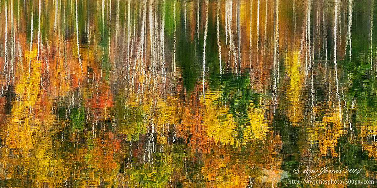
Here's another fall reflection shot from last October at Round Pond in the Adirondack Forest Preserve. This time, nothin' but reflections. This is a follow-up to Rock and Reflections, which I posted yesterday. I am interested in your opinions about which one, if any, would be wanted to hang on a wall. (See comment, below, for an example of the wall presentation I am thinking about.)

Please see the larger image.

QUESTION: Which one (if any) might be wanted to hang on a wall?
A -- reflection only, or
B -- reflection with rocks and/or pond edge

Thanks again for you valued critiques and opinions.

Canon 5D3
Canon 24-105mm.; Circ. Pol.
1/15 sec. @ f/16; ISO 160
This is a crop from a long multiple-frame panorama

Comments

18 comments
Comment posted by Wayne Jones on January 22, 2014 at 12:40 PM
Here's the sort of presentation I am thinking about -- 18" x 36" triptych (without the watermark, of course).
Registered on April 18, 2007, 953 Posts, 6435 Comments
Comment posted by Morris McClung on January 22, 2014 at 12:41 PM
An impressionistic paradise. Fantastic color, and the white trunks break up the color groups beautifully. These are fun to flip 180 degrees, too. This just makes me feel happy all over. :biggrin: :toast:
Registered on May 7, 2007, 670 Posts, 19650 Comments
Comment posted by Nancy Lea Sandy on January 22, 2014 at 1:21 PM
These a wonderful and it's tough choice between them for your triptych but, for me, this one has the edge. It is stunningly beautiful
Registered on January 24, 2011, 576 Posts, 6942 Comments
Comment posted by Chet Dowell on January 22, 2014 at 2:10 PM
Wayne, I thought I might like the complete abstract a little better and I do. The colors are again fantastic and the reflection just broken enough to enhance the abstract quality. Great work. Chet :toast: :toast:
Registered on December 3, 2012, 237 Posts, 1171 Comments
Comment posted by Philip Hodgkins on January 22, 2014 at 2:36 PM
This image for me, far and away: not because it is abstract, but because it is compositionally pure from edge to edge, horizontal lines and vertical lines with splashes of autumn color. The rocks are a jarring note, again to me.
Registered on July 24, 2006, 2741 Posts, 12349 Comments
Comment posted by Nick Bristol on January 22, 2014 at 6:05 PM
Wayne, This is wonderful and my choice would be this one hands down! I like the triptych presentation for this very much. Great idea...I think it will be beautiful! :toast:

Nick Bristol
Lone Rock, WI
Registered on February 1, 2004, 752 Posts, 14140 Comments
Comment posted by Greg AshworthFanch on January 22, 2014 at 6:48 PM
I have to agree with Phil, this image is much stronger compositionally, in my opinion. I have been working on a triptych myself, but have not been able to put something together that I was happy with; you are showing me the light. Well done!
Registered on December 14, 2012, 55 Posts, 67 Comments
Comment posted by Scott Fricke on January 22, 2014 at 7:53 PM
I like this one better than the one with rocks and I would hang it upside down since it's already kind of an abstract anyway. Nice work!
Registered on January 19, 2007, 133 Posts, 1448 Comments
Comment posted by Brian Schrayer on January 22, 2014 at 8:01 PM
I prefer this version because it places the emphasis on the vertical lines and the fall color. While I liked the previous post I did find my eye drawn toward the bright blue sky in the bottom of the frame. I would definitely print this one, but I think I would turn it 180 degrees (but I see that Morris beat me to that suggestion). :wink:
Registered on May 28, 2004, 114 Posts, 2890 Comments
Comment posted by gary phillips on January 22, 2014 at 8:32 PM
Wayne, my vote is for A. I think the triptych works way better because in can be broken anywhere were as the reflection with the rocks may not separate so easily. I do think the rock scene would make a better large print . I'd have no trouble finding wall space for both.
Registered on October 24, 2013, 185 Posts, 4136 Comments
Comment posted by Ed Lowe on January 22, 2014 at 8:40 PM
While I like both, this one is the winner for me, Wayne. This one is just a wall to wall riot of autumn color. The triptyph is a great idea. Print this baby big and hang it.

Ed
Registered on February 7, 2004, 414 Posts, 7115 Comments
Comment posted by Peter Cross on January 22, 2014 at 11:24 PM
Absolutely this is the one. Other is nice but this has much more going for it.
Registered on April 3, 2010, 271 Posts, 1342 Comments
Comment posted by Roberto Facchini on January 23, 2014 at 8:37 AM
Beautiful! Great colors and lights. I also prefer this version for its simplicity and cleanliness compared to the previous with the rocks.
Registered on November 15, 2012, 35 Posts, 202 Comments
Comment posted by Rick Turner on January 23, 2014 at 8:59 AM
Wayne,
For my taste the capture with rocks is out of this world and this just wonderful. Both are beautiful and prints that sell to hospitals or individuals. :toast:
I love em. :toast:
Registered on February 18, 2012, 534 Posts, 2755 Comments
Comment posted by Bill Reid on January 23, 2014 at 10:41 AM
Definitely this one for me Wayne. Just a wonderful abstract that separates nicely. The other would make a nice large print better to me. Both are just great.
Registered on January 27, 2013, 65 Posts, 2460 Comments
Comment posted by Mark Seaver on January 23, 2014 at 9:23 PM
This one is right up my alley. The colors are just wonderful, Wayne, and I really like the transition from stretched at the top to compressed at the bottom. The earlier version with it's connection to reality looked good, but this one gets into fantasy and just feels wonderful (I think I'll start dancing). I vote for this as presented, since I'm not a huge fan of the tryptich approach, but that's just me.
Registered on January 23, 2011, 1103 Posts, 17270 Comments
Comment posted by Angela Classen on January 25, 2014 at 12:53 PM
I prefer this one, too, for the reasons already noted. This would be a gorgeous triptych. The colors are glorious and the ripples add just the perfect amount of texture.
Registered on June 13, 2007, 434 Posts, 2742 Comments
Comment posted by Kirk Greene on January 27, 2014 at 10:31 PM
Another vote for reflection only. The triptych makes a perfect presentation and compliments the original image.
Registered on May 12, 2004, 191 Posts, 1578 Comments