Nature Photographers Network
This is the preserved archive of the original Nature Photographers Network. The community continues at naturephotographers.network.
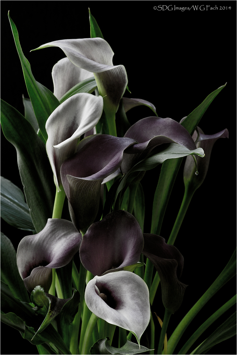
Callabundance 2
‹ PreviousFlora GalleryNext ›

Callabundance 2

by Bill Fach

Gallery: FloraPosted January 20, 2014244 views12 comments
Sony A77
Minolta 100mm macro
ISO 50, 1 sec @ f16

I'm making it one of my resolutions of 2014 to try some new things so offered for your consideration is a partially desaturated view of our Christmas Callas. Hoping that an old dog might learn some new tricks even if the new trick is pretty simple. All comments welcome; original image posted for comparison. >=))>

Comments

12 comments
Comment posted by Bill Fach on January 20, 2014 at 11:47 PM
Here is the original capture. >=))>
Registered on November 1, 2003, 1805 Posts, 26981 Comments
Comment posted by gary phillips on January 21, 2014 at 1:29 AM
Wow Bill, I thought looking at the thumbnail that you'd thrown a b/w in here. I guess this is as close as you'll come. :biggrin: I like the partial desat. Sometimes stripping the color away reveals true beauty. Nice job :toast:
Registered on October 24, 2013, 185 Posts, 4136 Comments
Comment posted by Morris McClung on January 21, 2014 at 11:56 AM
Amazing how the two evoke different emotions, Bill. Love your new exploration, and I am looking forward to your experiments. :toast:
Registered on May 7, 2007, 670 Posts, 19650 Comments
Comment posted by Gary Yeoh on January 21, 2014 at 7:45 PM
Bill

Wow! great effect. I do prefer the desat version with muted color and mystery it evoke. I know you like the al natural look in your images and do not like PP much so it is good to see you pushing your envelop. I sometimes like to play around with various process such blending a normal image with a bleach layer and the result can be surprising. Look forward to more of your experiment with PP.
Registered on September 1, 2009, 588 Posts, 8184 Comments
Comment posted by Carolyn Derstine on January 22, 2014 at 11:43 AM
I'm usually one to like the natural color in nature images. . .however, I like the results of your experiment with desaturation. :smile: Both images are great IMO but convey different feelings. The desat image has a more moody look with a feeling of a bit more depth. As far as comp, I do wish there was a bit more room at the bottom so the leaf edge wasn't resting on the frame.
Registered on February 16, 2011, 610 Posts, 3684 Comments
Comment posted by Catherine Reilly on January 22, 2014 at 4:32 PM
I think this is artistic, Bill, and a pleasing alternative to eye-popping color. The subtle color emphasizes the light and hence the graceful forms of the flowers and foliage.
Registered on August 16, 2006, 603 Posts, 9192 Comments
Comment posted by Nancy Lea Sandy on January 23, 2014 at 7:01 PM
After comparing this with the original my thought was that desaturating the color saturated the emotional pull. This is a powerful image. Nicely done.
Registered on January 24, 2011, 576 Posts, 6942 Comments
Comment posted by Ken Smith on January 23, 2014 at 11:18 PM
I too have played w/desat’ …but my results haven’t been post-worthy. I like the comp…my only thought is the grey areas of blooms don’t meet quite support as complimentary colors with the green b/g. That said, as for all art expressions…”man don’t stop…keep going for it”, it is all so subjective and personal taste driven.
Registered on September 5, 2008, 449 Posts, 2444 Comments
Comment posted by Ian Wolfenden on January 24, 2014 at 8:57 AM
Absolutely stunning image, Bill - the desaturation has had an extraordinarily dramatic effect on the scene. Skilfully lit and composed - a real gem of a shot, beautifully presented !!!
Registered on May 18, 2007, 1108 Posts, 7647 Comments
Comment posted by Howard Cheek on January 25, 2014 at 8:29 AM
Nice variation, works for me!
I'm an old dog & a simple man, so it doesn't take much to please me :wink:
Well done Bill:toast:
Registered on July 24, 2008, 1201 Posts, 10758 Comments
Comment posted by Albert Darmo on January 26, 2014 at 2:23 PM
Hi Bill :wavey: Gee!! Ian said it so well :cool: I find the Desat. version has an more creative and artistic feel to it. I would like to see you continue on this path. :toast:
Albert Darmo
Registered on November 25, 2008, 1386 Posts, 11978 Comments
Comment posted by Larry Lynch on January 28, 2014 at 1:32 PM
Love this look Bill. Reminds me of some of the old film looks which gives it a whole different feel and character. Thanks for sharing this. Terrific work.
Registered on September 16, 2006, 773 Posts, 9940 Comments