Nature Photographers Network
This is the preserved archive of the original Nature Photographers Network. The community continues at naturephotographers.network.
Secret's Afterglow [+edit]
‹ PreviousLandscape GalleryNext ›

Secret's Afterglow [+edit]

by John Williams

Gallery: LandscapePosted January 11, 20143,503 views24 comments
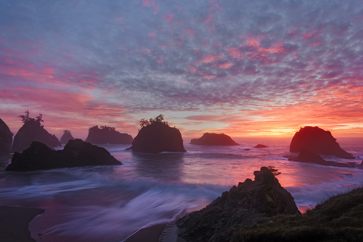
Secret Beach (Samuel H. Boardman State Scenic Corridor at the very southern Oregon Coast), a little later on the same evening as my prior post.

The larger version shows better detail since it's against a gray background. The color is pretty rich in the shadows, more than the eye would probably see, but I've left it that way as a personal preference. Thanks in advance for any input!

Nikon D7100
Nikon 12.0-24.0 mm f/4.0 at 12 mm (18mm equiv.)
Blend of 0.5, 1.0, and 4.0 at f/13 and ISO 100
There were footprints in the lower left, so I blended in an image with a receding wave to cover them.

Comments

24 comments
Comment posted by Kah Kit Yoong on January 11, 2014 at 7:45 PM
That's some beautiful light and the clouds fill the sky very evenly which is a bonus. The water motion has a soothing feel which suits the atmosphere well. Compositionally it seems a but less coherent than your best, somehow the the bottom of the frame seems truncated and I keep wishing to see more below.
Registered on September 27, 2006, 636 Posts, 10682 Comments
Comment posted by Philip Hodgkins on January 11, 2014 at 8:51 PM
John, I am more than satisfied with The color and composition. If the colors are too rich, all that is required of the viewer is the suspension of belief. That is the basis of most art and all movies! I do think as Kah Kit does about the bottom, particularly the truncated receding wave you blended in. :toast:
Registered on July 24, 2006, 2741 Posts, 12349 Comments
Comment posted by gary phillips on January 11, 2014 at 9:28 PM
Beautiful sunset in a wonderful spot. I think you pretty much nailed it. I agree with the others, the bottom left would have been better if the arc of the receding surf was complete. Really good as is
Registered on October 24, 2013, 185 Posts, 4136 Comments
Comment posted by Joseph Campisi on January 11, 2014 at 9:57 PM
My only criticism is that I'd like to see the full curve of the water rushing in at the lower right. I'm guessing that the location you were shootng from didn't allow for a longer view. Other than that, simply beautiful John, with awesome light and your usual stellar processing!
Registered on November 24, 2008, 304 Posts, 3211 Comments
Comment posted by Matt Anderson on January 11, 2014 at 11:02 PM
Beautiful light, lovely motion, amazing sky, and intoxicating catch lights in the clouds... magnificent !
Registered on September 6, 2007, 346 Posts, 2696 Comments
Comment posted by Jon Daining on January 12, 2014 at 1:58 AM
John, this is a beautiful image. My eyes also follow the wave in the lower left and find it a bit cut off, but I don't think this detracts much from the image. Great color, contrast, and composition.
Registered on February 25, 2012, 25 Posts, 191 Comments
Comment posted by R.Bill Moser on January 12, 2014 at 6:22 AM
Beautiful light and colors. I alos love the cloud pattern in the sky which makes the sky interesting to look at. I love it as is and I thin it's a gorgeous image. The only minor nit is curve of the receding wave...I'd wish this wave is complete. Beautiful image :toast:
Registered on January 29, 2010, 285 Posts, 4281 Comments
Comment posted by Rick Turner on January 12, 2014 at 9:36 AM
Outstanding work John both in comp and processing. What a sky :wavey:
Registered on February 18, 2012, 534 Posts, 2755 Comments
Comment posted by John Williams on January 12, 2014 at 3:08 PM
Interesting. The cut-off water didn't bug me that much. On the other hand 6 out of 8 above noted it (and the others may be avoiding hammering the point home :wink: ), and the main reason I post here is for such feedback. Since the foreground was a bit of subterfuge anyway, how's this version? (Besides the foreground, I've made a couple of other small tweaks.)
Registered on September 6, 2007, 221 Posts, 5985 Comments
Comment posted by Daniel Rappaport on January 12, 2014 at 3:18 PM
I have to say that the original composition seems more balanced; it works better for me than the second. Since there's no one foreground element, it's the balance that has to work. I've no trouble with the break in the curve of the wave - my mind's eye still sees the full curve. Goes withoug saying that the colors are a knockout!
Registered on September 9, 2009, 294 Posts, 2006 Comments
Comment posted by Joseph Campisi on January 13, 2014 at 1:21 AM
I disagree with Daniel, but we all have our opinions. The second version seems more cohesive and complete, as well as more balanced, IMO. Much better for me John! :toast:
Registered on November 24, 2008, 304 Posts, 3211 Comments
Comment posted by Carey Closs on January 13, 2014 at 5:41 AM
Amazing sky; love the textures and the colors look like a rainbow supernova. My preference is for the re-post.
Registered on April 15, 2012, 107 Posts, 326 Comments
Comment posted by Kah Kit Yoong on January 13, 2014 at 6:23 AM
Repost much better IMO
Registered on September 27, 2006, 636 Posts, 10682 Comments
Comment posted by Morris McClung on January 13, 2014 at 12:28 PM
Well, this one gets an, "Oh, Mommy!", John. Gorgeous light, color, and such a well thought out comp. Superb in every respect. :toast:
Registered on May 7, 2007, 670 Posts, 19650 Comments
Comment posted by Mark Seaver on January 13, 2014 at 1:36 PM
John, I thought I'd commented on this already, but clearly not. I liked the original and wasn't bothered by the cut off water, since it seemed to me that a key feature was the incoming wave. The light in the sky is tremendous and I sure do like the scattering of sea stacks through the foreground. Now that I see the repost, I prefer it, as that tongue of receding water is a great addition to the llc area and it provides some extra visual balance to the sun.
Registered on January 23, 2011, 1103 Posts, 17270 Comments
Comment posted by Zack Clothier on January 13, 2014 at 9:37 PM
Beautiful colors in this one, John.
Registered on January 28, 2010, 343 Posts, 2257 Comments
Comment posted by Richard Castillo on January 14, 2014 at 1:26 AM
Honestly, I believe they are both extraordinary images, with each telling a slightly different story, both balanced and successful given the slightly different focuses and emphases.

If I had to choose, well, I'd choose the first one. I just prefer this image's emphasis, and also the softer contrast and subtler, slightly understated tonalities, kind of bringing to life very nicely, at least imo, the atmospheric qualities and feeling of this overall beach sunset scene. I guess if you wanted the story to be a little more about the ocean, stacks and sunset, placed in context, and include more foreground, then the second would be better for this story, but to me there's just something slightly more compelling about the first composition.

Incredible work! :toast:
Registered on October 20, 2013, 9 Posts, 37 Comments
Comment posted by Bill Reid on January 14, 2014 at 2:08 PM
Stunning scene and colors John. I think I like the tones in the second and the comp from the first. The wave in the second pulls my eyes down. Super image and beautifully processed. :toast:
Registered on January 27, 2013, 65 Posts, 2460 Comments
Comment posted by Hamed Musharbak on January 14, 2014 at 2:12 PM
super seascape shot :toast: :toast: :toast:
Registered on June 1, 2009, 372 Posts, 2282 Comments
Comment posted by Phil Pogledich on January 14, 2014 at 3:13 PM
I'll take the second one. The cut-off edge of the surf is really a very minor issue given the overall strength of the image, but if I'm given a choice I'll take the one where the line of the surf on the beach is complete. Both versions are fantastic.
Registered on August 24, 2009, 123 Posts, 3099 Comments
Comment posted by Gary McGhee on January 14, 2014 at 3:57 PM
Stunning light and colour in this John, compositionally I prefer the repost.

Gary.
Registered on April 15, 2010, 142 Posts, 2416 Comments
Comment posted by Nick Bristol on January 14, 2014 at 4:19 PM
Wonderful. What a quiet and pleasing feel this has for me. Love the light and beautiful soft color. I like the mood of the first one better and the comp better in the repost. Really nice work John! :toast:

Nick Bristol
Lone Rock, WI
Registered on February 1, 2004, 752 Posts, 14140 Comments
Comment posted by Albert Darmo on January 16, 2014 at 8:30 PM
Hi john :wavey: I love the beautiful light in this magical scene. i prefer the second version. but croped tight to the edge of the wave :toast:
Albert Darmo
Canada
Registered on November 25, 2008, 1386 Posts, 11978 Comments
Comment posted by Rick Dunn on January 17, 2014 at 8:46 PM
Mmm, yeah, I like this one better due to the softer light. This is easily my favorite beach in Oregon. We came here the night after you; for this sunset we were up at Bandon Beach and came away with some great shots. What a sunset that night! I've struggled to capture a really solid image from Secret Beach - very difficult conditions. This is one of the best I've seen. Almost feel like you're in the South Pacific.... We often sit on that foreground formation and watch the waves roll in, occasionally with the company of sea lions. Great shot!
Registered on February 22, 2004, 35 Posts, 1311 Comments