Nature Photographers Network
This is the preserved archive of the original Nature Photographers Network. The community continues at naturephotographers.network.
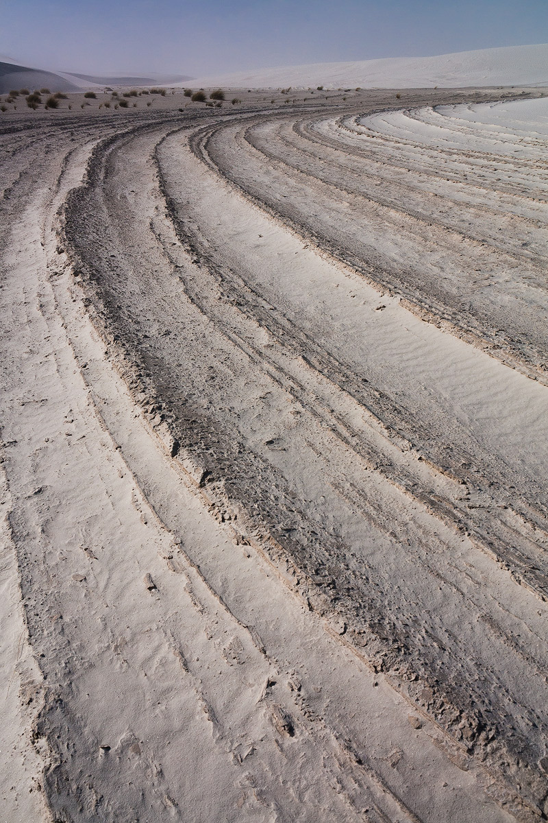
Under the dunes
‹ PreviousLandscape GalleryNext ›

Under the dunes

by Ronald Murphy

Gallery: LandscapePosted December 7, 2013148 views6 comments
White Sands, NM

RAW file processed in LR5, with TK resize/sharpening for web.
Canon T2i, 1/500 s, f/9.5, ISO 200, EFS 10-22 mm @ 18 mm, CPL, Handheld

Seeking any and all advice and comments. Thanks in advance.

Please view the large image!

Comments

6 comments
Comment posted by Preston Birdwell on December 7, 2013 at 2:11 PM
I can see where you were headed with this one, but it looks a little flat. You could try boosting the mid tone contrast a bit and/or trying a conversion to B&W. You might also consider cropping out the sky for a bit of more abstract look. I like the lines and the curves: You should capitalize on those, I think.

--P
Registered on November 1, 2003, 471 Posts, 5188 Comments
Comment posted by Stan Rose on December 7, 2013 at 2:35 PM
I knew where this was from the thumb--i was standing at this very spot just a week ago! Last time i posted a shot with these patterns, someone suggested they looked like truck tire tracks, which was kind of a downer, but i thihk they look pretty cool personally. I see Preston's point, but i would leave the sky here--it adds important context i think. Id just bump up the contrast a bit. :wavey:
Registered on September 15, 2005, 836 Posts, 17099 Comments
Comment posted by Harley Goldman on December 7, 2013 at 6:41 PM
Before even reading any of the comments, I thought of a B&W conversion (darkening the sky in the conversion) and a strong boost to the contrast. The image has nice strong lines and perspective.
Registered on November 19, 2003, 586 Posts, 11271 Comments
Comment posted by Tony Kuyper on December 8, 2013 at 11:06 PM
I like the balance of color and light. Compositionally, I sort of wish I could see the background elements more with less dominance of the foreground shape.
Registered on November 1, 2003, 364 Posts, 22328 Comments
Comment posted by Mark Seaver on December 9, 2013 at 4:34 AM
For me, this is all about the huge sweeping pattern in the foreground and I think the version presented here shows that nicely. Yes, going to b&w would emphasize that pattern and some local dodging/burning to even out the tones would add even more emphasis. I like the background he as it add some interesting context, but I can also see a version where you crop at the top ridge in the middle ground, then it's entirely the pattern.
Registered on January 23, 2011, 1103 Posts, 17270 Comments
Comment posted by Mark Metternich on December 9, 2013 at 3:22 PM
Fabulous radical use of line. :toast:
Registered on June 19, 2009, 276 Posts, 6240 Comments