Nature Photographers Network
This is the preserved archive of the original Nature Photographers Network. The community continues at naturephotographers.network.
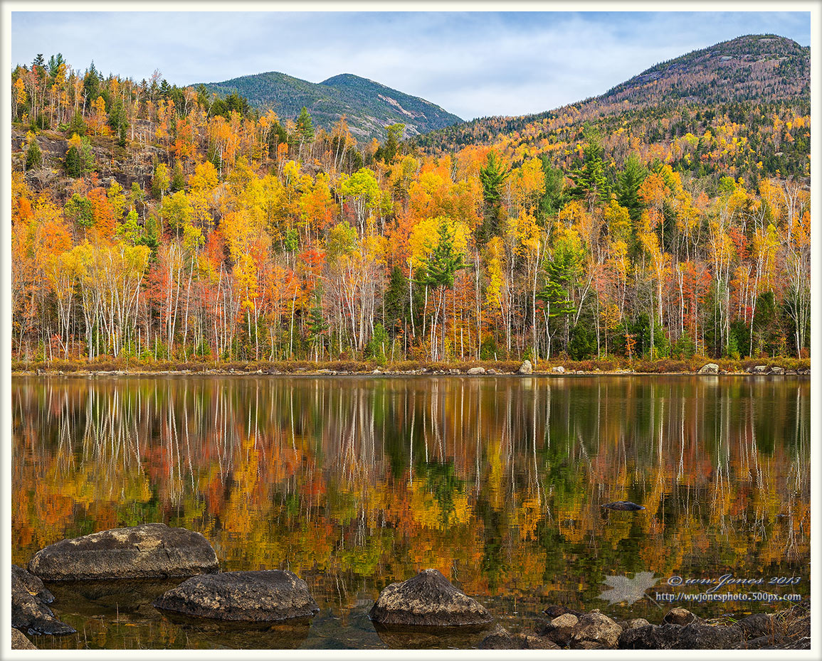
Fall at Giant's Doorstep
‹ PreviousLandscape GalleryNext ›

Fall at Giant's Doorstep

by Wayne Jones

Gallery: LandscapePosted November 11, 2013316 views19 comments
This is Round Pond, with one of the Adirondack high peaks -- Giant Mountain -- in the central background. Last week I posted some closer shots of the colorful shore of this pond, and a wide panorama of this place. Having covered the wide shot and concentrated on the leaves, I wanted a more conventional "old fashioned picture" to depict the pond in its High Peaks setting with a mountain that many Adirondackers would recognize.

I have two questions about this.
--> 1. To show the pond in the mountain setting, is this composition better than a crop of the wide panorama that is sort of dominated by the large foreground log and rock? SEE MY FIRST COMMENT, BELOW.
---> 2. I'm somewhat torn between this 4x5 horizontal and a 4x5 vertical from the center of this (SEE MY SECOND COMMENT, BELOW). But I'm leaning toward the horizontal. What do you think?

Canon 5D3
Canon 24-105mm.; Circ. Pol.
1/15 sec. @ f/16; ISO 160
Multiple vertical frames stitched in CS6

Comments

19 comments
Comment posted by Wayne Jones on November 11, 2013 at 12:37 PM
Question 1. To show the pond in the mountain setting, is the posted composition (horizontal or vertical crop) better than a crop of the wide panorama that is sort of dominated by the large foreground log and rock? HERE'S THAT ONE, cropped to vertical:
Registered on April 18, 2007, 953 Posts, 6435 Comments
Comment posted by Wayne Jones on November 11, 2013 at 12:38 PM
Question 2. Here's the Vertical version that I am asking about (Question no.2) as an alternative. Better or worse?
THANKS
Registered on April 18, 2007, 953 Posts, 6435 Comments
Comment posted by Roel Wijtmans on November 11, 2013 at 1:24 PM
I prefer the vertical version (your second comment), as it emphasizes the colors more. And I find the overall composition more balanced in that one.
Registered on September 30, 2012, 116 Posts, 2257 Comments
Comment posted by John&Patty Benway on November 11, 2013 at 2:13 PM
Wayne, I"m going to skip to question 2 first, I'm very partial to 4X5 verticals, I compose my scenes with that in mind, that said, I really cant pick between the vertical or horizontal, I honestly like them both, each has its own attributes, love the light and colors, and the warm autumn mood is fantastic. Question 1, just in my opinion, I think the log and bolder kind of steal the show and take away from the rest of the scene. Round pond definitely treated you to a beautiful fall show. Love everything you posted so far. Take care.
John
Registered on May 12, 2006, 626 Posts, 8700 Comments
Comment posted by Jim Greenwood on November 11, 2013 at 2:29 PM
I think my brain is going to explode! :biggrin:

Each of these images stands alone as a fine composition without trying to compare them and choose which one is better. You've demonstrated quite well how it is often possible to achieve several completely different and unique and exceptional compositions of the same scene.
Registered on November 9, 2003, 229 Posts, 1523 Comments
Comment posted by Stan Rose on November 11, 2013 at 2:54 PM
nice! I like the original by a mile. Id bump up the contrast a wee bit--the dr control is starting to sap it of it's life substance :wink: Its been a lonnnng time sinceive been in the dacks, maybe next year ill make it out there...
Registered on September 15, 2005, 836 Posts, 17099 Comments
Comment posted by Morris McClung on November 11, 2013 at 3:42 PM
Classic New England Fall imo. And, as usual, you have placed all of the elements where they show equally how important they are to the overall scene. Of course, there is the outstanding color, too. Superb work, Wayne. :toast:
Registered on May 7, 2007, 670 Posts, 19650 Comments
Comment posted by scott lanz on November 11, 2013 at 3:52 PM
"I like the original by a mile." Me too, Wayne. Top notch image. I like the way the rocks anchor the bottom. The rock and log are too much and the LLC a bit empty in #2. The vertical works, but more is better in #1.
Registered on November 14, 2003, 840 Posts, 12902 Comments
Comment posted by John Williams on November 11, 2013 at 4:11 PM
I'm in favor of the original Wayne. Strongly vs. number two, and a little bit vs. number three.
Registered on September 6, 2007, 221 Posts, 5985 Comments
Comment posted by Harley Goldman on November 11, 2013 at 6:24 PM
No question, the top, first post for me. Not even close for my tastes. Gorgeous colors and reflection.

Question 1. I find the log and rock dominate the whole scene. I find the trees and their reflection are the point of interest and they block me from that.
Registered on November 19, 2003, 586 Posts, 11271 Comments
Comment posted by Nick Bristol on November 11, 2013 at 7:49 PM
First post for me too, Wayne. I'm enjoying that view very much. Such wonderful color and reflections!

Nick Bristol
Lone Rock, WI
Registered on February 1, 2004, 752 Posts, 14140 Comments
Comment posted by Ryan Shain on November 11, 2013 at 8:13 PM
Another vote for the first post, the 2nd is my least, and the 3rd in the middle. The colors are stunning this year out your way Wayne. Excellent work once again on this beautiful fall capture.
Registered on February 20, 2007, 226 Posts, 4571 Comments
Comment posted by Nick Palmieri on November 11, 2013 at 10:28 PM
Gorgeous Adirondack image! Climbed Giant Mt. a few times but I missed round pond this year....If I had to pick one I like the first but they all work...The colors and reflections are perfect.
Registered on September 1, 2011, 35 Posts, 748 Comments
Comment posted by Vance Gese on November 11, 2013 at 10:36 PM
The first image by far is the best of the three, Wayne, in my opinion. Gorgeous fall color and a gorgeous image. Looks like you had one amazing day at this pond.
Registered on November 13, 2008, 298 Posts, 6629 Comments
Comment posted by Angela Classen on November 12, 2013 at 12:43 AM
Another vote for the original image. Beautiful composition and love all the color! Looks like you must have hit peak color.
Registered on June 13, 2007, 434 Posts, 2742 Comments
Comment posted by Paul Breitkreuz on November 12, 2013 at 10:46 AM
Wayne, being a LF shooter I find the horizontal is more appealing to my taste. The vertical with the boulder and log seem too overpowering in the scene. If the intent of those being the primary subject then yes it works, but if it is to entertain a fall scene as the primary viewing aspect, then no. :cool:
Registered on February 25, 2006, 525 Posts, 8448 Comments
Comment posted by Richard Olsen on November 12, 2013 at 12:37 PM
#1 shines for my soul! While all three are beautiful, the original comosition with the foreground rocks, reflections and mountain lines is just plain beautiful!! Very nice Wayne!!
:toast:
Registered on October 19, 2006, 306 Posts, 1571 Comments
Comment posted by Hamed Musharbak on November 12, 2013 at 1:30 PM
wonderful colors in this shot, i like it
Registered on June 1, 2009, 372 Posts, 2282 Comments
Comment posted by Aaron Feinberg on November 13, 2013 at 1:19 AM
Was up there end of Sept and missed this spot. Great to know and dig it. Bit cramped at the bottom but overall lovely scene!

aF
Registered on October 26, 2009, 399 Posts, 2789 Comments