Gallery: LandscapePosted October 20, 2013464 views15 comments
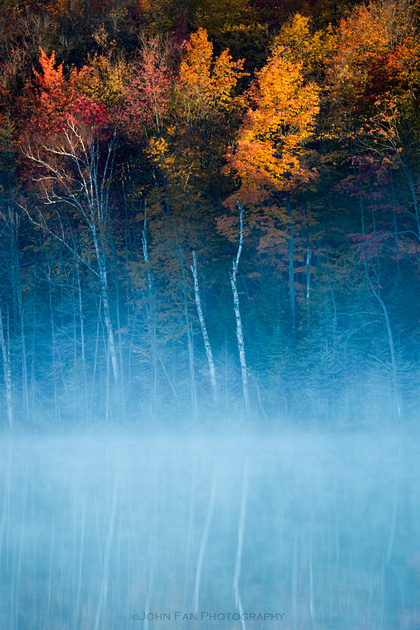
This is a picture from our recent trip to Upper Michigan. After a couple of days wondering around with no luck, finally, the weather, light and the scene came together that morning.
Comments
15 comments
Comment posted by Mark Metternich on October 20, 2013 at 5:27 PM
Great shot, as always man!!!!
I'd reduce blue slightly maybe.
Registered on June 19, 2009, 276 Posts, 6240 Comments
Comment posted by Ben Horne on October 20, 2013 at 5:50 PM
Beautiful shot! I love the contrast in color and texture. I think there is a bit of an optical illusion here from some of the trees that makes the image feel like it's leaning a bit to the left, even though your composition is indeed level. If this was mine, I would consider skewing the top of the image a bit toward the right to make it feel visually level.
Registered on August 27, 2009, 51 Posts, 959 Comments
Comment posted by John Fan on October 20, 2013 at 6:17 PM
Thanks, Mark.
Registered on August 24, 2010, 135 Posts, 489 Comments
Comment posted by John Fan on October 20, 2013 at 6:20 PM
Ben, the trees are not vertical. The horizon is spot on though.
Registered on August 24, 2010, 135 Posts, 489 Comments
Comment posted by Morris McClung on October 20, 2013 at 7:37 PM
Nice cool/warm color contrast. And, the fog adds that mood. Well done.
Registered on May 7, 2007, 670 Posts, 19650 Comments
Comment posted by Reed Bowman on October 20, 2013 at 7:45 PM
I like the contrast of cool blue mist and the warm sun on bright foliage....just the feeling you get on a cold morning when the sun first comes over the horizon and warms you....very nice
Registered on March 2, 2009, 166 Posts, 1058 Comments
Comment posted by Ben Horne on October 20, 2013 at 8:08 PM
John,
In my initial comment, I did comment that the horizon is level and the trees are in fact leaning. I wasn't implying that your shot isn't actually level. What I was alluding to was the fact that it looks visually uneven. There are times when I setup my compositions uneven so that they look level. In this case, I think you could make the shot feel more balanced if you skew the area above the waterline toward the right, and below the waterline toward the right. This would keep the horizon level as it is now, but make the trees feel more vertical. Sometimes nature doesn't get it right, but we need to make things a bit more clean in post to stop people from tilting their head to the side when viewing our work.
Registered on August 27, 2009, 51 Posts, 959 Comments
Comment posted by John Fan on October 20, 2013 at 10:51 PM
Thanks, Ben. Good idea to try.
Registered on August 24, 2010, 135 Posts, 489 Comments
Comment posted by Bill Reid on October 21, 2013 at 9:26 AM
Really like the colors in this John the warm cool works nicely. And the comp is very nice also. Well done.
Registered on January 27, 2013, 65 Posts, 2460 Comments
Comment posted by Brian Donovan on October 21, 2013 at 12:09 PM
I like the shot John, but I agree with Mark that the blue might benefit from being toned down a bit.
Registered on August 29, 2013, 11 Posts, 40 Comments
Comment posted by Todd Liotine on October 21, 2013 at 7:25 PM
Hello John, Nice image, i like the contrast going on warm/cool smooth/texture. I would tone down the blue a bit.
Registered on July 1, 2008, 131 Posts, 671 Comments
Comment posted by Stuart Williams on October 22, 2013 at 2:57 AM
john, mostly i am in agreement with the assessments presented above - the cold/warms works well but the blues might be toned down a touch; visually, one might perceive that there's a tilt to it - although I am unconvinced how one might adjust for that short of re-composing. overall, however, there is a nice atmosphere to this.
Registered on December 7, 2007, 247 Posts, 4792 Comments
Comment posted by Stan Rose on October 22, 2013 at 8:50 PM
Id tone down the blues very slightly and id also crop the top dark portion so its an even greater contrast. But i think this is fabulous as is!
Registered on September 15, 2005, 836 Posts, 17099 Comments
Comment posted by John Fan on October 23, 2013 at 7:55 AM
Thanks again, guys. I will play with the blue. For some reason, the blue was so saturated that I have already desaturated it by 10 pts in LR.
Registered on August 24, 2010, 135 Posts, 489 Comments
Comment posted by Joseph Campisi on October 23, 2013 at 11:23 AM
What Stan said. But I love it as is as well. Love the mood here John, this image really makes an impact!
Registered on November 24, 2008, 304 Posts, 3211 Comments

Comments
15 commentsI'd reduce blue slightly maybe.
In my initial comment, I did comment that the horizon is level and the trees are in fact leaning. I wasn't implying that your shot isn't actually level. What I was alluding to was the fact that it looks visually uneven. There are times when I setup my compositions uneven so that they look level. In this case, I think you could make the shot feel more balanced if you skew the area above the waterline toward the right, and below the waterline toward the right. This would keep the horizon level as it is now, but make the trees feel more vertical. Sometimes nature doesn't get it right, but we need to make things a bit more clean in post to stop people from tilting their head to the side when viewing our work.