Gallery: LandscapePosted October 19, 2013140 views10 comments
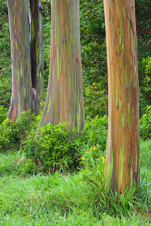
I liked the color tone shift from cool to warm between these 3 eucalyptus trees in Maui. Compression is killing the web version though
Comments
10 comments
Comment posted by Eva McDermott on October 19, 2013 at 7:59 PM
I like the streaks of green and red in the trunks Kartik. Appears a little bright though. I might be temped to bring down the overall brightness just a bit. I surely like the graphics and color though.
Registered on January 4, 2009, 1015 Posts, 13229 Comments
Comment posted by Dan Kearl on October 19, 2013 at 7:59 PM
The IQ shown looks fine to me.
Interesting and nicely composed.
Registered on September 2, 2013, 209 Posts, 1514 Comments
Comment posted by Ed Lowe on October 19, 2013 at 10:03 PM
I like the diagonal flow and the spacing of the three trees, Kartik. The coloring of the tree trunks is also very fascinating. Beautifully done.
Ed
Registered on February 7, 2004, 414 Posts, 7115 Comments
Comment posted by Balakumar Kaushik on October 20, 2013 at 4:09 AM
Striking colours and patterns in the tree makes this image pop.
Might selectively reduce the greens around the tress to bring more emphasis on to the trees themselves.
--
Kaushik
Registered on January 4, 2008, 98 Posts, 1403 Comments
Comment posted by Glenn Tunaley on October 20, 2013 at 12:41 PM
That's really neat! Really like the green and red streaks in the trees. I agree with maybe reducing the saturation of the rest of the image a bit so the trees stand out more .
Registered on March 1, 2013, 19 Posts, 93 Comments
Comment posted by Mark Metternich on October 20, 2013 at 5:18 PM
That works great! Needs to be huge!
Registered on June 19, 2009, 276 Posts, 6240 Comments
Comment posted by Nathan Apodaca on October 20, 2013 at 5:31 PM
Amazing trunks! Nice job...
Registered on November 16, 2011, 67 Posts, 1127 Comments
Comment posted by John Williams on October 21, 2013 at 10:01 AM
Nice Kartik. I agree this needs a large version; best part is the trunk detail. A zoomed photo from a perspective a little to the right that removed the separation between the trunks and the surrounding vegetation, if possible, would make a nice abstract.
Registered on September 6, 2007, 221 Posts, 5985 Comments
Comment posted by Bill Reid on October 21, 2013 at 11:00 AM
Wonderful colors and textures in the trees Kartik and a very nice comp. I agree about darkening the grass and backround to bring more focus on those great trees. Very nice as is though.
Registered on January 27, 2013, 65 Posts, 2460 Comments
Comment posted by Abdullaziz Bin Ali on October 21, 2013 at 11:17 PM
i haven't seen like this before, beautiful, colorful
Registered on May 31, 2009, 112 Posts, 1590 Comments


Comments
10 commentsInteresting and nicely composed.
Ed
Might selectively reduce the greens around the tress to bring more emphasis on to the trees themselves.
--
Kaushik