Nature Photographers Network
This is the preserved archive of the original Nature Photographers Network. The community continues at naturephotographers.network.
 Tribute to The King WC606
‹ PreviousWeekly Challenge GalleryNext ›

Tribute to The King WC606

by Jim Zablotny

Gallery: Weekly ChallengePosted October 13, 2013164 views6 comments
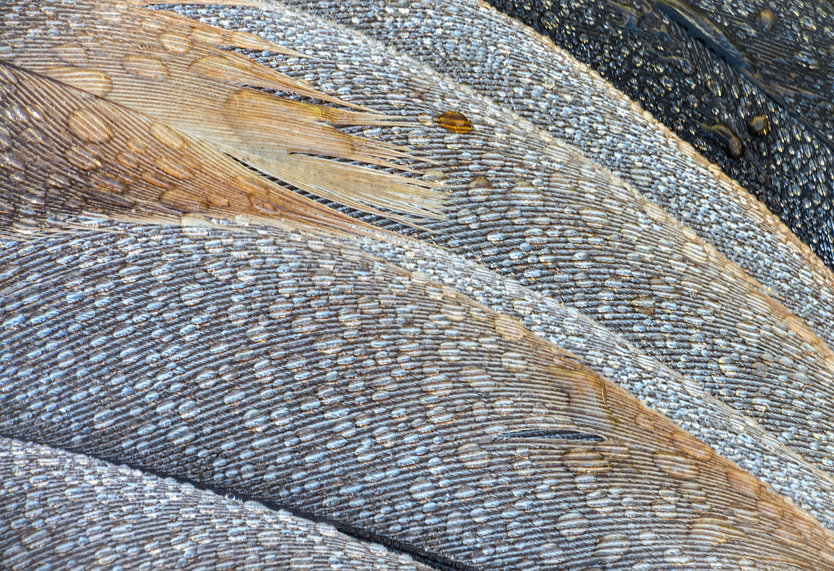
After tending my honeybees, I decided to hike around our 1/2 acre pond. Along the shore, I found a recently deceased great blue heron. These birds rule the pond feeding on frogs and small fish and are quite formidable predators. I'm not sure what killed this one as the carcass was not touched by any predators. The following morning, I photographed an area of the wing that was covered with dew. K5 IIs, 300mm f4 plus 40mm extension, 1/5 sec at ISO 320, natural light. For post processing, I used Tony Kuyper's Luminosity masks for the light and midtone values with an adjustment layer for curves. I used Topaz Detail for the final sharpening. Thank you for viewing.................Jim

Comments

6 comments
Comment posted by Richard Teller on October 13, 2013 at 3:08 PM
I especially like the lines in this image and the dew is a really nice touch.
Registered on August 23, 2010, 1162 Posts, 6692 Comments
Comment posted by Carolyn Derstine on October 13, 2013 at 8:56 PM
I've always found these impressive birds to view. We have several that visit the creek behind our house and they can look very regal while patiently searching for prey. Sad it died but at least it gave you a great photography opportunity. Nice comp you found and the dew really adds to the textural feeling of this image. Not sure about the yellow/brown drops though. Think I would clone them out or make them clear if possible. To me they add a bit of an uncertain squeamish factor. . .is it blood, urine, dirt? But maybe that's just me. :rolleyes:
Registered on February 16, 2011, 610 Posts, 3684 Comments
Comment posted by Balan Vinod on October 14, 2013 at 2:16 AM
Jim,

I initially thought its a landscape image, love this ..very well done

Balan Vinod
Registered on March 20, 2006, 889 Posts, 2312 Comments
Comment posted by Jim Greenwood on October 14, 2013 at 2:47 PM
This is a very visually appealing abstract, especially considering the subject matter. I would tend to agree with Carolyn about the one darker dew drop. It does draw the eye somewhat. I'd also suggest perhaps dodging the URHC.
Registered on November 9, 2003, 229 Posts, 1523 Comments
Comment posted by Mark Seaver on October 15, 2013 at 6:08 PM
Lovely collection of colors and shapes and the dew drops add even more wonderful texture. Great job.
Registered on January 23, 2011, 1103 Posts, 17270 Comments
Comment posted by Jim Zablotny on October 20, 2013 at 1:05 PM
Hi,

Thank you all for the comments. Following the advice of Carolyn and Jim, I removed the bright brown drop and dodged the UPRHC..............Jim
Registered on January 17, 2004, 705 Posts, 3594 Comments