Nature Photographers Network
This is the preserved archive of the original Nature Photographers Network. The community continues at naturephotographers.network.
Sturtevant Pond
‹ PreviousLandscape GalleryNext ›

Sturtevant Pond

by Christine Adams

Gallery: LandscapePosted October 6, 2013299 views14 comments
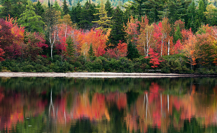
Who doesn't like/love fall reflections? No one I know! This was taken at a quiet pond that was just gorgeous! I did crop out uninteresting sky and sky reflection, and the usual brightening, contrast and sharpening.

Nikon D90, 28-70mm, polarizer, tripod

Comments

14 comments
Comment posted by Gary Reed on October 6, 2013 at 8:43 PM
Christine, Fantastic colour, love the still reflection. Is it just me or are you slanting down on the right? :smile:
Registered on September 19, 2009, 198 Posts, 1074 Comments
Comment posted by Nancy Lea Sandy on October 6, 2013 at 9:05 PM
This is terrific. Love the reflection. Great autumn color.
Registered on January 24, 2011, 576 Posts, 6942 Comments
Comment posted by Eva McDermott on October 6, 2013 at 9:31 PM
Gorgeous color Christine. Love the muted reflection.
Registered on January 4, 2009, 1015 Posts, 13229 Comments
Comment posted by Bill Reid on October 6, 2013 at 9:39 PM
Beautiful colors Christine and a wonderful reflection. I wish we got those great reds out my way. Well done.
Registered on January 27, 2013, 65 Posts, 2460 Comments
Comment posted by Kah Kit Yoong on October 6, 2013 at 9:42 PM
The splashes of red among the foliage and reflections make for some gorgeous accents.
Registered on September 27, 2006, 636 Posts, 10682 Comments
Comment posted by Nick Bristol on October 6, 2013 at 9:48 PM
Christine, A beautiful autumn scene. Hard to beat reflections like this! Nice work on this. :smile:

Nick Bristol
Lone Rock, WI
Registered on February 1, 2004, 752 Posts, 14140 Comments
Comment posted by Brian Schrayer on October 6, 2013 at 10:22 PM
Lovely scene, Christine. Those reds are impressive and contrast nicely with the greens and golds. Nicely composed as well.
Registered on May 28, 2004, 114 Posts, 2890 Comments
Comment posted by Matthew Goldsmith on October 7, 2013 at 10:10 AM
Very nice fall color Christine. I have two small suggestions. One would be to bring down the brightest highlights just a bit, especially in the shoreline (although I am viewing on a laptop that might be a bit bright). I would also suggest moving your logo. I know it's nitpicking, but it is distracting where it has been placed.
Registered on June 29, 2010, 37 Posts, 286 Comments
Comment posted by Navin Sarma on October 7, 2013 at 4:11 PM
Classically awesome. Beautiful colors
Registered on July 17, 2011, 233 Posts, 1373 Comments
Comment posted by Scott Fricke on October 7, 2013 at 4:54 PM
Gorgeous color for sure! I like the horizontal layering in the image with the banding of color and the slim silver shoreline, really nicely composed Christine.
Registered on January 19, 2007, 133 Posts, 1448 Comments
Comment posted by Harley Goldman on October 7, 2013 at 6:13 PM
Some eye-popping colors and fine reflection. I agree with Gary that it might need a CCW rotation and I might clone out the two white spots lower left.
Registered on November 19, 2003, 586 Posts, 11271 Comments
Comment posted by Bruce King on October 7, 2013 at 7:55 PM
great colors and the near 50/50 comp doesn't hurt it at all :toast:
Registered on January 14, 2010, 276 Posts, 2212 Comments
Comment posted by Daniel Finchum on October 8, 2013 at 12:53 AM
definitely a wall hanger! great job.
Registered on September 8, 2013, 43 Posts, 222 Comments
Comment posted by Joseph Campisi on October 8, 2013 at 5:50 PM
Brilliant colors Christine. Makes me miss New England! :toast:
Registered on November 24, 2008, 304 Posts, 3211 Comments