Nature Photographers Network
This is the preserved archive of the original Nature Photographers Network. The community continues at naturephotographers.network.
Turret and Stars (+RP)
‹ PreviousLandscape GalleryNext ›

Turret and Stars (+RP)

by Jared Warren

Gallery: LandscapePosted August 6, 2013424 views9 comments
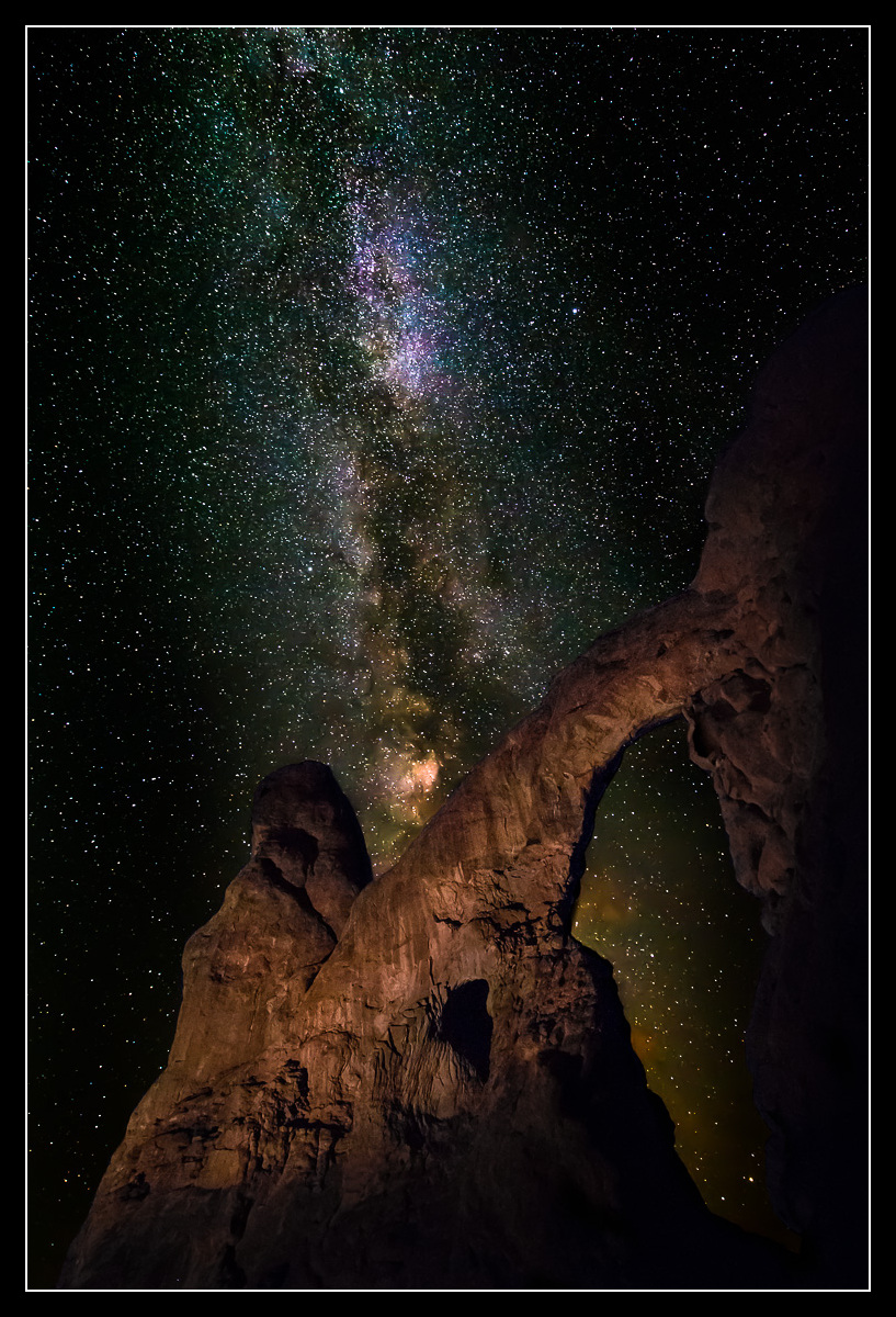
I wasn't sure what to think about this one at first, but it's growing on me. This is last month at Turret Arch, around 1am. I'll be interested to get your thoughts. What would make you like it better? Thanks for looking!

5Diii, Nikon 14-24 @ 14mm, 2 images (arch, stars) each at f/2.8, 20 sec, ISO 6400.

Please view LARGE!

Comments

9 comments
Comment posted by Mark Seaver on August 6, 2013 at 4:32 PM
That's an amazing star field. I'm less sure about the arch. I would like to see just some hints of stone along the right frame and in the lrc.
Registered on January 23, 2011, 1103 Posts, 17270 Comments
Comment posted by Morris McClung on August 6, 2013 at 5:06 PM
Wowzers, does that sky ever pop with detail! And, the light on the formation works for me. :toast:
Registered on May 7, 2007, 670 Posts, 19650 Comments
Comment posted by Bill Reid on August 6, 2013 at 6:05 PM
Wow the stars just pop in this Jared. And I like the light on the arch but maybe a little more detail on the right arch for my 2 cents.Very other worldly and very original. Really nicely done. :toast:
Registered on January 27, 2013, 65 Posts, 2460 Comments
Comment posted by John Mumaw on August 6, 2013 at 6:53 PM
Great skies you captured, and the light on the arch looks terrific to my eye. It's hard to pull off a successful light painting it seems, but you did it here.
The problem I have is that this is hardly recognizable as an arch. I kinda wish you had the lit the bottom and right sides as well as you did the rest of the monolith.
Registered on September 9, 2005, 62 Posts, 2289 Comments
Comment posted by Nick Bristol on August 6, 2013 at 8:58 PM
This is really cool looking, Jared. I agree with the other comments about a little more light painting on the lower part and right side but still you really came up with a wonderful image! Nice work... :toast:

Nick Bristol
Lone Rock, WI
Registered on February 1, 2004, 752 Posts, 14140 Comments
Comment posted by Brad Strong on August 7, 2013 at 2:39 PM
Jared, This is a good effort, but there are a couple of things that stand out to me. Like others mentioned, the light painting seems incomplete. Unless it was your intention fade the bottom and right of the arch into black, but it doesn't really seem so. There is also a green color cast to much of the image. Outer space and stars are not green, so it throws things off. The light part of the milky way around the arch is pretty muddy looking, perhaps from light contamination. While the milky way can have some magenta in it, the magenta in this image seems mottled with patches of blue. You did a nice job capturing the milky way, but maybe it needs a little more work.
Registered on October 1, 2012, 43 Posts, 302 Comments
Comment posted by Jared Warren on August 7, 2013 at 5:39 PM
Thanks for the helpful feedback so far. I think I've made good progress in the past year and I attribute much of that to the great discussions and critiques that happen here on NPN (I cringe at the processing of some of the images I first posted a year or so ago).

Not having the arch completely illuminated in this image was an intentional design decision, one that seems to go against the consensus of feedback from people whose work I admire. :) My intent was to increase the sense of interest/mystery while conforming to the darker borders around the star field, and I liked how it created two strong anchoring lines- the milky way and the arch span. And maybe the viewer would follow that arch span and wonder "hmm, where does that go?"

However, I'm willing to keep experimenting, and I've enjoyed calibrating my inclinations and reactions with/against those of others on this site. So, I did have a frame with the arch more fully illuminated, and have blended that one with the original star field on this revision. The LRC still could have been better lit but part of this area is recessed and would not have shown up unless lit from straight on. Parenthetically, my teenage daughter was doing the light painting and overall she did a great job! :)

This version could still be refined, but is this closer to what several of you had in mind? Other thoughts? Looking forward to any more feedback.

Brad, thanks for your feedback as well. The green in the image has been explained to me as "airglow" which can be more or less pronounced depending on the night. I have turned down the green on the revised image but it's pretty common to capture this in star photos. What I did really struggle with was a magenta cast in the arch shadows, still visible in places but could still be addressed with a little more TLC.

Thanks again, and keep the critiques coming!
Registered on May 11, 2012, 84 Posts, 931 Comments
Comment posted by Bill Reid on August 8, 2013 at 10:08 AM
I like the repost a lot Jared. The detail on the right helps this a lot. Nice.
Registered on January 27, 2013, 65 Posts, 2460 Comments
Comment posted by Brad Strong on August 8, 2013 at 3:19 PM
Jared, I prefer the repost, but I still think it's too green. The lighting on the rocks looks much better. It still fades in from the edges, but this version looks intentional and artistic. The other one looked like the shutter closed before you were done. Much better IMO.

Airglow, smog, aurora, etc. doesn't really matter. If you like the green cast, keep it. If you don't like it, change it. I deal with atmospheric conditions all the time being in the Blue Ridge Mountains, but in the end, I decide how blue they are in my final image. If atmospheric haze adds depth and mystery, I keep it. If it looks like doo doo, I reduce it with processing or shoot with a CPL, etc. I think the green looks muddy in some of the image and just unnatural in the rest. There's a psychological factor to colors in photos. If I showed you a picture of a blue banana, you'd immediately know it was off. The color cast in this raises a flag to me. I've shot the milky way before, and my pictures don't have a green cast in them. Some of the color casts in the image may be from high ISO, long exposure, especially the magenta. Everyone loves magenta and rarely want to call it noise. If it was in the shadows of the rocks, then it was noise. If it was noise in the rocks, then some of it the rest of the image is noise as well.

In the end, it's about your expression of what you saw that night. To me, the magenta and blue mottles and green color cast look like amplified chroma noise, smog, and light contamination. :wavey:
Registered on October 1, 2012, 43 Posts, 302 Comments