Nature Photographers Network
This is the preserved archive of the original Nature Photographers Network. The community continues at naturephotographers.network.
Coreopsis & Catmint + repost
‹ PreviousFlora GalleryNext ›

Coreopsis & Catmint + repost

by Carolyn Derstine

Gallery: FloraPosted July 15, 201398 views13 comments
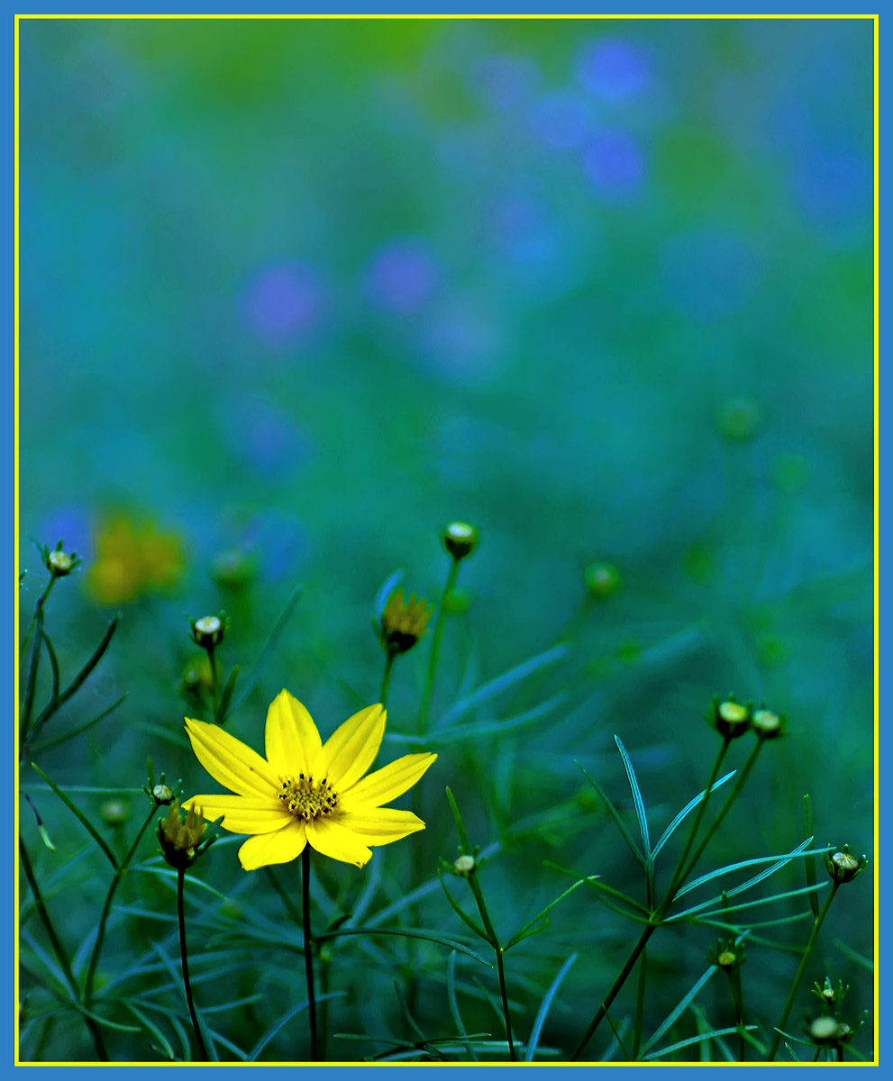
This is a view of one of my sun beds when the Coreopsis were just starting to bloom. Behind the Coreopsis, are the blue flowers of Catmint. The yellow smudges near the top are from yellow sedum that is blooming.

Canon 60D. 90mm macro lens. F/2.8 for 1/100 sec. ISO 100. Tripod mounted, natural lighting.

Comments

13 comments
Comment posted by Nathan Buck on July 15, 2013 at 6:03 PM
There are some great layers in this photo Carolyn. Very nice. I like the details in the bottom section. The photo feels quite cool. That is OK if that is your intention, but I wonder how it would feel if the WB was warmed up just a tad.

Nathan
Registered on November 1, 2003, 1101 Posts, 13589 Comments
Comment posted by Carolyn Derstine on July 15, 2013 at 6:20 PM
Here's a version a bit more warmed up. I was trying to emphasize the blue in the background but I agree a bit of warming up is helpful. Thanks, Nathan. :smile:
Registered on February 16, 2011, 610 Posts, 3684 Comments
Comment posted by Ramamohan Pai on July 15, 2013 at 7:10 PM
Carolyn - Wonderful use of the empty space - my eyes come back to the bloom without getting lost. I like the original version better as the warmed up version has removed the details from the petals (I am sure if you spent a bit more time, you could warm up without losing the details).

I really like the use of complementary yellow and blue here.

Registered on November 1, 2003, 550 Posts, 9037 Comments
Comment posted by Philip Hodgkins on July 15, 2013 at 7:49 PM
Agree with Ram. The details in the coreopsis bloom can easily be preserved, treating it as a separate layer and changing the hue down to the left of yellow.
Registered on July 24, 2006, 2741 Posts, 12349 Comments
Comment posted by John Neukirch on July 15, 2013 at 9:43 PM
For me the choice of f2.8 really makes this image, Love the clarity of the front 45% of the image. Very well done. :toast:
Registered on July 9, 2012, 207 Posts, 1476 Comments
Comment posted by S Govindarajan on July 15, 2013 at 10:06 PM
Beautiful image, Carolyn. Really like the impressionist feel of the background. The coreopsis is well placed. Agree with others on your reworked image. :toast:
Registered on April 19, 2008, 115 Posts, 1921 Comments
Comment posted by Greg AshworthFanch on July 15, 2013 at 10:32 PM
This is well done. I like to your vision here and the natural lighting.
Registered on December 14, 2012, 55 Posts, 67 Comments
Comment posted by Albert Darmo on July 15, 2013 at 10:54 PM
Hi Carolyn :wavey: A beautiful image, with a magical mood :toast:
Albert Darmo
Registered on November 25, 2008, 1386 Posts, 11978 Comments
Comment posted by Mark Seaver on July 16, 2013 at 6:45 AM
This is a very interesting view, with the single sharp bloom and lots of oof color in the background. For me, the subtle warming in the repost isn't worth loosing the details in the front petals of the bloom. I like this a lot.
Registered on January 23, 2011, 1103 Posts, 17270 Comments
Comment posted by Ian Wolfenden on July 16, 2013 at 6:52 AM
Superb image, Carolyn ! Very creative composition ( love how the buds seem to orbit around the flower ), with marvellous colouring and light. Either version works for me.
Registered on May 18, 2007, 1108 Posts, 7647 Comments
Comment posted by Catherine Reilly on July 17, 2013 at 5:08 AM
Great stuff! A bold, out-of-the-box composition that is eye-catching. Great color (I like either one). Very creative, indeed!
Registered on August 16, 2006, 603 Posts, 9192 Comments
Comment posted by Diana Clinch on July 17, 2013 at 6:01 PM
I really like how the flower jumps out against the background. This is my first impression without any further analysis. Nice.
Registered on July 17, 2013, 8 Posts, 35 Comments
Comment posted by Morris McClung on July 17, 2013 at 11:03 PM
I like the first for the color contrasts. The blue wash of color compliments the yellow flower perfectly. Beautiful image.+
Registered on May 7, 2007, 670 Posts, 19650 Comments