Nature Photographers Network
This is the preserved archive of the original Nature Photographers Network. The community continues at naturephotographers.network.
Milky Way
‹ PreviousLandscape GalleryNext ›

Milky Way

by Abdulmajeed Aljuha

Gallery: LandscapePosted June 28, 2013672 views24 comments
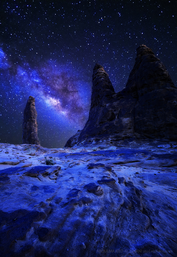
hi all

it was my first experience to take a picture for milky way. I blend two exposure to get this picture and it was as following:1- choose the right mountain and try to expect where the milky way will be.2- take one exposure for the mountains after the sun set.3- keep the camera as it is until the milky way will show up in the sky.4- again wait until the milky way rotate and set between the mountains.5- take the second picture for the stars and milky way.then I blend them together in photoshop with cold white balancespecial thanks to my dear friend who drive me to that spot and teach me about milky way Mr. Sakhr Abdullah http://500px.com/Sakhr

your C&C is highly required

thanks,
:toast:

Comments

24 comments
Comment posted by Joerg Bonner on June 28, 2013 at 8:31 AM
amazing first attempt, abdulmajeed! the comp works very well and the milky way is positioned perfectly. great job on the blending, too! my only point of critique would be the white balance - it all look a bit too blue to my eye.
Registered on September 5, 2011, 44 Posts, 221 Comments
Comment posted by Hamed Musharbak on June 28, 2013 at 10:52 AM
wonderful work as usual my friend, i like the comp a lot

i suggest to brighten up the the mountain :biggrin: on the right it looks a bit dark
Registered on June 1, 2009, 372 Posts, 2282 Comments
Comment posted by Ted Gore on June 28, 2013 at 11:22 AM
I think you did a good job with the blend here, but the image overall is WAY too blue. Warm it up, and I think you have some good stuff here.
Registered on April 25, 2013, 36 Posts, 149 Comments
Comment posted by Navin Sarma on June 28, 2013 at 1:00 PM
Awesome first try - gotta try this when I get back outisde of the city. :rolleyes: Agree with the comments on brightness in the mountain, and blueness
Registered on July 17, 2011, 233 Posts, 1373 Comments
Comment posted by Abdulmajeed Aljuha on June 28, 2013 at 1:34 PM
thanks a lot for you comments, I tried to adjust it as per the comment. is it okay now?
Registered on December 4, 2010, 77 Posts, 149 Comments
Comment posted by Allen Brooks on June 28, 2013 at 1:41 PM
I was really struck by the original in the thumb nail. I think it is well done. I guess I like blue. The original has an other-worldly feeling to it. It's night time, so I don't see anything wrong with the foreground being dark. In the repost I feel too much attention is drawn the foreground and not the milky way, which is the "star" of the show.
Registered on July 27, 2011, 262 Posts, 2597 Comments
Comment posted by Bill Chambers on June 28, 2013 at 2:05 PM
Downright scary good. So otherworldly in mood and style. :toast: :toast: :toast:
Registered on April 10, 2005, 753 Posts, 21216 Comments
Comment posted by Ted Gore on June 28, 2013 at 3:12 PM
still too much for my tastes. I'd go something like this. Feels more natural to me.
Registered on April 25, 2013, 36 Posts, 149 Comments
Comment posted by Navin Sarma on June 28, 2013 at 3:15 PM
I like Ted's idea, perhaps a little brighter and a slight crop off the top
Registered on July 17, 2011, 233 Posts, 1373 Comments
Comment posted by Catherine Reilly on June 28, 2013 at 4:57 PM
Incredible! The original image is surreal, which fits the subject and time of day. Perhaps the intensity of blue is a bit much, but the "natural" look is too ordinary for such an extraordinary scene. Love the comp, and the blue- dialed back just a bit. There is such a nice glow in the foreground from reflection of light off the snow. Don't think the reposts quite arrive at the glory of the original.
Registered on August 16, 2006, 603 Posts, 9192 Comments
Comment posted by Richard Hartmann on June 28, 2013 at 6:18 PM
I relay like the otherworldly feel of the blue. Thanks for the idea. I’ll have to try this one day.

I prefer the first post with the darker feel to the land.
Registered on January 15, 2009, 13 Posts, 772 Comments
Comment posted by Ben Horne on June 28, 2013 at 8:29 PM
I really like your composition here and how the milky way is aligned between the two spires on the left. I also love the fact that there is an odd number of spires. The small lines in the foreground work nicely to draw the eye in, and I really like the texture of the foreground as well.

I do agree with the others that the color is way too strong. You already have some very bold elements, so the strong blues just make it feel over the top -- and in my opinion, takes away from the shot. Before reading any comments, I quickly scrolled down and saw your repost as well as Ted's repost (which I at first assumed was a second repost by you). My initial reaction was that the repost didn't look much different from the original, but Ted's post reflects what I would have suggested.
Registered on August 27, 2009, 51 Posts, 959 Comments
Comment posted by scott lanz on June 28, 2013 at 10:31 PM
Very cool, although all versions look unreal and alien.
Registered on November 14, 2003, 840 Posts, 12902 Comments
Comment posted by mike cain on June 29, 2013 at 2:53 AM
Im a real rookie here, but with all this manipulation is this photo art, this looks like a back drop for star wars or something did it really look like this ? please don't get me wrong It sounds as if you put alot of effort into it, kudos to your talent with photoshop IT does grab your attention
Registered on January 17, 2013, 31 Posts, 40 Comments
Comment posted by David Edwards on June 29, 2013 at 3:28 AM
I like the original a lot. The extreme blue I think adds to this otherworldly landscape and invokes a lot of imagination for me. Nice work!
:toast:
Registered on December 6, 2008, 142 Posts, 2623 Comments
Comment posted by Johan Eickmeyer on June 29, 2013 at 6:31 AM
Cool shot. I like the composition and effort put into this.

I've found setting the white balance to around 3950K is a good starting point for shooting the milky way.
Registered on March 25, 2013, 36 Posts, 164 Comments
Comment posted by Matthew Goldsmith on June 29, 2013 at 9:20 AM
Amazing. Feels like the surface of the moon.
Registered on June 29, 2010, 37 Posts, 286 Comments
Comment posted by Matt Anderson on June 29, 2013 at 11:33 AM
Nice first milky way! I'd go with Ted's repost, but maybe 15% back towards yours. A bit richer in color. I also would still try to squeek a hair more shadow detail out of the very right spire. None the less, what a clear sky and interesting area.
Registered on September 6, 2007, 346 Posts, 2696 Comments
Comment posted by Youssef Ismail on June 29, 2013 at 12:49 PM
Abdulmajeed,

This is a fantastic composition and a great result for your first time doing this. I would make these suggestions if you don't mind. The blue is very strong, but I would not tone it down as much as Ted suggested. Somewhere in between your repost and his. Second, I think your exposure of the starts is good but you let the shutter open just a bit to much as the stars exhibit a slight motion blur, making the stars appear out of focus. I really like the surreal nature of the whole photo so do not make it to bright in the repost, the darkness lends to its surrealism.
Registered on November 1, 2003, 474 Posts, 5555 Comments
Comment posted by Bob Miller on June 29, 2013 at 1:14 PM
I like the mood of the blue/purple. Fantastic! :toast:
Registered on January 24, 2005, 152 Posts, 405 Comments
Comment posted by Jared Warren on June 29, 2013 at 7:41 PM
Great work here! Very surreal - "otherworldly" as others have said. You've already received some good feedback so I'll just say keep up the good work!
Registered on May 11, 2012, 84 Posts, 931 Comments
Comment posted by Joseph Campisi on June 29, 2013 at 11:57 PM
I agree with Catherine's observations. This is an absolutely stunning otherworldly image Abdulmajeed! I thing a version somewhere between your repost and Ted's version would be perfect! Stellar image! :toast:
Registered on November 24, 2008, 304 Posts, 3211 Comments
Comment posted by Abdulmajeed Aljuha on July 5, 2013 at 7:36 PM
thanks a lot for all of your comments, I get mix comments regarding the blue. I think I'm going some where btw my version and Ted version.

appreciate your comments :toast:
Registered on December 4, 2010, 77 Posts, 149 Comments
Comment posted by Mark Metternich on July 6, 2013 at 5:15 PM
I like the tailored down version much better but still wish the milky-way was a tad more conservative. Great shot worth the effort. Love its celestialness. :toast:
Registered on June 19, 2009, 276 Posts, 6240 Comments